Delight
Original Available - contact me for details
Shop Online for Archival Prints
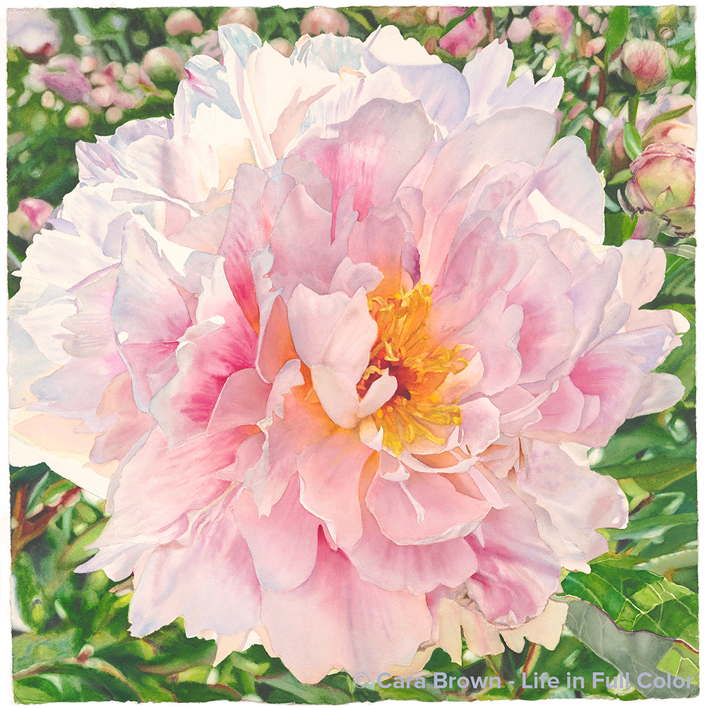
The Magnolia Artists gathered for the first time as a group - since March of 2020, in the gardens of Filoli in Woodside. It was early May 2021 and we had all received our two doses of COVID vaccine. It felt like we were safe to be in each others' presence - especially out of doors. We were giddy getting to be together - especially in such a breathtaking place.
I've not painted many peonies - and not for lack of desire. I've just not had many peony images tell me to paint them. Roses keep butting in. This is a herbaceous peony, rather than a tree peony. The herbaceous type are not quite as showy, but the freshness and purity of this one got me. I love the petal curled over towards the center, making it almost demure.
I helped the composition along by inserting the field of buds, in pinks and greens behind the top of the flower, giving a more complete picture of what it was like to be there that day.
Zoom in to the upper right corner and you'll see how our weeks-old puppy, Bozzy, added his creative touch to the piece. He scratched it with his sharp baby dog claws, which I hadn't noticed until I put paint down. This will forever be the painting I was working on at the start of his puppyhood.
The title is a nod to Ross Gay, author of The Book of Delights, a wonderful book that reminds us of how small joys are found in the every-day and how making space for delight is a worthwhile pursuit.
Plus, for me it's almost always about the light.
March-April, 2022 - 29”x29” – Watercolor on paper.
Delight
Originals, Other Flowers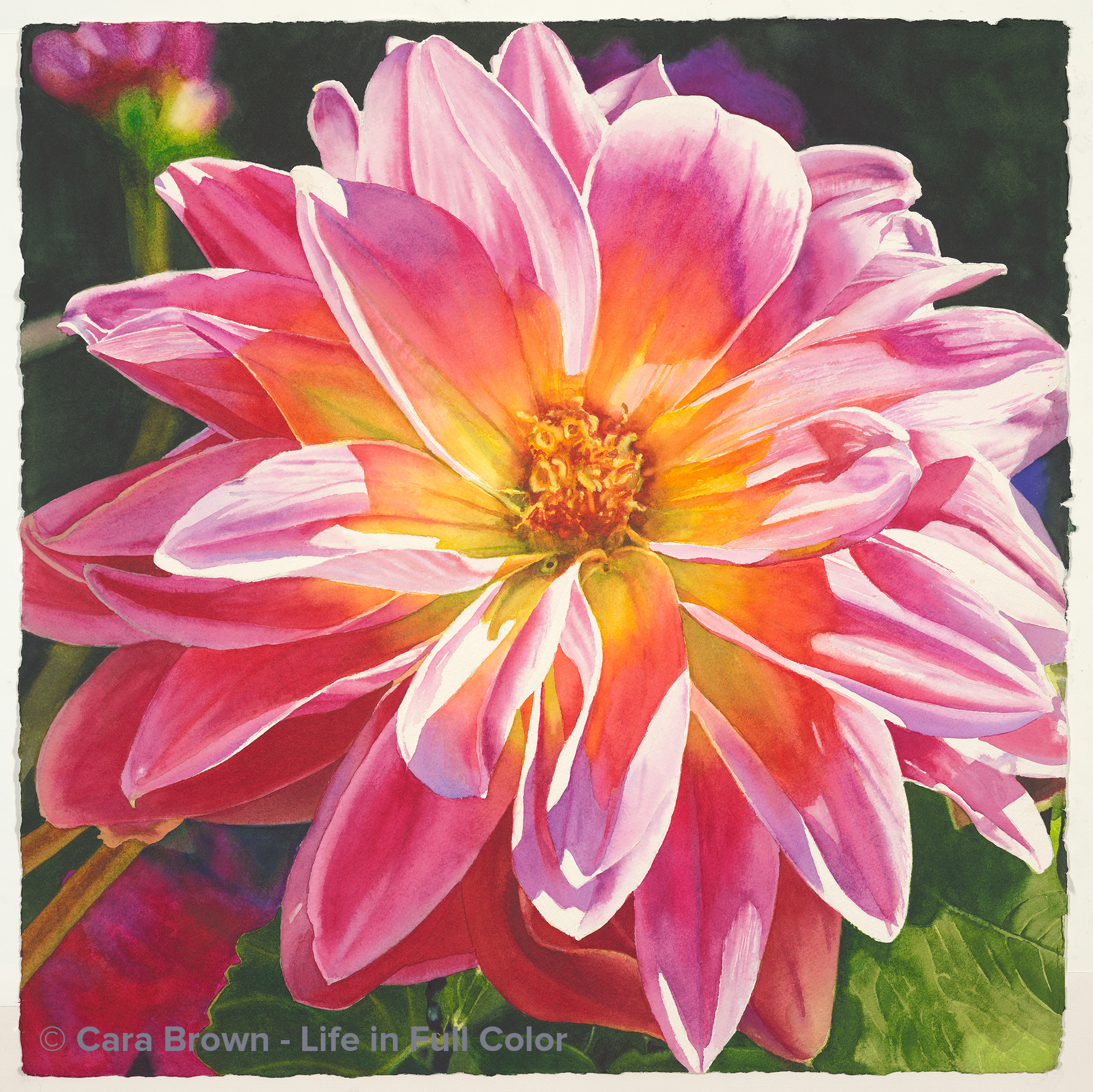
Hello
Original Available - contact me for details
Shop Online for Archival Prints
There are pieces of art I've made that have held lots of meaning, some of them have become "important" even before I've started painting. This one, not so much. I decieded to paint it just for the fun of it- the colors, the light, the simplicity. And since I can be such a serious and purposeful person, this is really good for me!
I took the photo more than 10 years before painting. I noticed this sweet flower along a path in Anne and Gary's garden - the same one that is the source of my peaches and apricot paintings, as well as the gorgeous roses that became "Lavish" in 2019. This dahlia was a tiny little thing, not more than 4" across. In reality it was all pink, except for a golden center, but I had to mess with it, addig more orange, to make it sort of tutti-frutti - just for fun.
Pam, an artist in our Friday group, helped me with the title. Just about finished, I had it up on an easel in Larkspur. She walked in the door and said "Well that's a big 'hello'!" Funny, I was considernig calling it "Hello" but was, as I often am, doubting it. I love having my inclinations accidentally affirmed! So, just after finishng a small rose painting I called "Farewell," here is "Hello" - marking the partings and greetings of life.
January-February 2020 - 22"x22" - Watercolor on paper
Hello
Originals, Other Flowers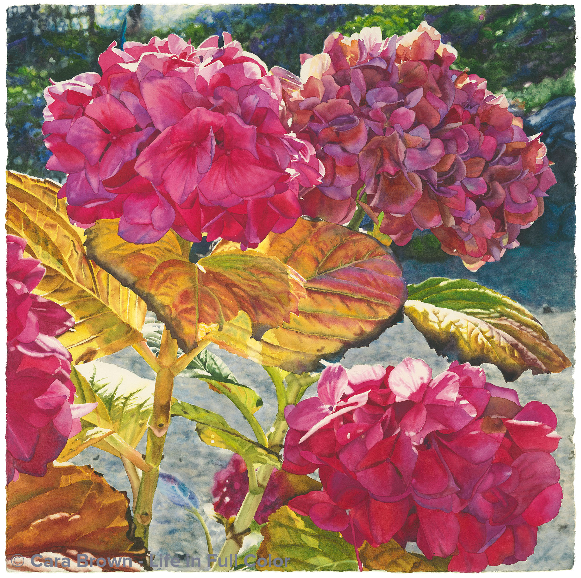
Beatitude
Original Sold
Shop Online for Archival Prints
These hydrangeas were blooming the Christmas before last out at my parents’ place. I was enjoying the unseasonably mild weather wandering the garden with Leigh and Lena, my niece and her partner, visiting from Brooklyn for the holidays. The light was low - even in mid-day - illuminating the whole thing, and grabbing my attention to save it all with my trusty iPhone. The leaves reveal the lateness of the season, but most of the flower clusters were as bright and vibrant as mid-summer! It was a mild winter, but still – this colorful?
After the presidential election of 2016 put much of the world into turmoil, I wanted something to paint that would bridge my inner spaces, some tattered and weary and others committed to life and beauty no matter what. The series of images I took of these vivid pink flowers and yellow leaves came to mind. In my studio was a square frame of beautiful wood that “Rest” left behind when it went off to Alberta, Canada - prompting me to see if I could come up with a square composition that would please me.
Before even drawing it, as I was still working with the image in Photoshop, the name came to me. Though the word “beatitude” means “supremely blessed,” in my mind it was an allusion to the Beatitudes - part of Jesus’ Sermon on the Mount. I have very little to do with the Bible, though the tradition that is the most mine is Christian. But this passage is different – I have a history with it that dates back to a 2003 trip to Cuernavaca, Mexico with my former church when I learned of its prominent place in Liberation Theology - for those living in terrible poverty in Latin America.
After the name came to me I looked it up and realized that living by the Beatitudes is more called for at this time in human history than ever – at least since I’ve been alive. There is a paradox in them – the meek inheriting the earth – a defying of standard logic - that I felt in this image: Blessed are the late-season hydrangeas, though they are tattered and tired, they still are filled with color and illuminated by the light.
I tussled inside with whether I had the audacity to give a painting of flowers this piece of scripture as its name. As I was finishing it, I revealed my struggle with Sandy, one of the artists in our Friday group. Sandy is wise and awake and has a spacious heart. She told me I must go with it. I knew that I did – and it helped to be encouraged too. The name had come to me so early on, and had never left, throughout the weeks I worked on the painting. I’ve learned to accept and honor these messages – regardless of how much they challenge me.
January 2017 - 29"x29" - Watercolor on paper
Beatitude
Other Flowers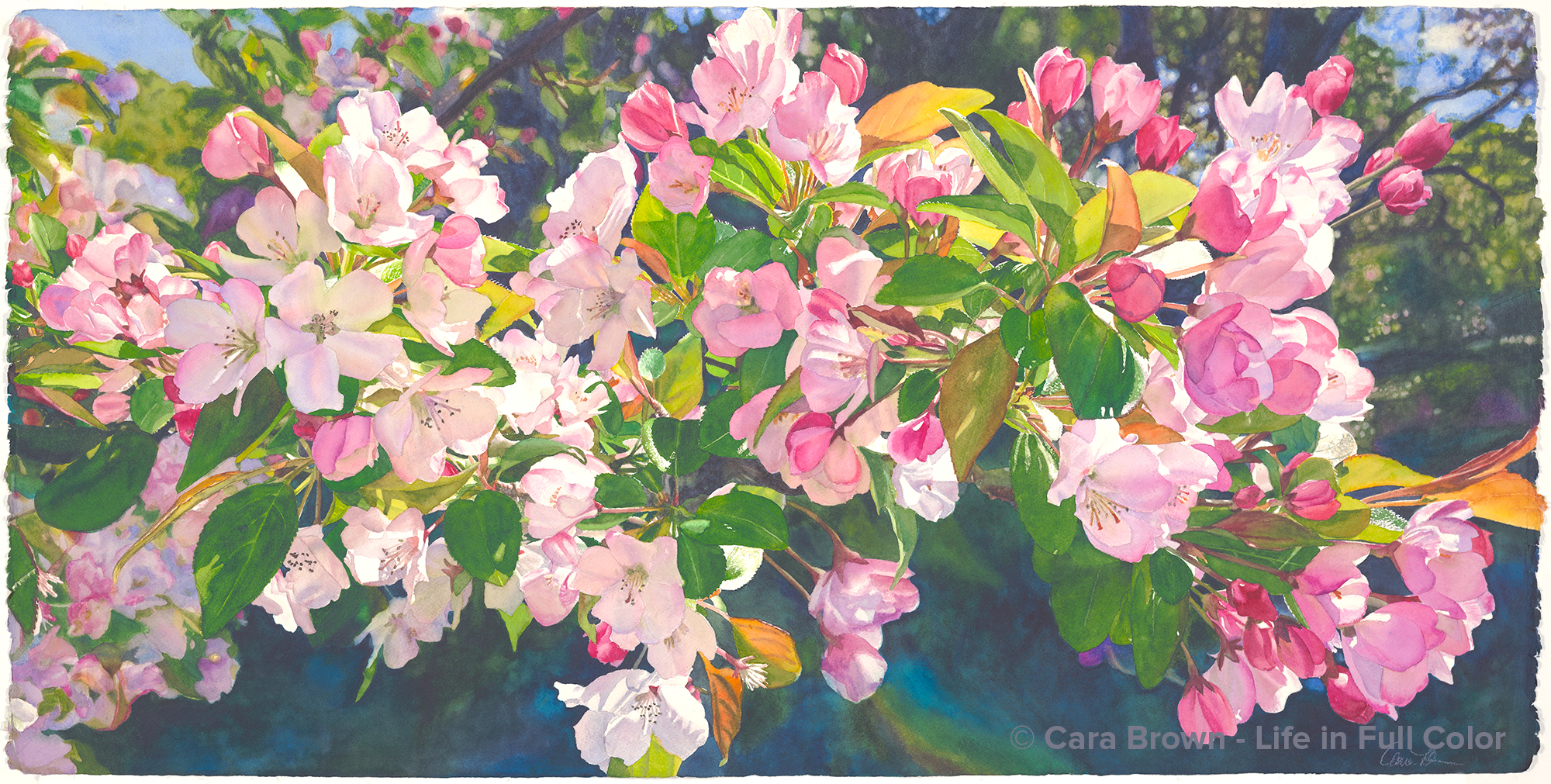
Glory
Original Sold
Shop Online for Archival Prints
Blossoms on a crab apple (I think!) branch from a tree gowing at Filoli - a treasure of a public garden where I've found solace and inspiration for decades. It was April in 2019, a Tuesday - an all-Magnolia field trip to see the spring in full glory. There were bloosoms on all kinds of fruit trees, rows and pots of tulips and hyacynths and blooming wisteria draped on buildings and walls. Filled with the sights and scents of the flowers, several of us went further south to Sandy's in Los Altos Hills for a delicious lunch in her lovely home. Days like this are nothing short of a privilige.
I was intrigued by the winding quality of this branch - the way it snaked across my camera's viewfinderl Later, revieing the photos, I was glad for the tops of the huge valley oak trees, that so pul one in that place in the background. I had to mess with it a bit, though! I added small clsuter here and there, to both accentuate the wave and take up some of the extra negative space. I knew this ould take a while - there are lot of petals and tons of intricate details of stems and sunlight weaving through. This is an interesting composition, in that there isn't really one focal point.
I started painting two years later, it the spring of 2021, when we were first advised it would be safe to gather in person again. We did so in our really nice garage - well nice as far as garages go! It was a heady time, It was then that I got to see in person all the many paintings that the artists in our grups painted while gathered only on Zoom.
My beloved Sister Mary Neill helped with the name. When she saw it she said "Oh, Honey! It gives glory to God!" So "Glory" it is.
April - August, 2021 - 20 1/2" x 41" - Watercolor on Paper
Glory
Other Flowers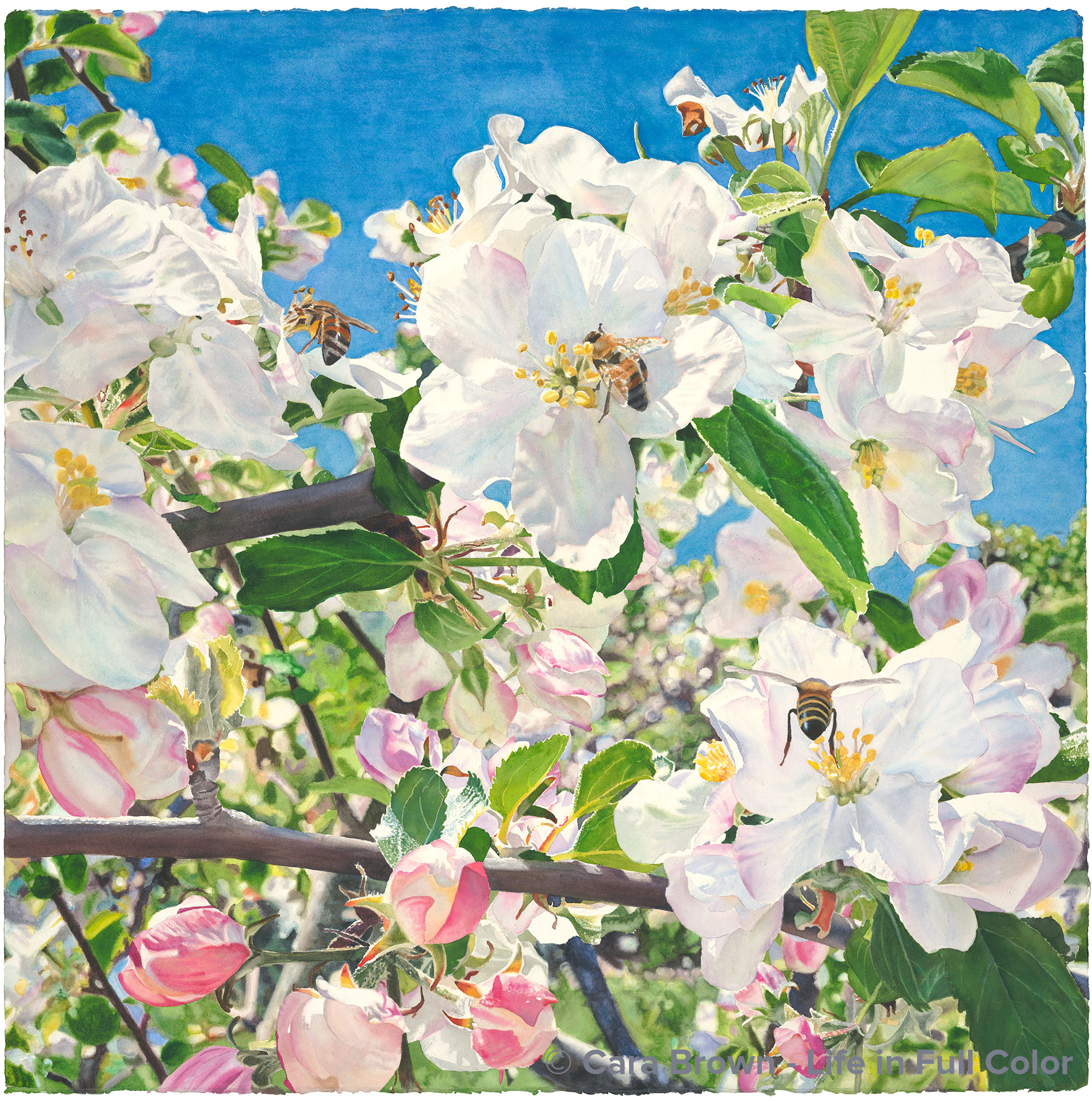
Eden
Original Sold
Shop Online for Archival Print Sizes/Prices:
There’s something so special about being with someone who loves what we love as much as we do. This painting came out of that kind of experience. I was in the gardens at Filoli in Woodside, California in the spring of 2016 with Lenore and Sue - two new and very dear friends. Sue and I share a thing about apple blossoms – how sweet and chubby they are, the buds are soft pink and they open to flowers with delicate, roundish petals. And there are the beginnings of green leaves at the same time as the flowers and buds – some flowering trees the leaves come after the blooms. Green and pink are such a happy combination!
While Lenore amused herself in other areas of the garden, we reveled – we obsessed – pointing out to each other this cluster and that. The bees, the bright sunshine, the freedom from anyone hovering, trying to be patient while it’s clear they are bored and ready to move on. We snapped pictures on our iPhones with all the time in the world at hand. It was a piece of heaven!
Later, looking through all those pictures, not a single one of them on its own expressed how I felt – so off to Photoshop I went. I ended up with basically two images, top and bottom, but I had to fit them together so they appeared as one. And then because I could not help myself, I brought in two more bees. I wanted to portray the sense of aliveness of the moment - and a single bee just didn’t. I simplified the background some, but I didn’t want to paint just sky behind the main subjects. I wanted to include the profusion of all the other trees in the orchard around it – meaning I had a whole lot of detail to wade through.
I started working on it late in the spring of 2016 and through the summer, disciplining myself to paint the background sections before working on the branches, leaves and finally the flowers. But, when August came around I was craving intense color. The time had passed for soft colors and for the first time I set aside a painting that had come this far, to work on something else. When the spring of 2017 came around I was totally ready to work on it again, finishing it up in just three weeks.
The name "Eden" came to me at the beginning – even before I’d painted it. I had considered giving this name to a rose painting I did just before starting this one. When that one became “Eve” I realized that “Eden” - the name of the original garden, with all its fertility and promise – was meant for this painting. That it is an apple tree makes it all the more so.
May 2016 - April 2017 - 40"x40" - Watercolor on paper
Eden
Other Flowers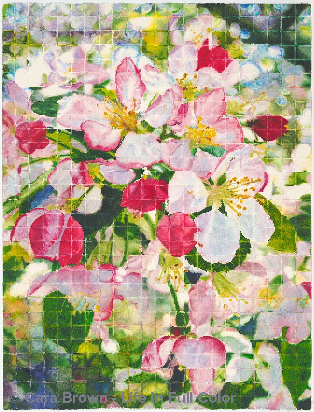
Blossoms Squared
Original Sold
Two of the ladies in my Tuesday painting group were inspired to paint a palette like the piece I call "Full Spectrum" I painted years ago. It's a chart of 22 colors down the left and across the top with each color mixed with all the others in the middle.
I was sruck by two things out of this: one, how much fun they were having painting (sometimes making this art requires such intense focus and concentration that it's not easy!) and that I remembered having the thought back then that I'd like to do something else with painting squares.
Then it came to me that I could paint one of my reference photos one square at a time. Instead of a contour drawing of the image, I superimposed a grid on the image in Photoshop and drew lines on the watercolor paper. Each square is a small absract painting.
At first it was totally thrilling! I loved the shapes and colors. But that left-brain of mine really is tenacious! It wants to get in there and make something of the art. Painting one square at at time is a huge lesson in patience.
I think the result is interesting and the exploration was worthwhile. Also, since I painted each square wet (for the most part) it was incredible practice at working with the paint and water - which I can always learn more about. Six of the painters in the Tuesday group then jumped in and painted a piece square by square. They each said they leaarned so much - about really seeing what they're painting, about working wetter and softer, about the abstract quality of all painting.
This image came from my neighbor Megan and Jeff's crabapple tree one spring. "Blossoms Squared." 29"x21" - May 2012 - Watercolor on paper
Blossoms Squared
Other Flowers, Squares-Maps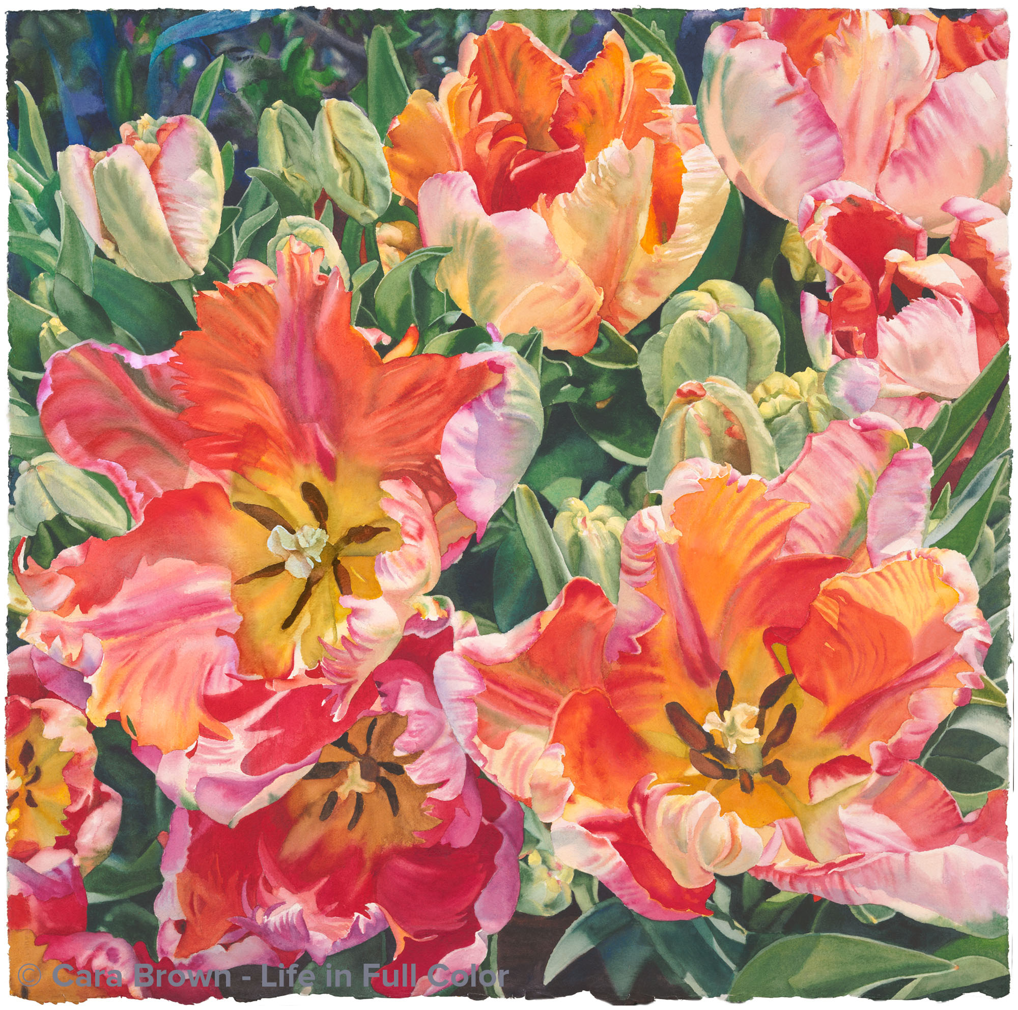
Gala
Original Sold
Shop Online for Archival Prints
Another painting inspired by the gardens at Filoli… last spring (2016) I had a half a day on a Wednesday free and I took a ride down to Woodside - all on my own. I love people; I adore the people in my life – family, friends, students. It’s great to share exceptional places with my beloveds – doing so amplifies my joy and makes wonderful memories. But sometimes it is just as sweet to have the time to myself. I think this is so particularly when it’s part of my creative life. I can follow my own whims and rhythm without having to tend to anyone else's.
Spring in this garden gives me the physical experience of the word “breathtaking.” It’s one gasp after the next – both the extent and expanse of all that is in bloom. It was just past early spring and the garden had really gotten going: rhododendrons, camellias, crabapples, hyacinth, magnolia trees, wisteria – and pots and pots of tulips.
I was there at the peak of the first bloom of the ulips – the flowers I went in hopes of seeing – somehow I had not yet painted them. These parrot tulips took the cake! I went back to them several times just to make sure I got enough pictures of them to work from. Pink and orange are a favorite color combination and you can’t beat these particular tulip flowers for complexity – just looking at them is exciting.
I envisioned yet another square painting. To create enough going on to warrant a large 29”x29” square I needed to paste together several images. I made a high quality 15”x15” print of the resulting image on my giclee paper and carried it around in my art sleeve for months before starting on it. It had to wait for spring to come back around. Many of those who saw the photo print exclaimed at it's aliveness and color – and encouraged me to paint it – soon!
When I was nearly done with it Paulette in our Thursday group called it a “carnival” which gave me an idea for the name. This painting does seem to be a kind of party of color and shape, but carnival wasn’t quite it. A quick look at the synonyms and “Gala” jumped out at me. It's more elegant and it also has an older meaning to do with fancy dress. Welcome to this gala of color and light!
April 2017 - 29"x29" - Watercolor on paper
Gala
Other Flowers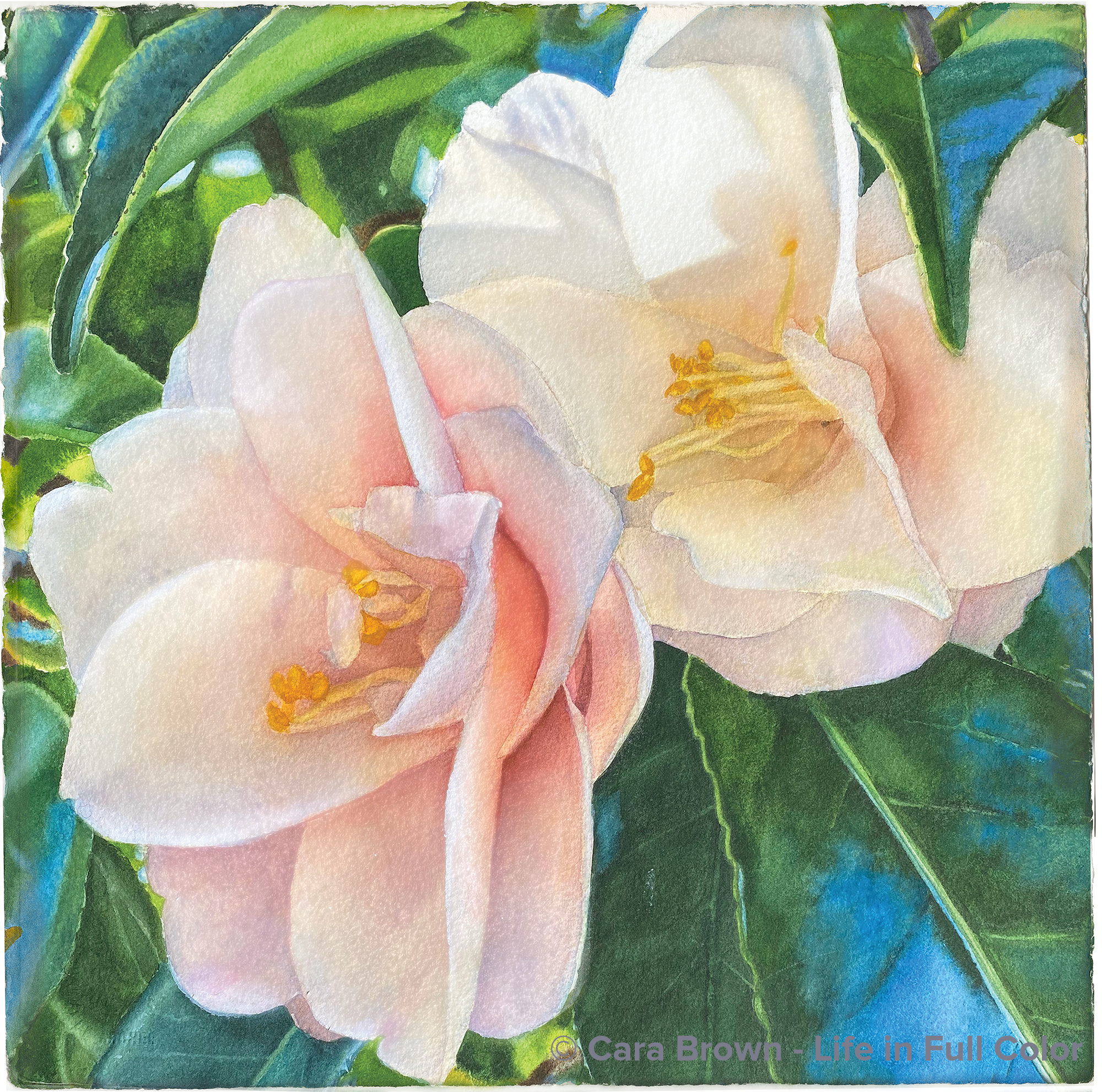
Us
Original Sold
Shop Online for Archival Prints
A quiet little painting – another from a morning walk in our neighborhood.
This composition of a pair of camelias rose to the top of the list of things to paint so I’d have something for February in the 2021 In Beauty…at Home calendar. The winter months aren’t as easy associate with my paintings as all the other months are.
This one joins a few others I’ve painted where the leaves end up providing just as much interest as the flowers – maybe even more. And I’m not sure what this thing is with my seeing blue in leaves and exaggerating it like this, but it does make the finished work more exciting to me.
Layering the petals such that the light was as subtle and lovely as I saw in the image was elusive. Painting – especially in watercolor – is a considerable challenge, one that I don’t think I will ever outgrow. I hope to be a model for those who have less experience than I, in acknowledging this. I’m sorry to report that it’s still not consistently easy-breezy for me. But I find something about the artist’s sincere struggle that comes through their artwork, giving it more soul. At least I hope so.
The state of our country and world at this moments is troubling - to so many. This painting’s name comes from my desire, in even a miniscule way, of reminding us that we are an “us.” It’s interesting to me how “us” is also “US” as in the United States. This isn’t real for millions of us for whom there is also a “them.”
I’m never going to give up on the cause, regardless.
15”x15” – Summer 2020 – Watercolor on paper.
Us
Other Flowers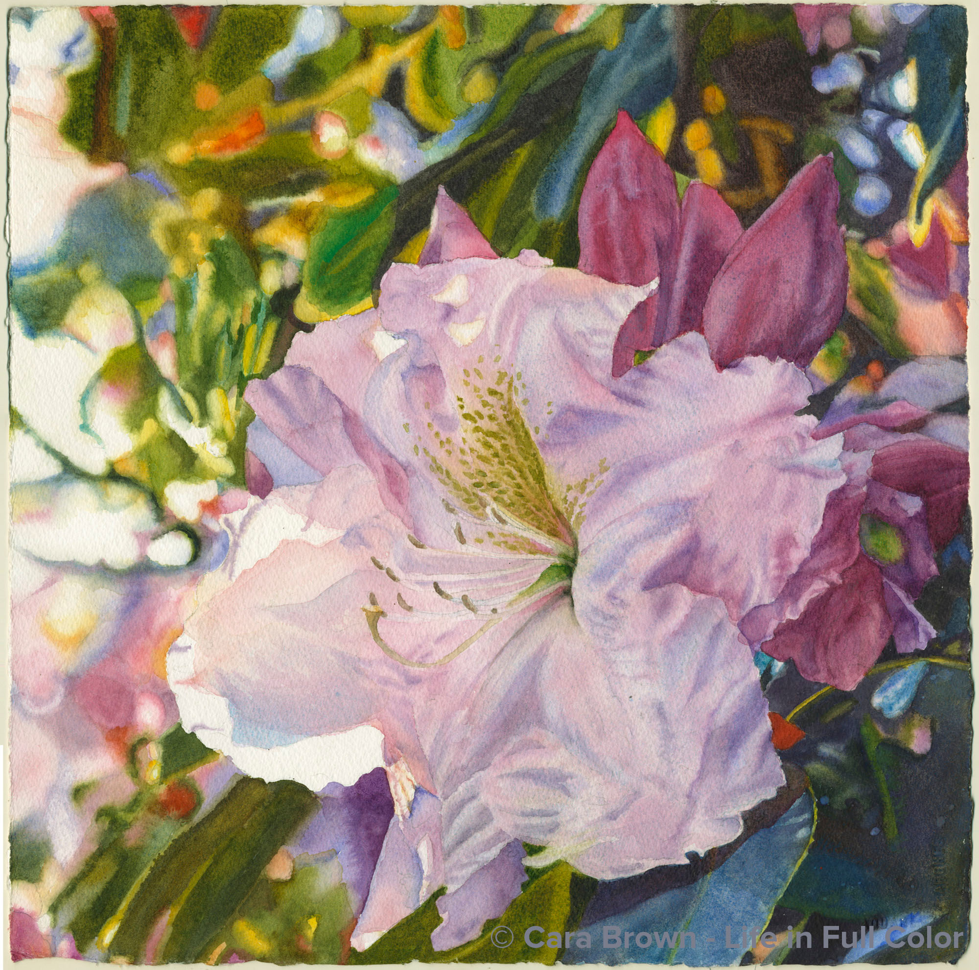
Reverence
Original Sold
Shop Online for Archival Prints
This is the first photo I’ve been inspired to paint (apart from commissions) that I didn’t take, I didn’t witness the moment the camera captured these shapes, shadows and colors. It was taken by Paulette, one of the faithful artists in our Thursday group, of a rhododendron in her garden in Mill Valley. She had uploaded it to her folder of potential paintings on Dropbox. Whenever she asked me to look through the folder with her in search of her next painting, I kept asking about this one. “Why don’t you paint this one?” I asked. I just loved the soft light and the wonderful shapes and colors in the out-of-focus background. Over and again, she said she couldn’t see herself painting it. In response to another “nah” from her, I said – mostly teasing - “well, then, I’ll just have to paint it.” She took me seriously and bequeathed the image to me.
This is the second in a recent series of small paintings. I’m painting them using a printed image to refer to (no electronic devices) and a tiny palette of just some my favorite paints. They are “unplugged” paintings – something to work on when taking a short break from my bigger work, or when it’s not practical to use my big palette and computer. I’m enjoying working at a more leisurely pace as well as having little attachment to how it “turns out.”
The name came via one of my weekly posts. Feeling like we are swimming in a sea of irreverence and disrespect, I found myself writing a post about reverence. Looking at the in-progress art and the reference image and it just worked. I wasn’t intending on offering these unplugged paintings for sale. But then Lissa, my business coach and a devotee and collector of my art saw it in progress and it did that mysterious-something that art does to those it’s meant for. When she read that I was considering calling it “Reverence,” that clinched it. And it is now in eastern Canada.
January 2017 - 15"x15" - Watercolor on paper
Reverence
Other Flowers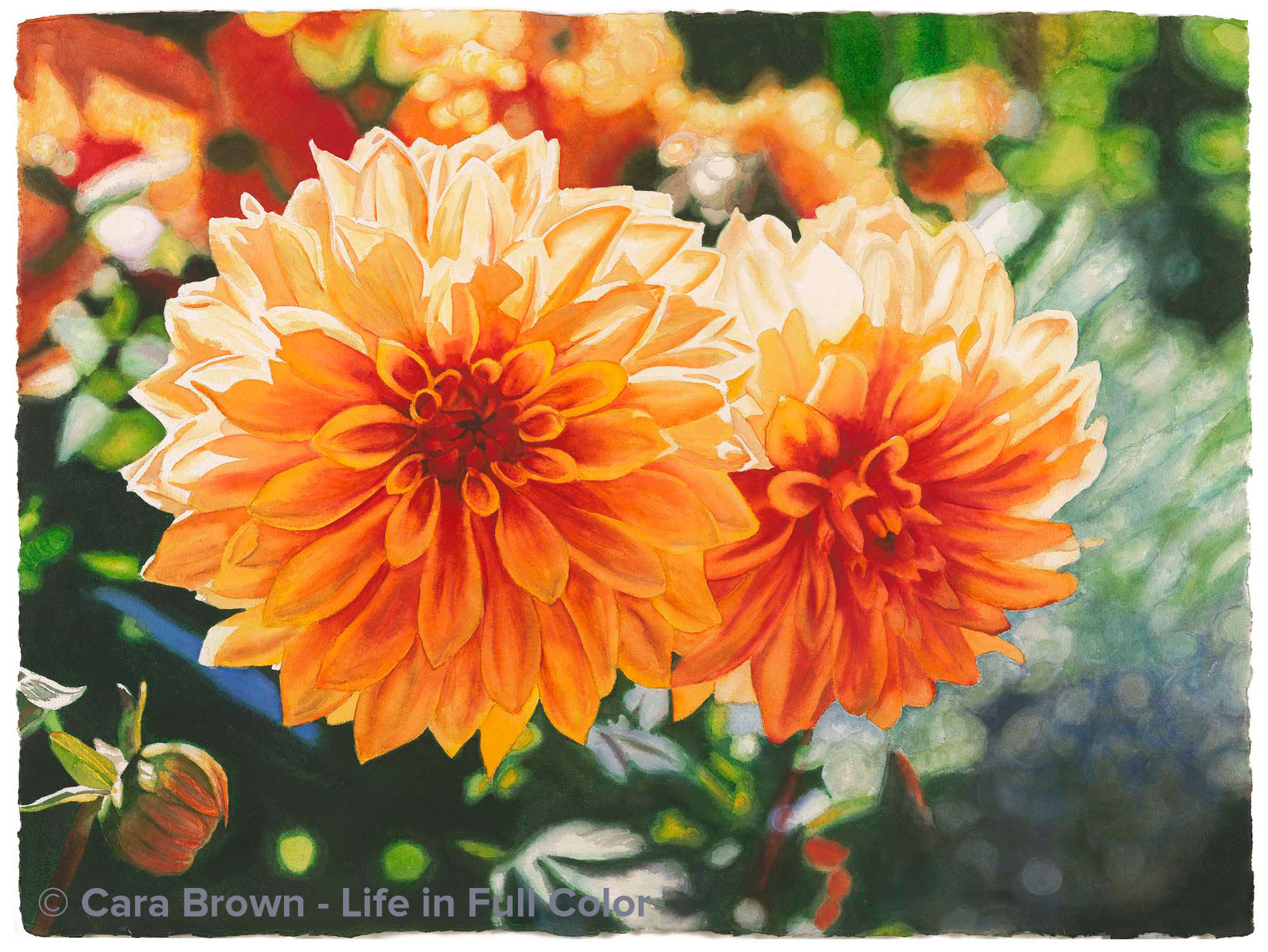
Twin Dahlias
Original Sold
Shop Online
Archival Print Sizes/Prices:
22"x30" - $495
15"x20" - $250
7.5"x10" - $75
This is painted from an image from my stay in France in 1996. I took a long weekend on my own in August to tour the chateaux along the Loire valley. There was an amazing garden exhibition near one of the castles that was fascinating. These dahlias were growing in one of them. I've been in love with the right side of the image - it's so full of motion. Painting it I became entranced by the light. Once finished, these two flowers evoked the spirits of my twin nieces: Kiersten and Nicole. One is face-first, full-out bold energy, the other a bit more reserved, thoughtful and mysterious.
June 2007 - 22"x30" - Watercolor on paper
Twin Dahlias
Other Flowers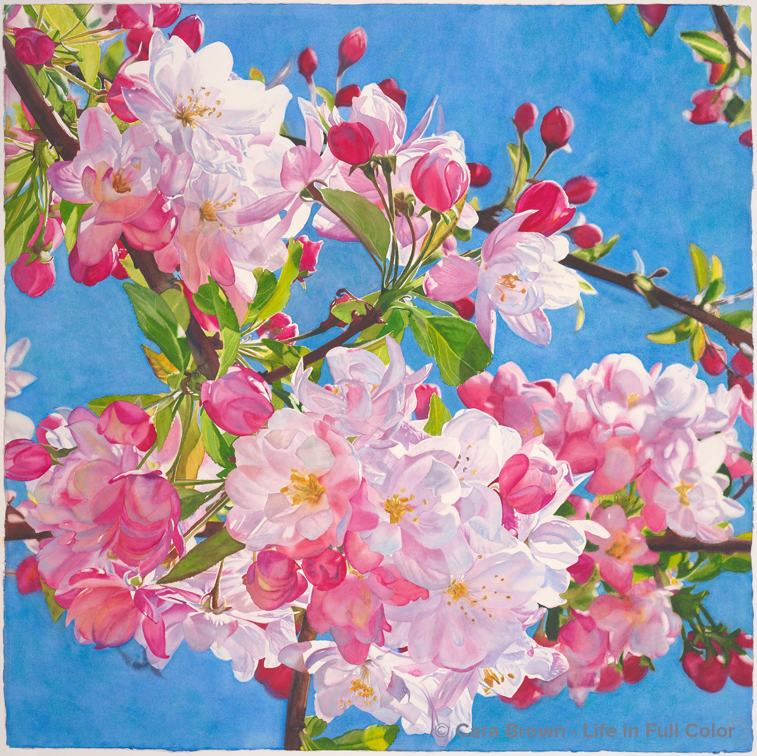
Happy
Original Sold
Shop Online
Archival Print Sizes/Prices:
29"x29" - $595
22"x22" - $395
15"x15" - $195
7.5"x7.5" - $60
When I exhibited at Art Expo in New York City in the winter of 2009, after the setup, my mom and I went to the Nancy Hoffman Gallery to see if they had any of Joseph Raffael's work on display. We walked up the stairs to the second floor of the gallery and at the top of the stairs was a gigantic painting of his - apple or cherry blossoms - about 5 feet high and 7 feet wide. We both - involuntarily - took a huge breath in - this is where we get the term breathtaking! It was just stunning - blue sky and white blossoms expanded so that the tiny blossoms were as big as a human head, intense yellow and orange around some of the edges of the blossoms. Incredible energy and life. Amazing - in the exact sense of the word. To think that this kind of art might be in some way in me seemed beyond reality.
The image that I used to create this painting was taken on a walk in Fairfax, not too far from home in the spring of 2008. The tree was in its prime bloom, no spent blossoms. It captured me in the same breath-taking way. This spring (2014) I got the inkling to paint it. When I projected this image and fully saw all the detail in it, I got that it needed to be as large as I could make it - 40"x40." I started with what was the most challenging part - the blue sky. I wasn't sure I'd be able to keep some consistency between the various areas of sky in color and intensity. Mixing three pigments: cobalt blue and manganese blue hue with a little ultramarine violet, I layered on a thick Life in Full Color blue. Yikes, it was too much! Too intense. It needed to be softer. So I lifted it off with a lot of water and paper towels. Painting it back on with a less intense wash was definitely better. Painting the rest - branches, leaves, blossoms and buds was a matter of stamina. Plenty of detail, lots of spaces and shapes and shading.
Somewhere along the way, I realized the blue was still too violet and cool. What to do to "warm" it up? I didn't want to add yellow, that would make it greenish. A relatively new-to-me pigment, cobalt teal blue (think swimming pool blue) popped into my head. I took a small part of the blue and floated a layer. This did it. The cobalt particles tend to sit right on top and reflect light. The pale turquoise color was what was needed to balance the violet. Success!
The name came from another one-word song title. I'm so grateful for the bouyancy and joy in Pharrell Williams' Happy song - I can listen to it over and over and over. I love the lyric: "if you feel like a room without a roof." This is my room without a roof. Right now, as I've just finished the painting, "Happy" sounds like a goofy title for a painting of blossoms. As it has with other paintings' names, this name will grow on it - and me. Happy is a fine idea to be echoing into world. Thank you to Joseph, the Fairfaxian who planted this tree and Pharrell!
March - June 2014 - 40"x40" - Watercolor on paper
Happy
Other Flowers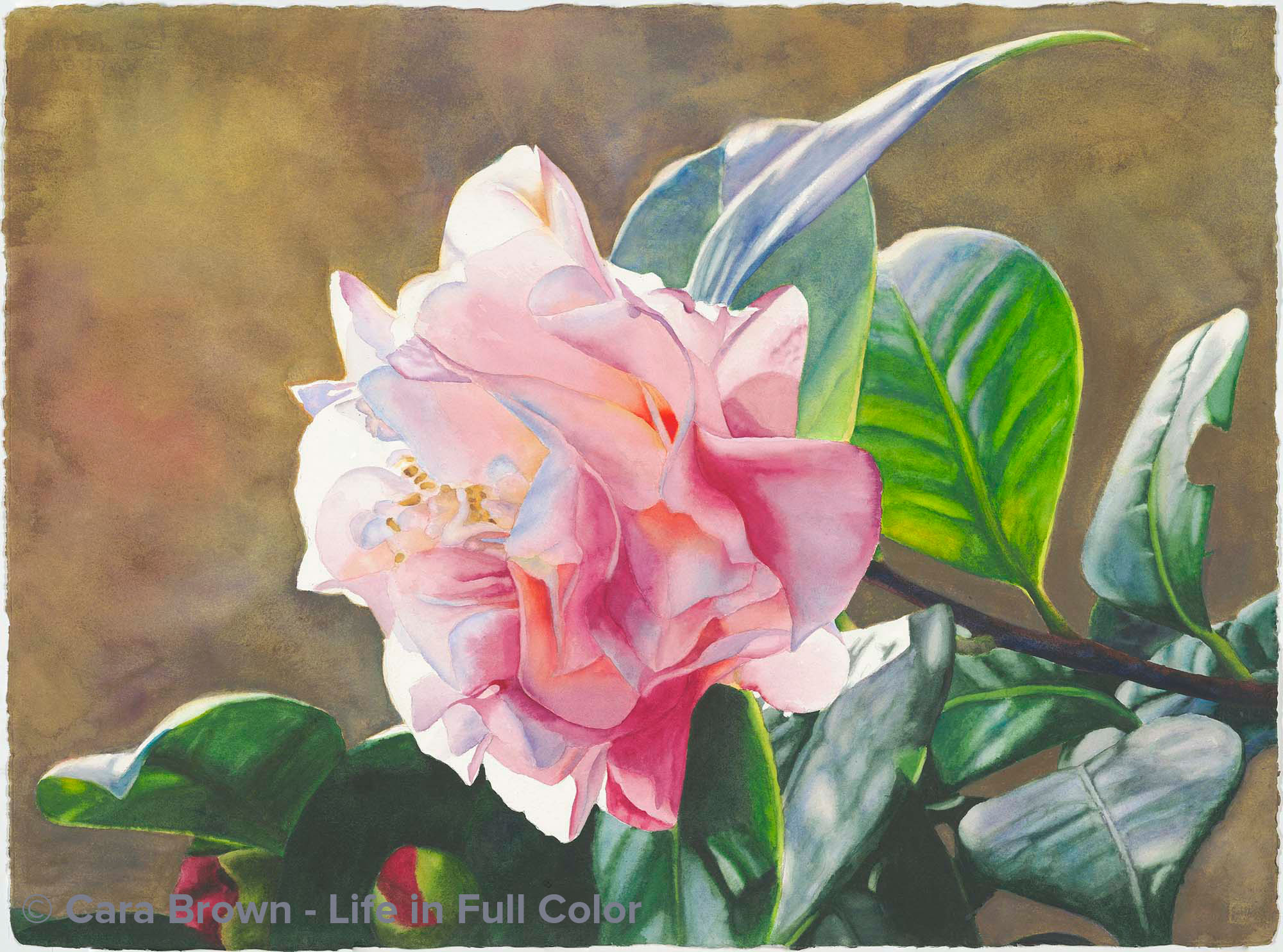
Morning Shine
Original Sold
Shop Online
Archival Print Sizes/Prices:
22"x30" - $495
15"x20" - $250
7.5"x10" - $75
When we were living in Petaluma, two dear girl friends - Cathy and Nancy - and I went jogging at the crack of dawn most mornings. The three of us were the "The Lulu's" and our jogs were a hoot! Mostly we jogged in the rural areas just outside of town, but now and then I could talk them into a "garden tour" jog, to see what was blooming behind all the charming white picket fences in town.
Now that we're in Fairfax, I head out in the morning with our dog -- and sometimes with my camera. I took this photo in Dean and Nancy's old place - they've moved on, but their garden blooms on. As often happens, I fall in love with an image and HAVE to paint it because of something that grabs me - in this one it was the light bouncing off the shiny camellia leaves. Wow!
And as often happens, I am challenged as to how to represent it with paper, water and paint. The background is a departure for me, it was just the side of the house in the image, so I got to play with layers of washes and subtle texture - it was fun. My husband really likes this painting - my guy's guy - a pink flower - how cool is that?!
September 2010 - 22"x30" - Watercolor on paper
Morning Shine
Other Flowers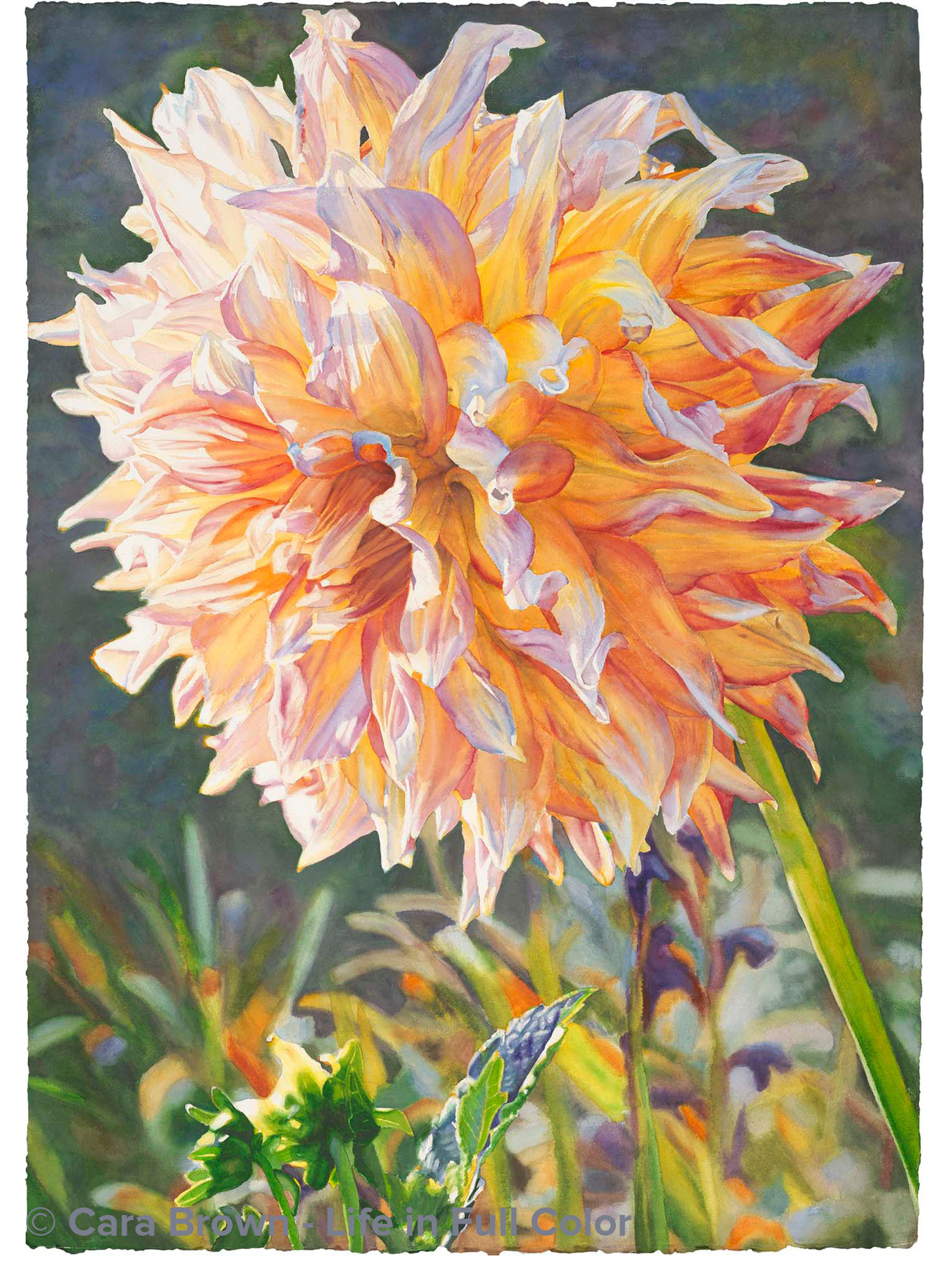
Touched by the Sun
Original Sold
Shop Online for Archival Prints
This dahlia is from Mike and Julie's garden where the Zin vines I've painted grow. All the Browns were at their place for a barbeque one day in the late summer of 2008. The low evening light on this flower caught my eye.
This painting swam in my imagination for weeks while I was preparing for, doing and recovering from showing my art at ArtExpo in New York in early 2009. I couldn't wait for the time and energy to bring it through.
Its name comes from a Carly Simon song title. I've played this song for years and years, whenever I wanted to sing out or juice up my inspiration. This single bloom stands on its own - lit externally by the sun as well as from within by its own power.
April 2009 - 41"x29" - Watercolor on paper
Touched by the Sun
Other Flowers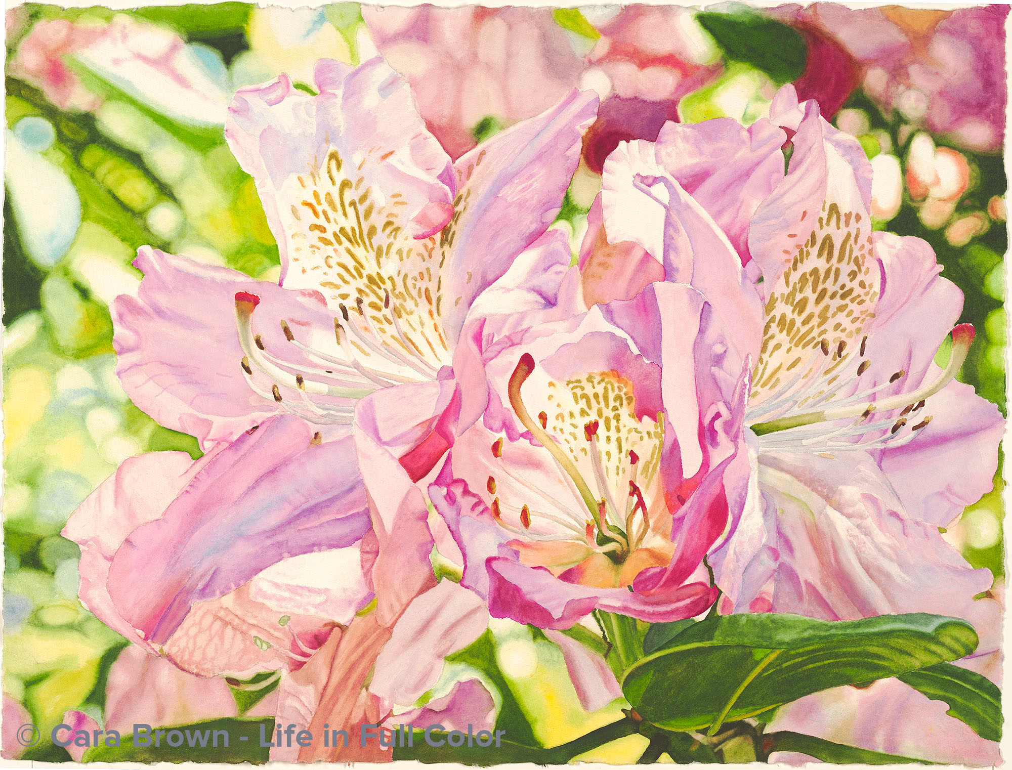
A Celebration of Pink
Original Sold
Shop Online Archival Print Sizes/Prices:
22"x30" - $450
15"x20" - $250
>
7.5"x10" - $75
What to paint after the meaningful yet difficult experience of painting my dog BJ, just after he died? I just couldn't get into resuming the painting that I was working on (of grapes) when the accident happened. Three weeks ago I was out at my mom and dad's house on a Saturday. I was in their garden taking photos of roses and happened to notice the lovely afternoon light coming through this rhododendron from behind. Later looking at all the images on the computer, this one jumped out. It almost looked like a painting as it was. I just loved all the abstract shapes in the background and all the pink!
I have three brothers and am used to being around a lot of male energy - which is pretty much everywhere in our world. At the same time, I am unequivocally a pink-girl on the inside. We call our guest room the "pink room" and I need regular "pink time" in it. It seems that painting all these pink colors was just what I needed. Sometimes I feel bashful about how much I love pink and other times I claim my pinkness with great pride. It is with that spirit that this painting is named - a celebration of pink.
June 2010 - 22"x30" - Watercolor on paper
A Celebration of Pink
Other Flowers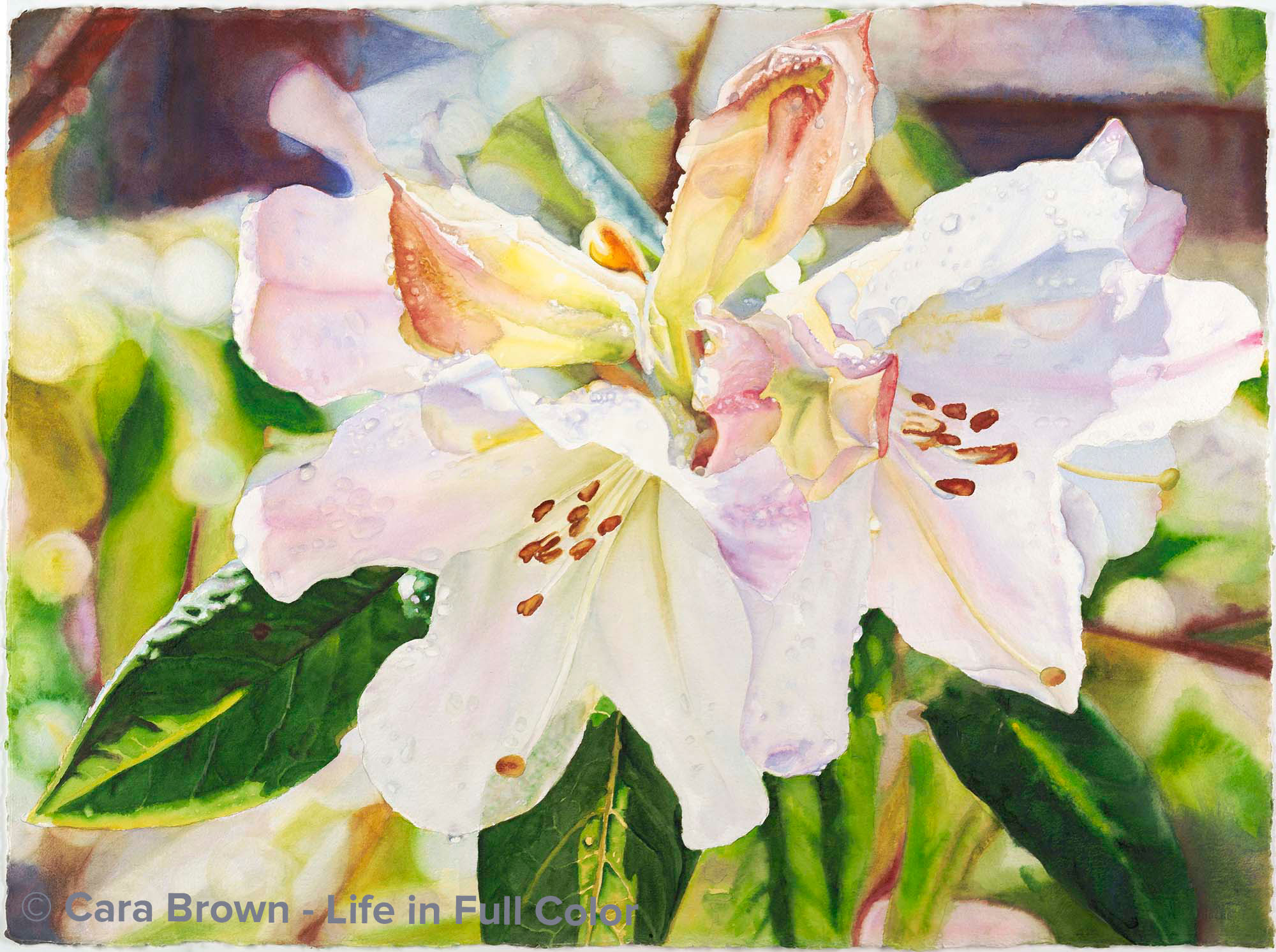
Rhododendron Raindrops
Original Sold
Shop Online
Archival Print Sizes/Prices:
22"x30" - $495
15"x20" - $250
7.5"x10" - $75
These blossoms are from a rhododendron bush in our front yard, right after the rain, in the bright late morning light. After the daffodils, these are the first of the spring flowers in our yard. They are faintly fragrant and so delicately colored. These images full of drops and sunlight have captivated me for a while and yet none of them seemed quite right. Playing around in Photoshop, I combined two images and the result jumped out saying "paint me." Painting all these drops was fun and puzzling. Painting the center I had the thought that I was painting the inside of an oyster - the round organic shapes, the luminescent, pearly colors. It took a while for this one to proclaim itself finished. I'm happy that it is.
May 2009 - 22"x30" - Watercolor on paper
Rhododendron Raindrops
Other Flowers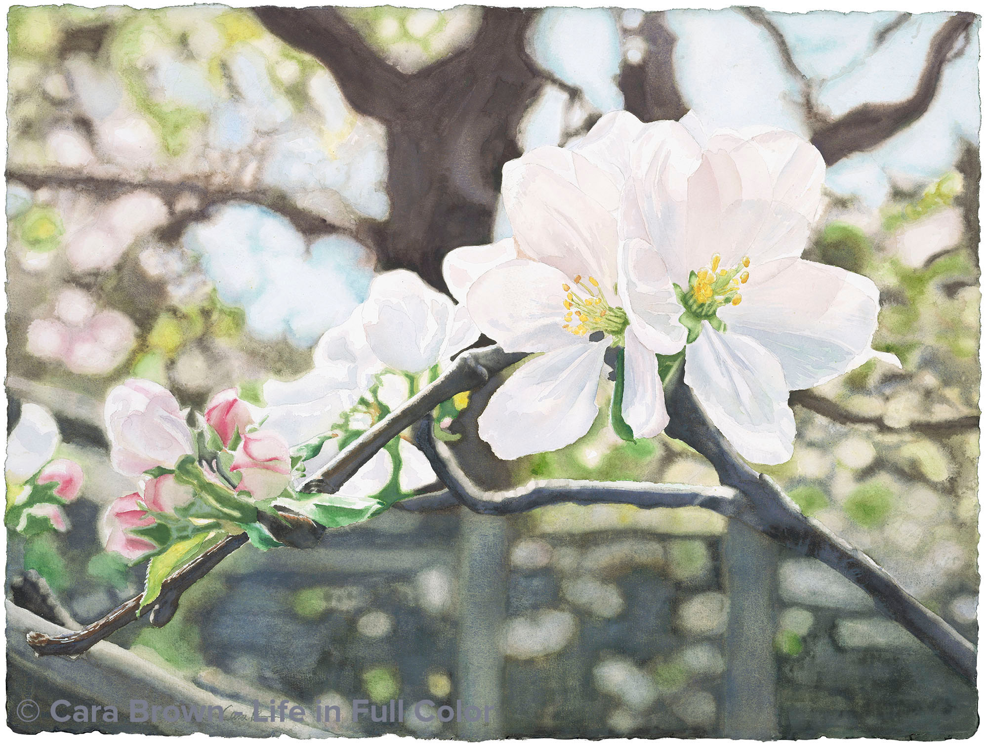
Apple Blossom Spring
Original Sold
Sizes/Prices:
Shop Online
Archival Print Sizes/Prices:
30"x22" - $495
20"x15" - $250
10"x7.5" - $75
Our dear friends Dean and Nancy lived for many years in a sweet house with an even sweeter garden in Fairfax. I took this photo of their Gravenstein apple tree growing in their side garden. I just loved the configuration of the branches and the delicacy of the apple blossoms in full bloom. Of course, I'm also a sucker for back lighting! It seems most of the paintings I'm drawn to create contain some new artistic challenge. In this one it was white blossoms. I actually painted them first, as I had a hard time trusting that I could paint them to please me and did not want to paint the whole thing and then "ruin" it with badly painted white flowers. This is the least colorful of all the paintings I've done, so it's quieter. It speaks of trust, beginnings, becoming and it is anchored by the steadfastness of the giant sycamore tree.
April 2007 - 30"x22" - Watercolor on paper
Apple Blossom Spring
Other Flowers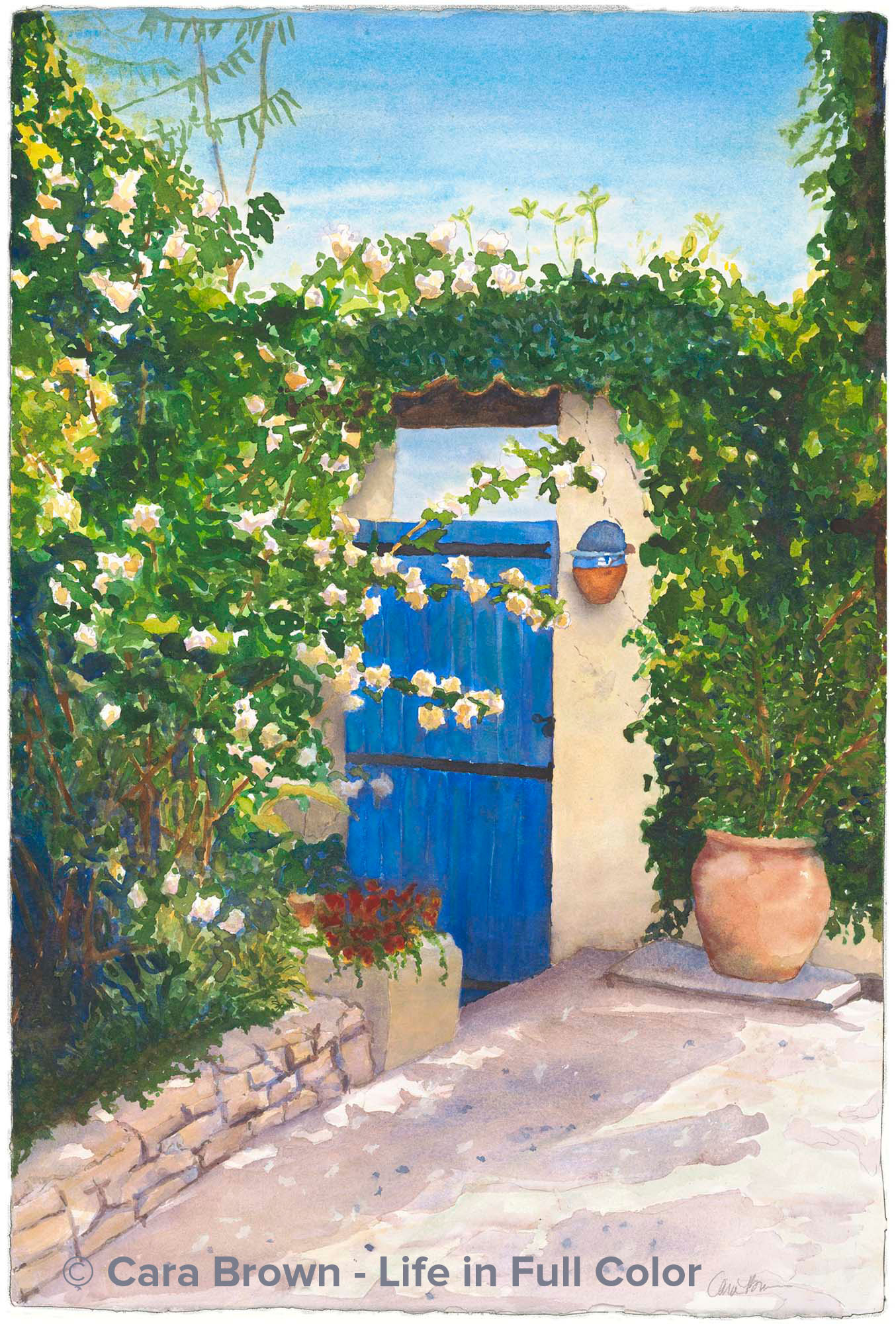
Blue Door
Original Sold
Shop Online
Archival Print Sizes/Prices:
I was on vacation with my parents just before my divorce in 1995 when I took this photo in Quarante, a small village in Languedoc where we spent a week. Those 12 days in France continue to be some of the best days I've ever spent on vacation, and I love being reminded of it by this painting.
This was an attempt to paint in a looser, more impressionistic style. It was an interesting experience, and I wasn't sure I was happy with the resulting painting. A dear family member, Illa Newman saw this little photo in my journal at Marin Open Studios in May 2007. She asked about it. I was unsure about its appeal, so I had not included it in the show. I later took it to her and now, not only is it hers, but she has painted her front door blue! This painting evokes for her, her many visits to Puerta Vallarta, Mexico. I love how my work brings people to places that I'd never anticipated.
April 2005 - 22"x15" - Watercolor on paper
