June 7, 2017 – The two faces of color
- At June 7, 2017
- By Cara
- In Life Stories

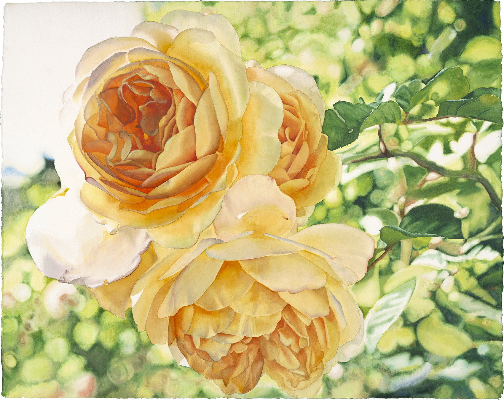
Blossoming Hope – the yellow roses I painted… in yellow!
I’ll never forget her question: it was at my second festival in San Anselmo 9 years ago, a woman held up a print of “Blossoming Hope” and asked if I “had this available in red?” It took me a second, but then I realized that she didn’t recognize it as a piece of artwork, but rather like drapery or a couch cushion! After all, fabrics in a particular pattern are often made in different color schemes. I know she didn’t intend for her question to sound ridiculous to me, she indeed liked my painting! And I get it – red just went better with her décor. I found it within me to tell her in a pleasant voice that I had only painted that painting of yellow roses. Since she wanted a print, with the wonders of Photoshop, I could have attempted to modify it, making the roses red, but I couldn’t go there. Since I’ve made my life with color this is one of the more memorable situations to have shown me how completely subjective color is. And yet, we make art and live our lives in a world where everything we’d like to do with color is not possible. We must come to terms with how our ideas about color can bump up against its limits – and how each of the paints we use is much more than just a color.
Color is a rather abstract idea. It doesn’t exist without something – even just light – to carry it. In fact, color really isn’t anything at all – it is a reflection of part of the light spectrum. The nature of the substance it is reflected from is such that it absorbs all the light except for the color we see. Color also is energy. There is less energy in violet than there is in red – which must have something to do with the length of its light waves. Energy varies from color to color as do our responses – which are as individual as we are. Very vibrant color is enlivening to some, and overwhelming to others. Muted, neutral colors are boring or dull to some of us, while to others they are calming. I’m making choices for some new finishes for our kitchen and I’m finding it a challenge for this color-lover – there is so much grey out there!
Adrienne Rogers in our Friday group brought back for me a wonderful book from one of her trips to Boston called “ROY G. BIV,” by Jude Stewart. Its subtitle is “An Exceedingly Surprising Book about COLOR.” For any of you who are as into color as much as I and are amused by fascinating facts and stories, it’s a book for you. It’s filled with all kinds of meanings and associations for colors and our relationships with them – in all their shades. Did you know that many years ago, pink was for boys and blue was for girls?
I love this quote from the book:
Color is like sex. It’s mysterious. It’s unknowable. It never looks the same twice. No two people see the same thing. I once went to China on a cruise ship. Eight hundred of us got off the ship wearing white, because it feels festive and shippy and says “I’m on a cruise.” In China white is the color of mourning. We looked insane. – Stephen Drucker, editor-in-chief, House Beautiful
Within this abstract world of our ideas, inclinations and preferences for color, those of us who work with it have to do so the real world. The challenges of seeing, capturing and attempting to re-produce color are threaded throughout the entire art making process – and they continue when we attempt to share images of our finished paintings. Living with the variation and imprecision in color is a fact of life for artists.
When we see something as we go about our lives that we’d like to paint, many of us start by taking a photo of it – and here’s where our color challenges begin. For the most part our cameras do a decent job of capturing color – way better than my memory can! But cameras really cannot capture exactly as we see; red and dark pink are notoriously difficult to capture accurately. From there our device displays and printers each bring in their own color interpretations. With all these variables the color in our images are more often different from what we saw in real life.
Then there are the paints-pigments that are available to make our art with. It’s a very common misconception when we begin to use art paint to think of the different colors of paints as different versions of the same basic substance. I thought so when I first started! But, the pigments that color our paints come from very different sources. Most modern pigments are created by chemists in the lab, but there are still plenty of them in use today that come from ground up earth and stones – as they have for millennia. It’s not uncommon to see a color in an image and have a hard time re-creating it with paint. I have a big collection of paints in the pink-fuchsia-magenta range, in my attempt to find a certain favorite color! And still there are hundreds of colors of art paint available and I remind myself is that no one ever looks at my paintings and thinks they are lacking in color!
The pigments in our paints have qualities in addition to color we must learn about in order to get the results we want. Pigments can be transparent or opaque, they can have very tiny particles that dissolve into the water creating clear layers of color – or they can be comprised of larger, heavier particles that settle out of the water, creating texture. They can be easily lifted or they can stain our paper. And one quality that I pay particular attention to – they can be “lightfast” – resisting fading as they are exposed to light, or they can be “fugitive” – meaning they will indeed fade or change color over time. There is so much to know about our “colors” beyond the colors we see as we paint our paintings!
So that I can better help those who come to learn to paint from me, I have tried very hard to observe what is going on with the paint and the water as I make my paintings. The thing I’ve observed and attempt to explain is how pigment, as it is mixed with water is a physical substance. The amount of paint, the amount of water, and the ratio between them, all make an enormous difference in what happens as we paint.
I do know a lot about color, I can recognize a number of pigments based on their color, I can see color in color – such as the green in a grey or a blue in a violet-maroon. I can because I have paid careful attention for all these years I’ve been painting to what is happening as I am painting. I’ve said this before, but how and to what we pay attention creates our world. I’ve created a world for myself that is filled with color.
I have a real relationship with my paints at this point. I recently put together a new, smaller palette of paints to take on a trip with me. I filled the wells in the palette with only the paints that I use often – those that I love the most. When I looked at the collection of paints, my thought was: these paints are my friends! I don’t regularly provide a list of my paints to students (besides a starter list of student level paints for those who are just setting out and need guidance). I resist sharing my paints because I don’t want you buying these paints just because I like them. I want for you to discover what paints are your friends.

A work in progress with samples of some of my paints.
It’s no secret I’m inspired by color. Color and the illusion of light weave through just about every painting of mine. I need color, I experience it as nourishment and couldn’t imagine wanting to go on living in a world without it. And to make art we need to also learn how to work with color in the world – in our photos and digital images – and in the real substances that are our watercolor paints. I know… there’s so much to learn – even for me! And I didn’t even start into the whole idea of mixing color!
With my appreciation for you in my world,
Cara
P.S.: I’m offering the “Get Intimate With Color” weekend workshop this summer – a “color camp for grownups!” July 7-8 (Sat-Sun) In Larkspur, CA. It’s a great way to get started with color and with painting in watercolor. No experience necessary – really!
Contact me for more information. I’d love to have you join us!
