January 17, 2017 – What’s next?
- At January 17, 2017
- By Cara
- In Life Stories

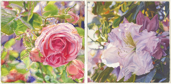
“Promise – my little rose and Reverence – the one I just finished.”
Listen to this post:
The last couple of weeks in our regular groups I’ve spent time with several disconcerted artists who were at a bit of a loss about what to paint next.
There are a few things I notice about what I’ve just written: First I see that it is obvious (to us) that there is a next – another on the continuum of paintings which are coming through us. To an artist, finishing a painting creates a space that wants for the next one to pour ourselves into. Then, I see that the possibilities of what we could paint are literally endless – but, not just anything will do. There must be a certain something that meets us. It is actually registered by an instrument at the center of us whose purpose it is to recognize “our work.” It knows whether or not this particular arrangement of shapes, colors and contrasts is worthy of spending our time on. Lastly, we are happiest when we are working on something that does it for us. Left wondering whether or not there is another “something” – and our artist-selves are uneasy.
Art-making is a force that takes us over. It has its own ideas and is most satisfied when it is engaged with something that it finds inspiring, challenging or interesting. I keep a folder on my Dropbox called “candidates.” It’s an always-changing collection of images that my instrument saw as possibilities. I peruse this folder when wondering what’s next. Sometimes I feel like there are images for paintings waiting in line. Where is the time to paint them all? But sometimes a scan through this folder leaves me wanting for something else. Then, it might be time to turn to my larger collection of photos and Photoshop.
In preparation for a class I’m planning on modifying photos for our paintings using Photoshop, I found dozens of Photoshop files on my computer. These files reveal the tracks of my creative play, working to bring out the potential of an image. I saw the hours and hours I’ve spent cutting pasting, lightening, saturating, and combining parts of multiple files. Digital collaging has become an integral part of my process. The traditional art world teaches students to make thumbnail sketches and black and white studies. Though I see the value in doing this, I can’t bring myself to when I have the power of Photoshop at my disposal.
When I promised to paint every day last year, I drew a rose on a 15”x15” piece of paper and painted it using only a tiny palette with a few paints and a printed image (not looking at any electronic device). I did this so I could work on it anytime and just about anywhere – alternating with working on my bigger paintings. When this rose was done, I missed having a small one to work on, so I started the lavender rhododendron that I just finished last Friday. I’m again wanting a “little” painting, so over the weekend I went on a hunt. What follows is what came next.
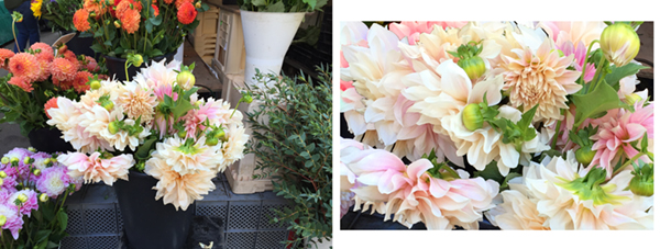
I took this photo in the spring of 2015 when a bunch of us went up to the Russian River Rose Company in Healdsburg. With all the pictures I took of showy, colorful roses and the way I love color, I’d not guess I’d have this soft, quiet rose call to me, but there it was – that “something.” (The original image is on the left, below) I wanted another square composition, but I’d lose parts I liked if I just cropped around the rose. The leaf cluster from the bottom, right corner came up and tucked under the rose. And the upper left corner with sky and leaves peeking through, came down. You can see these two parts duplicated in the right image:
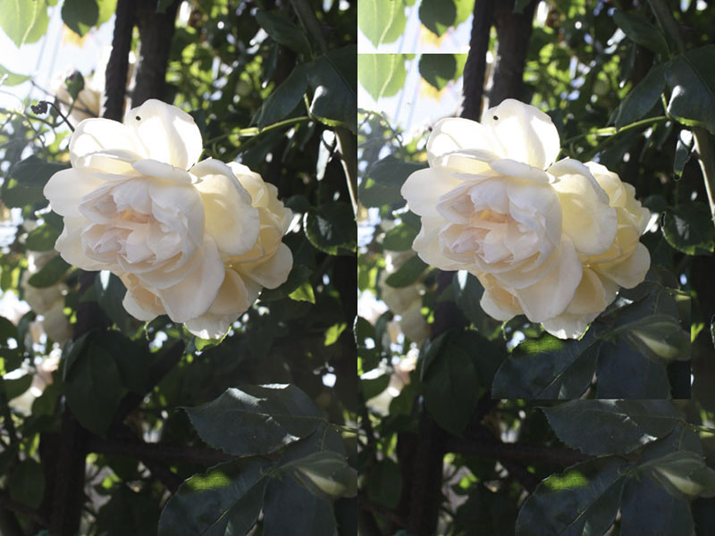
Then it was ready to be cropped (below, left). And me being me, I had to bring out the color (right). I saturated the whole image, then I brought out the red (pink) and blue some more:

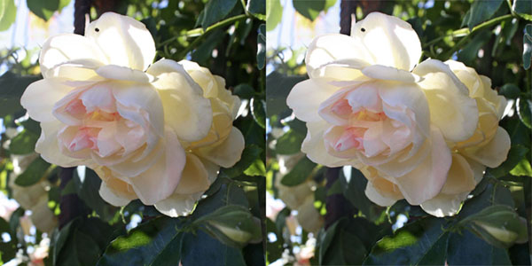
Next I realized that the vertical part of the rose arbor wasn’t actually vertical (about a third in from the left). It took a bit of work to rotate it and still keep the background parts in I wanted – I had to back-track to the uncropped version and make just the rose a bit bigger. Rotating it also had the rose hanging down more, which I liked. The result is below, left. Finally, I wanted to bring out some of the detail in the darks. Especially since I am going to paint this from a printed image – darks are always darker in a printed photo. The final image is below, right.
I am so very grateful to Steve Kimball and the time I worked for him at Light Rain. Not only did he pass along to me the valuable knowledge of how artwork is reproduced, but he taught me how to edit photos in Photoshop – which I now could not do without. When I first started painting I collaged images for my paintings the old fashioned way – with printed photos, scissors and tape! I go to Photoshop regularly, not only in my own work, but I often make simple changes to the images for artists in my groups. Hence, the upcoming class – we all want to be self-sufficient in our creativity.
Two recent examples of changes made under the art direction of two artists who had been at a loss as to “what’s next” (original photos on the left):
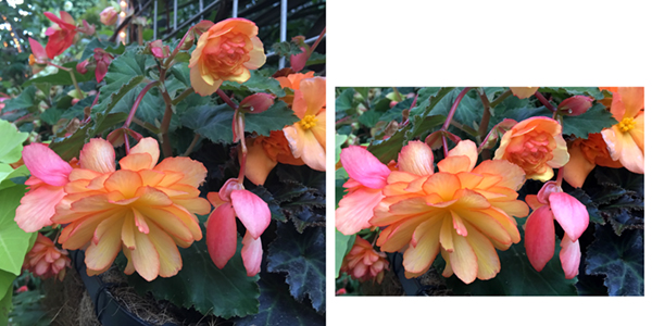
“Paulette had a rectangular piece of paper she wanted to use. But, she wanted to include the smaller flower, so we moved it down and tucked it behind the main flower. She also had me shift the color of the light green leaves on the left to make them more blue – then a final crop.”
“Sondra took this in a market in Paris on our Pilgrimage in 2015. She had me bring the flowers closer together in the middle and shift the color of the petals in the background, upper left towards pink, creating a bit more contrast. Cropping in close, leaving a few darks around the edges finished it.”
We carry around in our psyches ideas that using technology in this way is somehow “cheating.” But the way I hold it is that we each have a line – our limit in the use of technology. People now make art entirely with technical tools. Using special hardware tablets and styluses and art-making programs with different brush sizes and styles, incredible art is being made – all in the digital realm. Doing this does not really call to me – not seriously. I want real paper and real brushes, water and paint.
When I was working for Steve, he suggested that I could use a filter to identify just the edges of my image and then send my watercolor paper through the printer to print the contours of my image, saving me the time of projecting it and using a pencil to make the drawing. I appreciate being offered this idea – as it pointed out to me my own limit. There is an element of “cheating” for me if I don’t make the drawing with graphite myself. Besides, graphite is erasable, printer ink is not! But if this idea appeals to someone else, I say go for it! We get to choose what combination of using art materials that have been around for centuries and brand new technology we use.
There are only three rules that have occurred to me – at least so far – in our regular groups. 1 – Only watercolor paint because it’s relatively low impact and we are in my mom’s carpeted offices, not in an ok-to-get-messy art studio. 2 – No one can disparage anyone’s artwork, hopefully even their own. 3 – The music (which is necessary) can’t make anyone crazy – you can’t paint if the music makes you nuts! Beyond this, anything goes. Really, anything – especially when it comes to making art. Just because I don’t use masking fluid very much or I don’t like black paint, neutral tint or Payne’s gray doesn’t mean anyone else can’t use them!
I found myself saying last week that I see my job as doing anything within my capacity to support those who come to me with a desire to paint, in bringing forth their art. This means passing along watercolor skills (of course) and using technology in any way I know how. Also not insignificant is to support of their minds, hearts and spirits through the often bumpy inner experience of making art – especially at the start. Eventually we realize that, though it does get easier, it’s always going to be hard in some way.
I’m going out on a limb to say that for all of us, landing on something to paint and then applying ourselves to see it through to completion is just about the most rewarding thing we now do with our lives. We can trust that our art-making force is strong enough to get us through, as long as we give it the time and space – and then get out of its way!
Here’s to what’s next!
Love,
Cara

Sondra Blake
Great article Cara!!