May 5, 2015 – Color is life
- At May 5, 2015
- By Cara
- In Life Stories

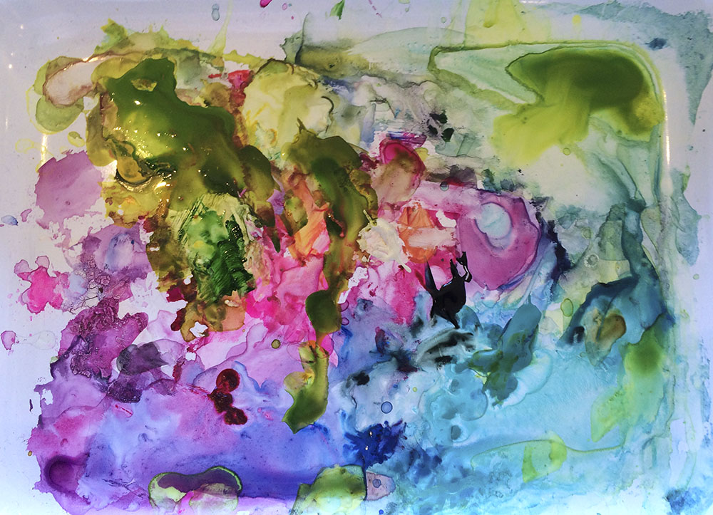
Velda’s palette after painting a recent Friday group. It was a painting in itself!
Listen to this post:
It’s no secret to any of you that I am pretty much obsessed by color. Looking back it started pretty early. Like probably most of us, growing up I had coloring books and Crayola crayons. I’m sure we had them at home, but my clearest memory of “coloring,” as we called it, was at Grandma and Grandpa’s house. My dad was an only child and was old at 28 when he married Mom. So when, in less than four years, the four of us came along, Grandma must have felt like she hit the grandchild jackpot! She adored us. And she devoted one of the six drawers of her dresser to us. This was where all the coloring books and crayons were. Often there were four full-sized Hershey bars waiting in there too!
I remember being a bit disappointed that no matter how hard I tried; crayons wouldn’t make a solid patch of color. From the start, I’ve wanted color to be saturated! When I was in elementary school, I used to love to make rainbows with both crayons and felt pens. Starting with red triangles in all four corners of the paper, next came orange, yellow, green, blue, purple and back to red. Then repeat until the lines, or arcs met to make a rectangle and fill the rectangle to the middle. Much later, I learned that this is called a God’s Eye. I loved how one color leads to the next and then back to the start in one continuous blend. Such a perfect system!
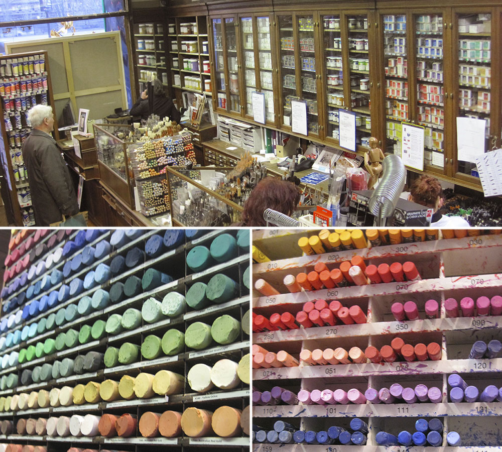
I’d guess that most of us are drawn to seeing color in the spectrum in this way. But, I just love being in art supply stores and seeing the color in all the paints, pencils, pastels. And they are almost always arranged in the spectrum – it just makes sense to do this! Here are some photos from the first time I went to the Sennelier art store in Paris. An art supply store in Paris, for me it hardly gets any better! My clothes in the closet are arranged in the spectrum. Color is the filter I see the world through.
When I’d been leading watercolor groups for about a year and a half, I received an email from a lovely woman in Montana who asked that I let her know when I have a weekend workshop, she’d like to come to California to take it. Weekend workshop? What weekend workshop? I asked my regular painters, if I were to teach something beyond what they get from me every week, they said: Color. You know a lot about color.
So I figured out how to present what I thought would be useful to convey about using color, pigments and paints – and a color workshop was born. While I was putting this workshop together, I went to see my spiritual director, Sister Mary – a treasured source of love, affirmation and wisdom in my life. I showed her the cover of an art supply catalog that had the spectrum – the rainbow – in art supplies and I asked her, why do we love the spectrum, why do we love color presented in this way? She said that the rainbow is light, which is God made visible. And the complete spectrum has a wholeness to it. Oh, so, it’s whole and it’s holy!
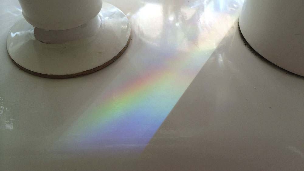
Just after writing, I saw this spectrum at the kichen sink!
Since becoming a teacher of color, my natural curious nature has me learning all I can about it. Color is all about light, which is energy. I’m sure most people know that the color we see is the part of the spectrum of light that the object does not absorb – it’s the portion of the spectrum that is reflected back to our eyes. What blows my mind, is the capacity of the photoreceptors in our eyes to receive the different frequencies of light and how that registers in our brains to allow us to discern very subtle differences in color. And that this is a capacity we can grow. We can learn to see color with finer granularity.
Color is subjective too. It’s amazing to me what Joe will call “pink.” For me pink is pink. For him it can be a color I see as a beige with a slight red in it, or even what I’d call violet. He’s not a “pink” guy, so anything tending in that direction is labeled such. And color is personal. I’ve come to see that each artist has a palette. Paulette does not like green-green, so she uses a lot of turquoise-green and yellow-green in her paintings and they are beautiful. Gillian likes muted, sophisticated, hard to name colors. Heather’s paintings are the opposite. She uses clear, pure color in a refined and delicate harmony. Mine is a full-spectrum palette, especially as time goes on. I’m happiest when I can bring all six major colors of the color wheel – red (or pink), orange, yellow, green, blue, violet – in some form, into my paintings. Some colors may dominate, of course, but having them all there gives me a sense of “all is well, nothing is missing.” That said, red is not so much my color, for me pink is it!
Color is light – to see it there must be light – but not too much. There’s no color in the dark, but, in blinding light, there is no color either. The “colored” object is so awash in light that all of it is reflected back to us, which we see as white. Since light is energy, color is energy. The more color the more energy. Right now, most of my paintings (which are life in full color) are at my mom’s office as we are in between the weekends of Marin Open Studios. The walls are bare and the house feels different. It’s spare and empty, not just visually, but at deeper level too. Conversely, if you walk into the real estate office, you can feel the energy in the space from all the color that surrounds you. I hear this all the time – it’s not just me!
I know bold color is not for everyone. Not only do we each have our personal colors, the world has its color trends. The interior design palette for some years now has been quite muted; neutrals, greys and black and white have been the style. I read somewhere that colors become subdued when the economy is in a downturn. I was recently given a subscription to House Beautiful magazine. I’ve not read these magazines in years. But I’m really encouraged to see the recent issues filled with vibrant color. Hallelujah.
For me, color is a nutrient. It feeds me. And this makes sense, as it is energy, light, God even. Owning my love of color – and using it to express what is in me, has given me my life’s work. The thrill of putting color onto white paper never gets old. I’m watching the paintings in me become increasingly vibrant as time goes on. I see this as a reflection of my clearing the way, of opening more to allow the life-force to come through me. Color and light shows up in my paintings and I show up in the world. We each are a unique and precious expression of our source, of God. Color may or may not be how you are channeled into the world. If it is, I invite you to come out and play with me. And regardless, whatever is your way, bring it on!
Love,
Cara
