Paris


Original - My Private Collection

Shop Online
Archival Print Sizes/Prices:

29"x29" - $595

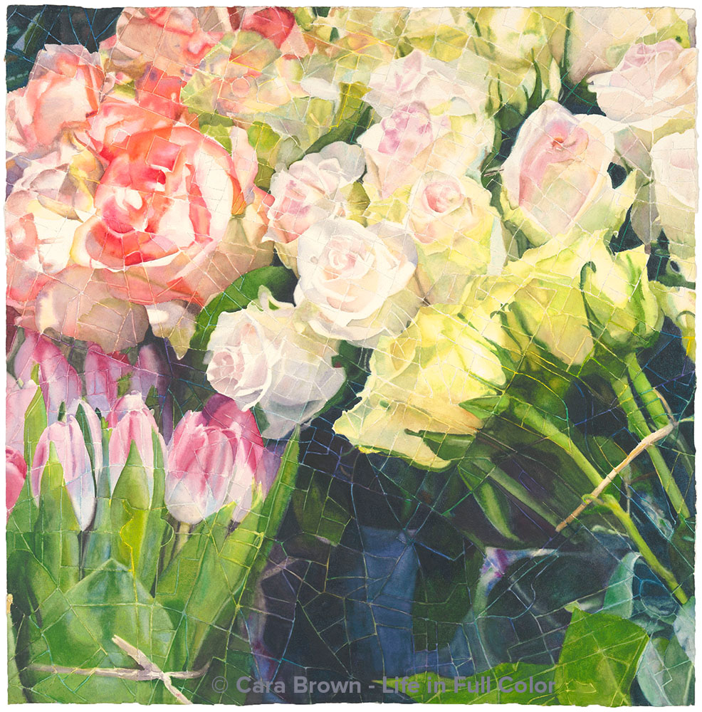
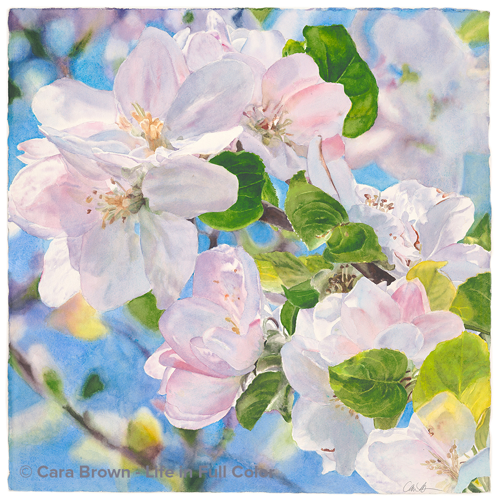
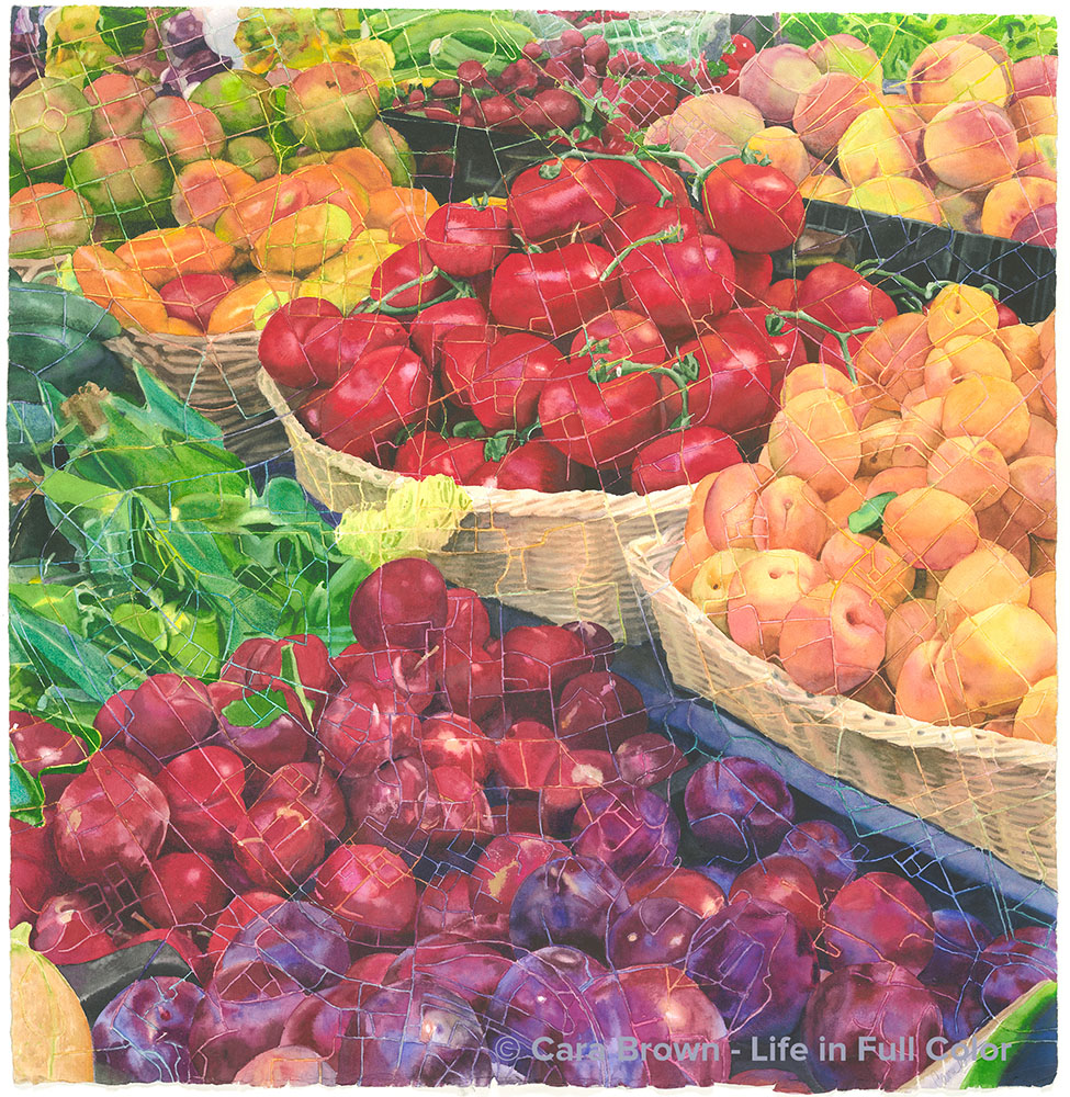
In the spring of 2012 I painted a piece I called “Blossoms Squared” where I superimposed a grid over a reference photo and painted it one square at a time. This triggered a stream of ideas. I thought about simply rotating the grid so the squares were on the diagonal, but also thought about other “screens” through which to create an image and started seeing them everywhere: a brick wall, detailed scrolled ironwork… But then, I thought about maps. I love maps! One that I know well and is very close to my heart is the street map of Paris. Thus emerged the seed for this painting.

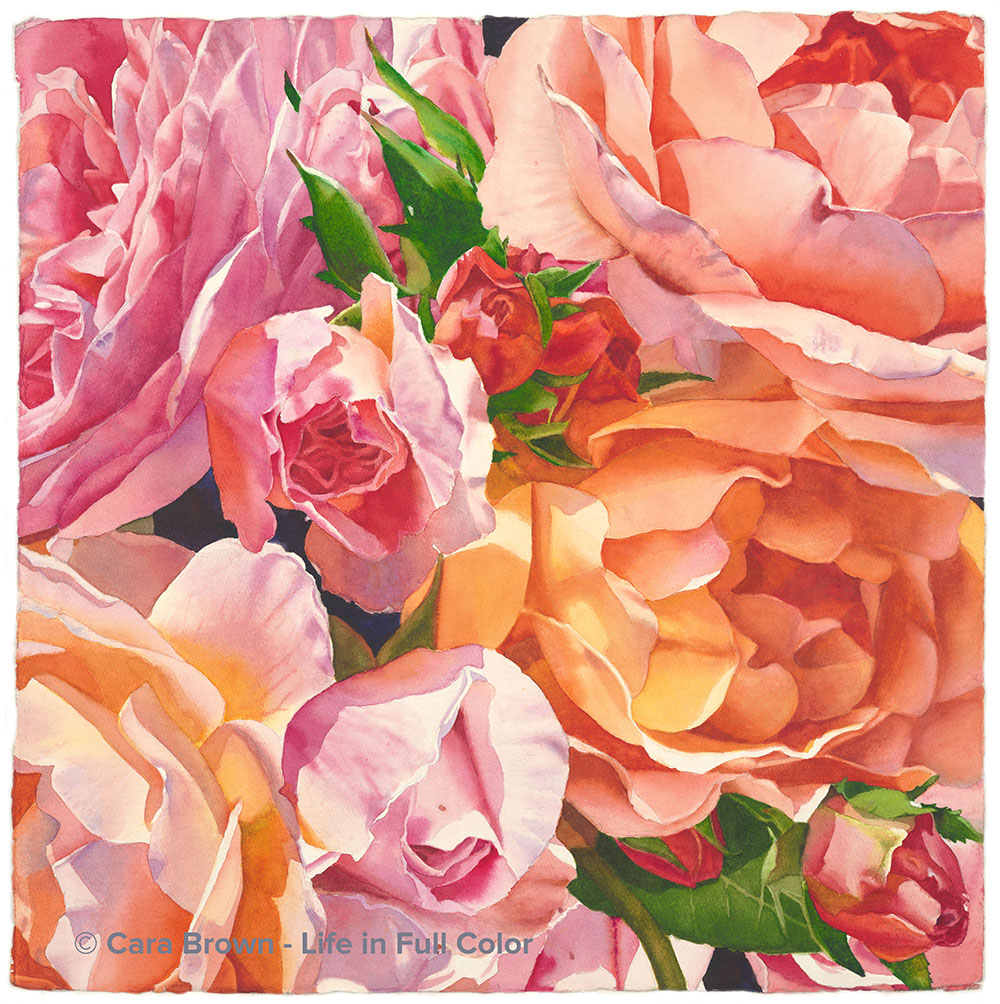
These flowers were in a florist’s sidewalk display on rue Monge in the 5th in Paris – not far from my apartment when I spent half a year there in 1996.

Setting it up was a challenge which took some technical skills to pull off. If I simply enlarged a street map of Paris, the width of the streets would be so large that they’d obscure too much of the flowers. Using my projector and Photoshop, I was able to create a workable “screen” out of the map. In order to have a the right level of detail, I ended up including only the very center of Paris (not even the Eiffel Tower made it in) to superimpose over the image of the flowers.

This is an entirely different way to think and paint. I had to find the image within each of the shapes on the map. It was interesting to watch myself switching back and forth between concentrating on the image of the flowers and noticing where I was in the city, while either remembering when I’ve been in that spot or wondering what is there on that stretch of street – apartments, restaurants, bookstores? Even without the street names, I still recognize a remarkable number of streets and bridges.

I wonder if I’d painted this image as I normally do, from a contour drawing, if it would be as interesting.

I’m so grateful for the creative spark to explore ideas like this. Now which map/image combo is next?

I tossed around myself and talked about possible names several times with others. More involved names seemed forced, so I decided to keep this painting's name super simple. This is Paris.

May - June 2013 - 29"x29" - Watercolor on paper

Paris
Originals, Paris, Squares-Maps

Remembrance


Original Sold

Shop Online for Archival Prints

This is an addition to the “I Love Paris + Roses” vein that runs through my work. After the not-to-be-repeated emergence of Eternal, the “clock painting” in 2015, I’ve been in the dark as to what would come next. I liked the circular motif of Eternal, which brought up the idea of a rose window from a church/cathedral.

For a long time I’ve loved the pattern of the rose window in Sainte Chapelle, the little church that is ensconced within the walls of the Palais de Justice (Hall of Justice) on Ile de la Cite – the opposite side of the island from Notre Dame de Paris. Unlike many (most?) rose windows it’s not a radiating pattern. Its pattern is called “flamboyant” because it evokes flames.

In the years before landing on this idea, I’ve played around with other images to combine with this lovely tracery – including a version of my self-portrait. This particular image of roses was from the same garden – the Jardin de Plantes as “Paris Roses” that I painted in 2005. I took it on our trip in the summer of 2017 and it was the latest iteration of images I’d put “behind” this window.

For some unknown reason, I was overtaken by a burning need to jump into it on Friday April 12, 2019. I had just finished “Lavish” – which had received such enormous praise that I was almost frozen in how I’d follow it. I had drawn and started on a rose and sage still life, but it wasn’t grabbing me enough to keep me from the impulse to set it aside.

After my Friday group ended, I projected and drew a quarter of the design on a piece of plain paper and then spent 2 hours cleaning up the drawing – and then took a photo of it. Over the weekend my job was to use Photoshop to remove all the white paper in the spaces between the tracery– and further cleaning up the drawing, before replicating it to make a complete circle/square. After superimposing on the new rose image, I drew it on Sunday morning and started in on the painting Sunday evening.

Late morning Monday, the 15th, I my dad called my cell phone asking if I’d heard the news about Notre Dame. I’m so glad it was my gentle, loving, protective papa who told me that it was on fire. At this point, it was still feared that it would not be saved. No, no, no! Like many of us, I plunged into grief at the thought of a world without Our Lady, without Notre Dame de Paris!

The intense emotion spurred me to paint with even more devotion Though it’s not the design from one of Notre Dame’s rose windows, the whole thing felt too close to not be connected up somehow.

I painted it in a particular sequence – first the four corners, then the nooks between the six heart shapes that make up the circle, then the hearts, one by one – and finally the star shape in the center – while leaving all the tracery white – no masking, just painting around. It took patience and dedication to make sure that all the colors and intensities were such that it appeared to be one image “behind” the white.

My initial plan was to leave the white – I wanted it to be feminine and lace-like. But once painted, it just looked unfinished. Figuring out what to do though, didn’t readily come to me. I made an attempt to make it look pearly with pale washes of blue, pink and yellow. I took an unfortunate foray with iridescent, silvery paint – which I then paid hell getting it (almost) all off. The last was an attempt at darker rainbow-ish colors. Nope, nope, nope! Now what?!

God bless the creative process and the mysterious source of ideas! It came to me to cover the corners and edges with a multi-colored brownish-ness that would evoke earth, with progressively lighter greens emerging – like vines growing towards the light in the middle. I had a new plan.

Doing the final painting was fun and easy. No image to look at – just mixing and blending colors. I let the playful part of me lightly brush some gold iridescent paint in the center. It’s subtle, but there.

The search for a one-word name had me bouncing back and forth between “Revelation” and “Remembrance.” The latter referring to the Sufi practice I’d learned from Mark Silver – to reconnect our hearts with the Divine. It also took me back to where I started this piece – with my heart very close to Notre Dame - Our Lady.

Then, just as I was finishing it, a dear friend Carol Torresan, very unexpectedly passed away, washing us all over with how precious life is, and how precarious it can be. For Carol, for Notre Dame, for the Sacred Feminine, the force that grows from the earth toward the light: Remembrance.

April-May, 2019 - 29”x29” – Watercolor on paper

Remembrance
Paris

Eternal


Original Available - contact me for details

Shop Online
Archival Print Sizes/Prices:

29"x29" - $650
22"x22" - $395
15"x15" - $195
7.5"x7.5" - $60

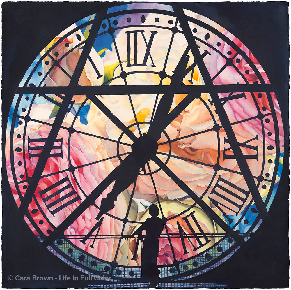
There is so much to say about this painting!  I've written a journal post about it while I was working on it.   In this post I share the time and place of the source images and the progression that led to the idea to paint it.  Rather than repeat that here, I'll share the process of actually creating this painting.  The creative work for some of my paintings actually starts in Photoshop, piecing together parts of several photos.  More than any other, this one was defined as a piece of digital art first.  The original photograph, of me - standing in front of a clock inside the Musee d'Orsay in Paris - has substantial parts of the clock blocked by the structure of the building and the clock's supports.  I wanted to include some of this structure, to keep the spirit of place, without having it be too heavy and encumbered looking.  Since, in my painting, I don't make it up as I go, I needed the reference image to be well defined and refined before I even started drawing - which took many hours.  Before drawing it, I shared the image with many people in my life, generating enthusiastic responses across the board as something altogether different for me - a new phase for my work.  It was my niece Leigh who said she could see it really, really big and up on a ceiling.  There does seem to be something cinematic about this image.   The largest paper - in the heavy weight I like to paint on - dictates that I needed to paint this one at 40"x40".  In any case, painting it a lot larger would pose all kinds of logistical hurdles - that I'm not sure I'm ready for!

In my exploration of color and how it works, I've been curious about what might happen if I paint something using just three primary pigments.  I used Phthalo Blue, Quinacridone Rose and Hansa Yellow Medium, which are very similar to the cyan, magenta and yellow in inkjet printers.   Even the "black" in this painting is mixed from those three paints!  The experience of painting this with just three colors was incredibly instructional and even in an odd way, freeing. If I needed to make a brown, or a dull, dark blue, I didn't have to look to all the other paints on my palette, I had to find the color "solution" with just those three.

The name for this painting came out when I showed the finished reference image to Sister Mary, my spiritual director.  She used the word "eternal" in response, which jumped out at me as the painting's name. She described all the symbolism in it:  the suggestion of a triangle indicates the Trinity, the roman numerals represent the human hand (one of the painters in my group noticed that the four is actually IIII instead of IV!), the X evokes the St. Andrew's cross. And then, of course the rose which, besides being an anagram for "eros," is so filled with symbolism and meaning.  I find it remarkable that the little girl who ran around barefoot all summer and played hide-and-seek after dark with all the boys in Woodacre, is this feminine image. Most of my life I've had no idea that she was in me!  I've learned from Alison Armstrong that the feminine is all about the eternal, yet we live our lives in a physical, time-bound world.  It's all here in this image - the eternal feminine framed in temporal world, supported by the masculine structure.  Over a hundred years ago, there was a day when this clock first started keeping time; there will be a day somewhere in the future when it will stop, and in between, infinite moments when beauty can bring us into the experience of eternity.

February - March 2015 - 40"x40" - Watercolor on paper

Eternal
Originals, Paris

Macarons


Original Sold

Shop Online
Archival Print Sizes/Prices:

22"x22" - $395
15"x15" - $195
7.5"x7.5" - $60

La Durée is a venerable Salon de The (tea house) in Paris. I took the photo that became this painting while on a trip there with Anne and Brad (my sister-in-law and nephew) in March of 2008. This image has been calling to me to paint it as a companion to the eclairs from Fauchon - colorful pastries from Paris - food as art. These lovely crispy, intensely flavored cookies I'm now seeing everywere...though the first time was here, in Paris - at La Duree. Yet another completely different subject matter to actually paint, all the details of the "foot" of the merengue cookies - the silver plate, its details and the reflections were really fun to paint. And as I was painting each one, I kept wondering what the flavor might be. I'll have to go back to find out! Yum!

April 2010 - 22"x22" - Watercolor on paper

Macarons
Paris, Sweets

Fauchon Eclairs


Original Sold

Shop Online
Archival Print Sizes/Prices:

22"x22" - $395
15"x15" - $195
7.5"x7.5" - $60

I took this photo of these brightly colored eclairs in a fancy food shop called Fauchon on a trip to Paris in the late autumn of 2004 with my brother, Matt. When I saw the photo in the display of the camera, my first thought was "this would make a fun painting." Graphic, surprising, a departure - my first attempt to paint food - another of my passions! I was challenged by the reflections, wondering if I could render them accurately. I just did what I do, I painted what I saw. The reflections on the chocolate ones are actually light violet-blue. Ok, so I painted them light violet-blue. This painting won the blue ribbon in the aqua media category at the 2007 Marin County Fair and was accepted in a juried exhibition at the newly christened Marin Museum of Contemporary Art.

may 2007 - 22"x22" - Watercolor on paper

Fauchon Eclairs
Paris, Sweets

Paris Roses


Original Sold

Shop Online
Archival Print Sizes/Prices:

22"x30" - $495
15"x20" - $250
7.5"x10" - $75

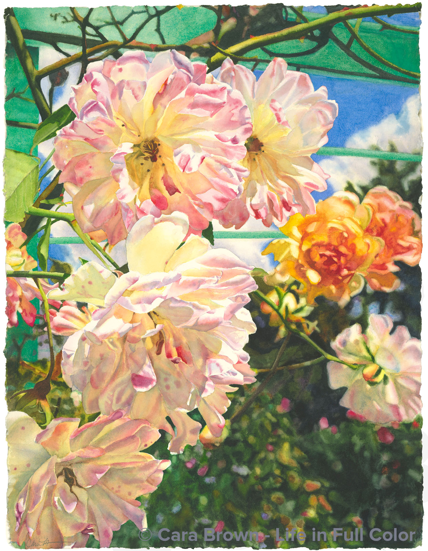
This painting came from a photo I took of these roses that were hanging from a trellis in a rose allee in the Jardin de Plantes on a trip back to Paris, in late May, 1998. This was before I'd really begun painting in earnest. Yet, the photograph stayed with me. I had been wanting to paint it for a long, long time - in 2000, I did a few quick watercolor sketches, which showed me both the potential of this image and how painting these roses quickly was not going to be satisfying. It had frightened me to attempt to paint it - that the finished painting could never express what I felt looking at the image. I started on the yellowish center rose, then left it lying undone for a while. I see now that I had to trust the process. When I came back to it, I just painted one petal at a time. And then it hooked me in - it couldn't wait to get time to work on it. Finishing this painting was a turning point. My courage and work had raised to a new level. This is the second of my paintings to sell. My friend Victoria Bentley bought it because of the way it moved her just looking at a scan of it I e-mailed to her! She said when she saw it, it took her to a place inside that she didn't even know existed. Several years later, David and Cindy told me they would love to have had this painting, never thinking they could. I put this out to Vicki as she had since put her life and much of her resources into her cause in Africa Empower Congo Women. It happened to come at a perfect time when she needed to fund a project. Now David and Cindy have Paris Roses, Vicki has a specially-embellished giclee and children's school fees in Africa have been paid.

December 2005 - 22"x30" - Watercolor on paper

Paris Roses
Paris, Roses

Jellies from Hediard


Original Sold

Shop Online
Archival Print Sizes/Prices:

22"x22" - $395
15"x15" - $195
7.5"x7.5" - $60

Paris holds such a special place in my heart and in my life - as it does for many people. It's an extraordinary city. And I find that by following my desire to go there, I end up going, really as if by magic. The most remarkable was when I was just separated from my first husband. I wrote in my journal that if we did end up divorcing, I wanted to go to Paris for six months. Nine months later I was on a plane - to Paris - for six months! A more modest version of that happened this past fall and winter. In November I heard on the radio the director of the Musee D'Orsay talk about a huge - largest ever - Monet exhibition that was going on at the Grand Palais until sometime in January, while the Musee d'Orsay was being refurbished. I thought to myself "it would be so great to go to Paris to see it." I mentioned this to my mom. She has a dear client and friend, Perry, who works for an airline who had just been stationed in Paris. One thing led to another and we had tickets and a room in Perry's apartment right next to the Jardin de Luxembourg - the week before the end of the big Monet exhibition. Mom and I had a wonderful week in Paris taking in over 300 Monet paintings (!), the gorgeous window displays, old and new friends - and FOOD! We visited all the big fancy food places, Fauchon, Mariage Freres, Le Bon Marche, and Hediard - where these jellies are. This painting was scary - all those white spots! No big washes here, just lots of squiggles and dots. A new fun way to paint - and I found it quite meditative. They are "happy little aliens" as my friend Vicki calls them! And more than one person has said they make their mouth water. I guess this means I've done my job. Thank you Perry, thank you Paris!

June 2011 - 22"x22" - Watercolor on paper

Jellies from Hediard
Paris, Sweets

Full Circle


My Private Collection

Shop Online Archival Print Sizes/Prices:

11"x15" - $150
6.5"x8.5" - $60

This is a deeply personal painting. In the late summer of 1995 I left a very difficult 14 year marriage. Days after leaving I wrote in my journal I wanted to live and work in Paris. The next spring I moved to Paris to work for a small software company for six months before helping to establish their San Francisco office. While there, one Saturday I was looking at a Victoria magazine that had been forwarded in my mail from home and saw a candle from a shop called Dyptique. I could see the address in the label on the candle in the magazine - it was a short walk from my apartment. I went that day and bought a rose-scented candle. When I came back to Marin, I was fortunate to be able to buy myself a little house in San Anselmo, where I planted many rosebushes. The candle had since burned to the end and the glass cup made a lovely little vase. I set up this still life one weekend and took several photos. Then I met my real love.  We married, endured a bout of cancer together.  It wasn't until facing my grief at not being a mother, while spending a week at a wonderful spa in Mexico where I re-found my loveliness, that this painting came out of me. To Paris and back - to myself.

August - December 2004 - 11"x15" - Watercolor on paper

Full Circle
Flower Still Life, Paris

Reach


Original Sold

Shop Online
Archival Print Sizes/Prices:

30"x22" - $495
20"x15" - $250
10"x7.5" - $75

L'Hay les Roses is an absolutely phenomenal and overwhelming rose garden in a suburb south of Paris. I visited it one Saturday in June, several weeks after arriving in France in 1996. It had been gray and cloudy since I'd arrived. This was the first sunny weekend and I was buoyant and eager. The underside of this rose growing skyward caught my eye. I love interesting perspectives. Painting it I kept fretting that it was going to be a too-sweet, grandma painting, ugh. I painted the sky last. I had an awful time getting the even, clear wash I wanted. I was convinced I'd ruined it. Creative impulses were fed by my aghast and frustration. I got a 4" house painting brush out of the garage, moved outside on the patio table, painted standing up and just slapped on a lot more paint and water, dropping in new colors. The now on-purpose textured sky is deeper and the painting far more interesting than it would have been. This is a life-in-full-color sky!

July 2007 - 30"x22" - Watercolor on paper

Reach
Paris, Roses
Copyright © Dandelion by Pexeto