Journal
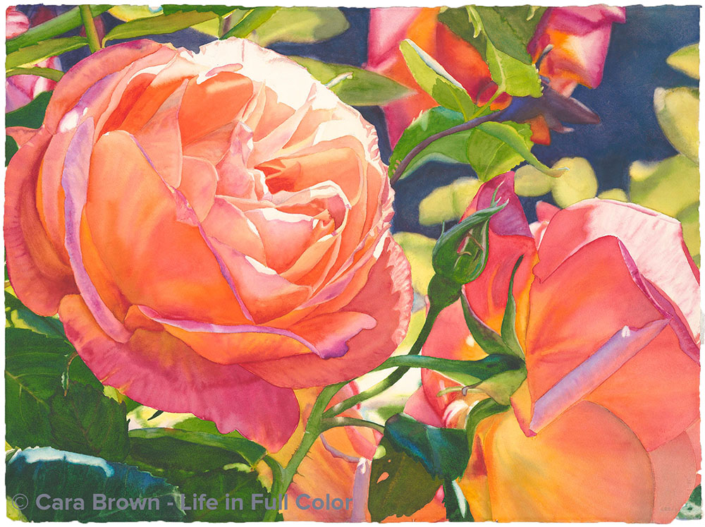
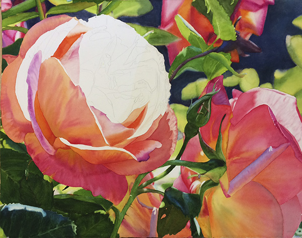
Click on an image to read more about my process.
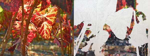
Broadway and its reference image – November 15, 2023
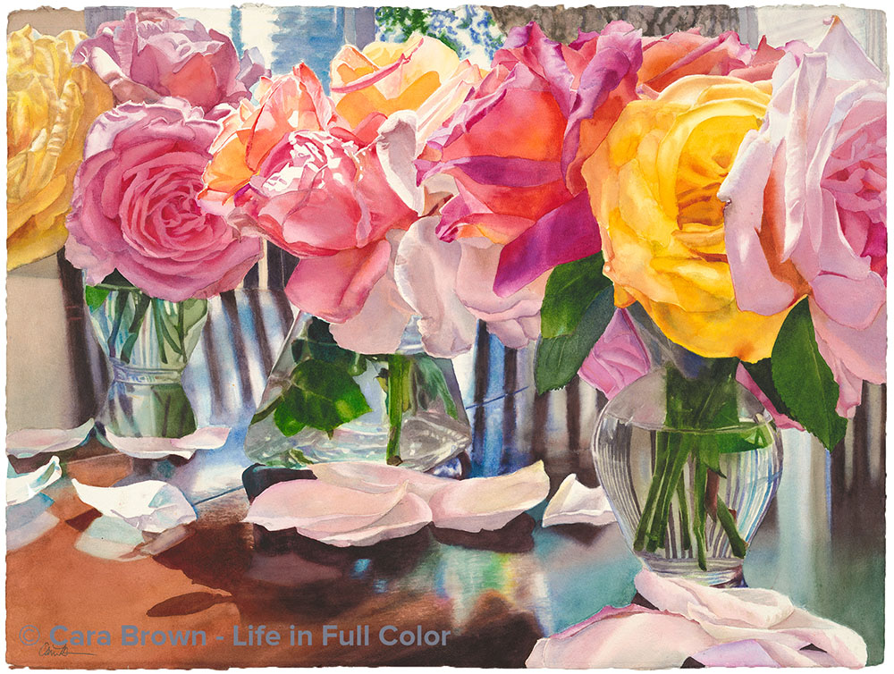
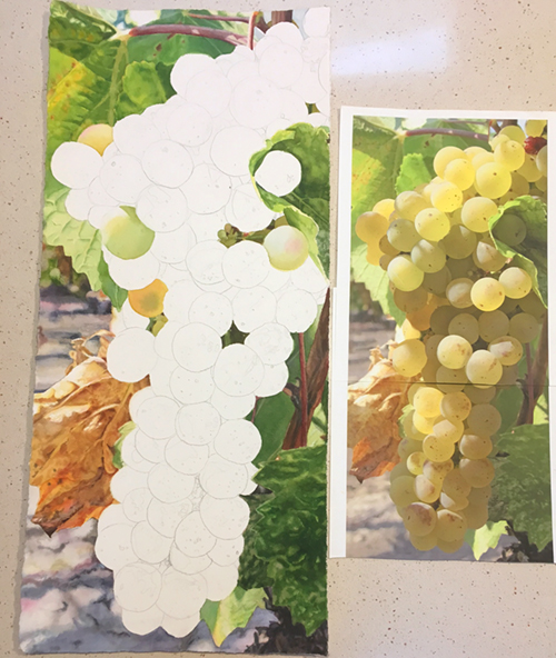
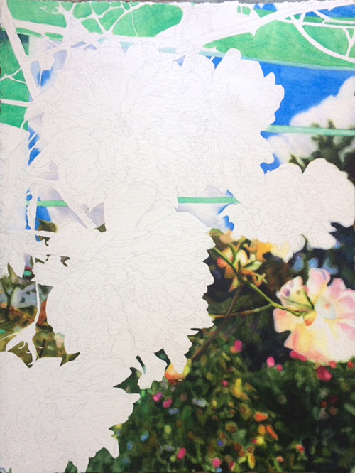
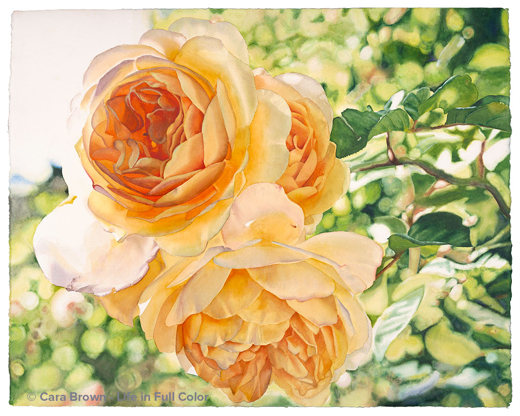
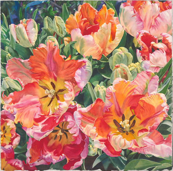
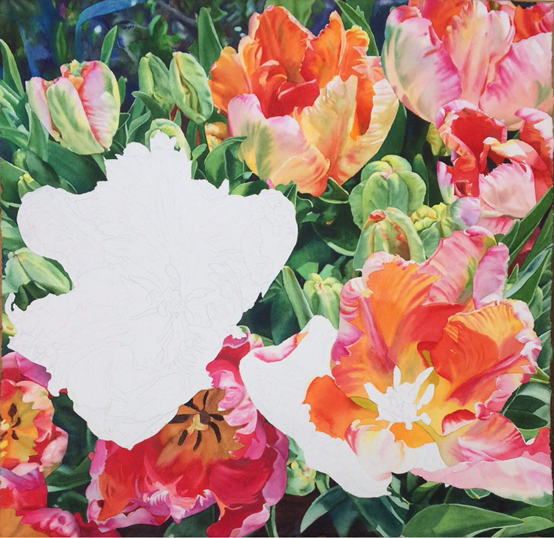
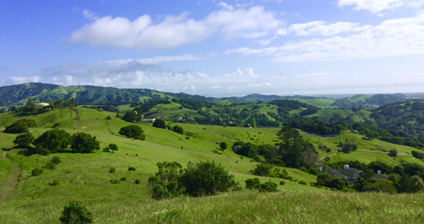
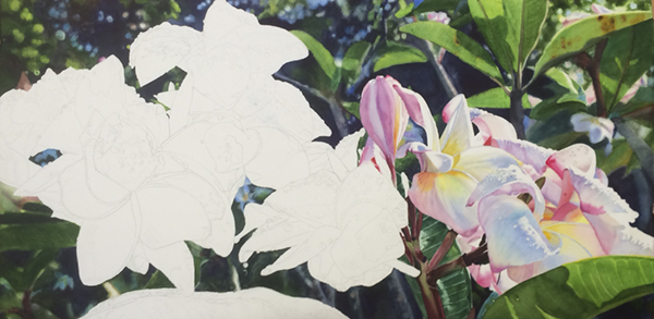
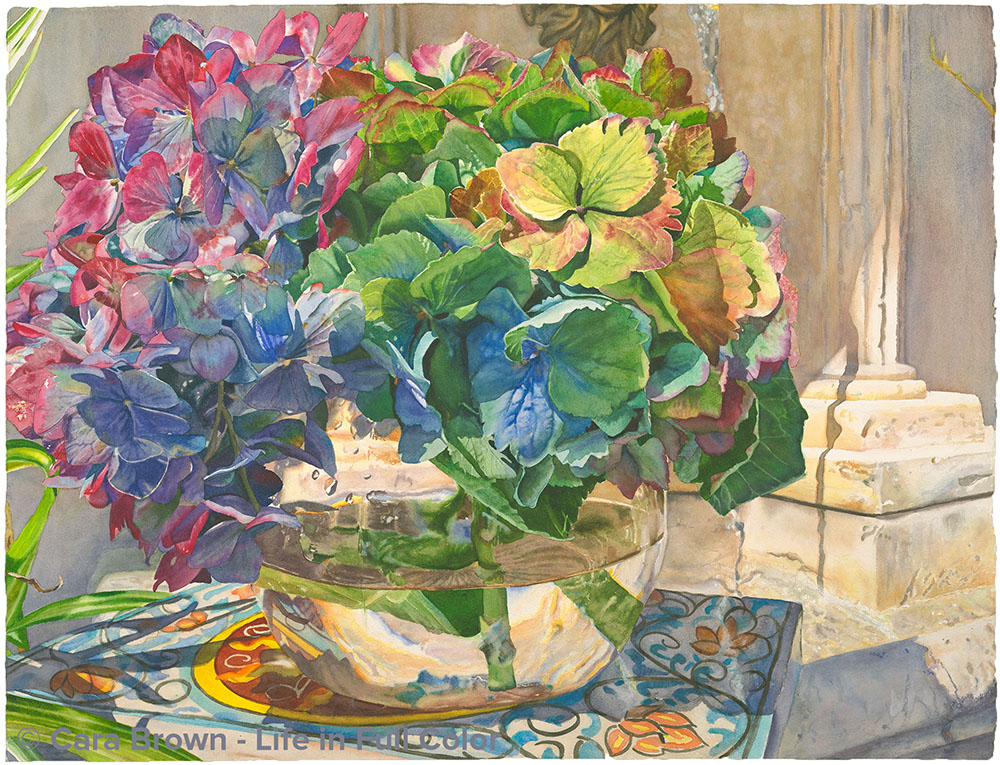
Here's another painting (top) and its photo inspiration. This one - named "Broadway" - 22"x30" I painted this year. It was chosen to be part of the California Watercolor Association's National Exhibition early next year.- 2024. This year it's an online show - everyone...
Paintings and the images they came from – November 14, 2023
Hi everyone! I was updating my website with a couple of new paintings yesterday and realized it's been two YEARS since I've shared something here with you. I have been using my voice on a new-ish occasional podcast more than I have been writing journal entries. I had...
Bojangles – Our Baby Dog – December 2, 2021
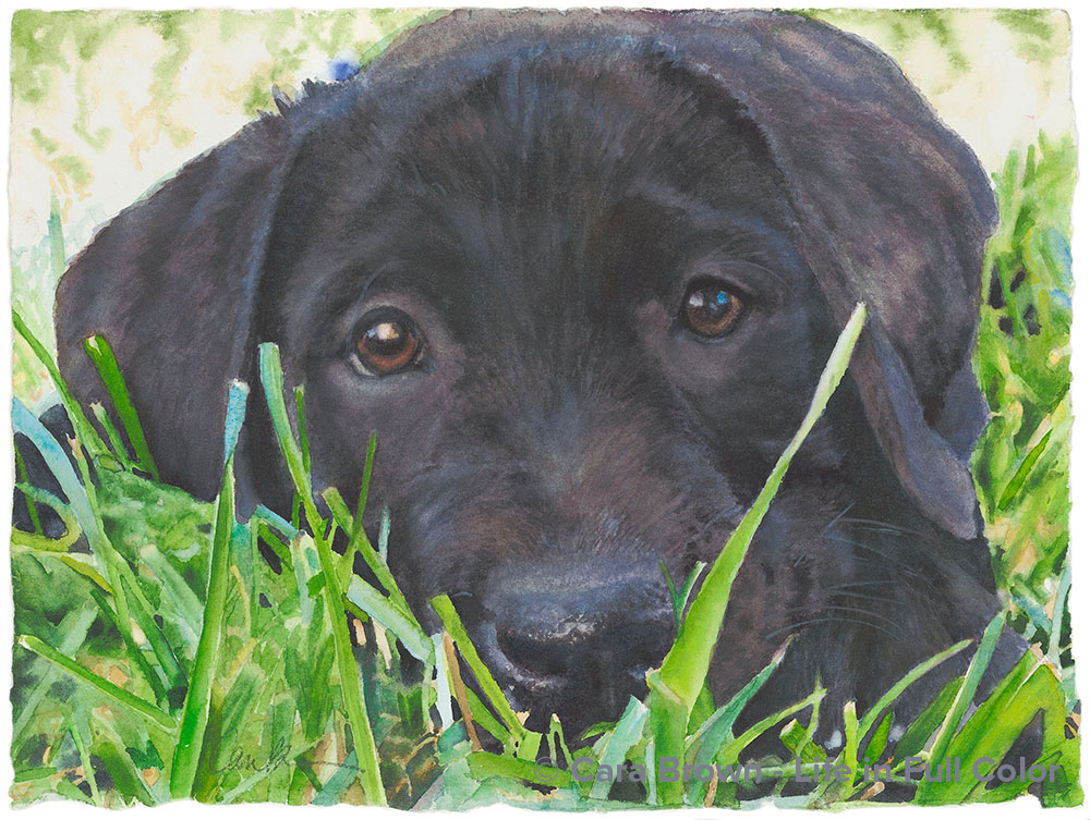
A month ago tomorrow we had to say goodbye to our beloved Bojangles. Though he was 11, he seemed to be doing just fine. He and I walked the 3 miles around Lake Bon Tempe the day before. Then the next day he collapsed, letting us know he was sicker than we knew and it...
Inspired by Joseph Raffael – December 2, 2021
I learned that he was gone via a text from Patti: "Did you see that Joseph Raffael passed away?" Patti Sulewski is a beautiful artist and beautiful person from Auburn, WA who tracked me down during the pandemic. She joined us on Zoom when we were only meeting...
April 28, 2021 – Finding each other again across the Pandemiverse
There is a very beloved Rumi poem that has the line:"the world is too full to talk about" This is where I am - where I have been for the past year or so. Lots has happened - for all of us on Planet Earth.And also in my personal world. I wanted to catch up with you. I...
Your Hands – December 13, 2020
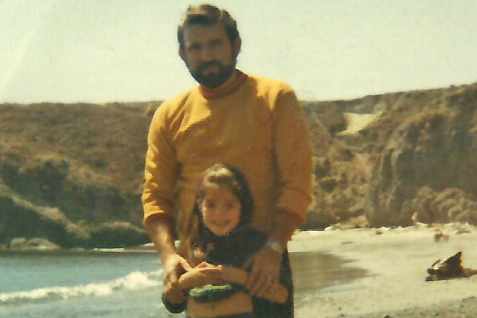
On November 11, 2020, at just about 2 in the morning my very beloved dad took his last breath and his spirit left his earthly body. He was the most amazing dad. Everyone who knew him says “what a guy.” The first man to love me, someone said the week he died. My...
April 12, 2020 – Peace and joy, even now… especially now
It’s Easter morning, my phone said 5:37am. I’ve not been sleeping well for weeks, waking up in the middle of the night hot and with my cranky shoulder aching. Thankfully I was able to get back to sleep so I have a reasonably bright brain. I just read my dear friend...
October 1, 2019 – Bewitched by beauty
Inspiration and energy to make these watercolor paintings have been relatively steady resources in the past dozen or more years. I have a folder of “candidates” - photos I’ve taken that have given me the message they are worth spending my time on. Most of the time...
July 10, 2019 – Riding the waves of creative inspiration
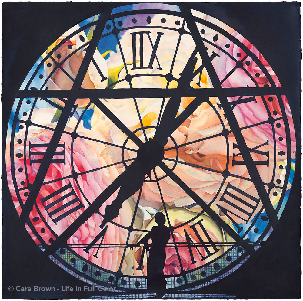
This is an addition to the “I Love Paris + Roses” vein that runs through my work. After the not-to-be-repeated emergence of Eternal, the “clock painting” in 2015, I’ve been in the dark as to what would come next. I liked the circular motif of Eternal, which brought up...
April, 22, 2019 – Honoring Home
On Saturday the commissioned diptych I painted at the start of the year went home. Chris and Bob came over to see the piece for the first time and take it down south with them. Here's the story from my portfolio gallery: Chris and Bob are dear friends from when we...
November 14, 2018 – A dream, a word and a portrait
Towards the end of last year, as I sat to write, I was coming up empty. Looking around inside for what to say there were neither words nor the energy to dig deeper. 2017 was a big year – the summer was a sprint from a family Europe trip to remodeling our kitchen and...
December 6, 2017 – Awaiting what is to come
In case you didn’t notice, I didn’t post last week. The off-the-top reason was that it was my birthday and I was very busy receiving one phone call after another from my loved ones, singing and celebrating me - in the middle of what ended up as a whole birthday...
November 22, 2017 – Welcome it all
I started writing a post about a trip I took last weekend – a trip down an online rabbit hole into the darkness that is emerging in our world, seemingly at every turn. I’m so compelled to understand human behavior in the big scheme of things, that I just can’t help...
November 15, 2017 – Human Beauty in NYC
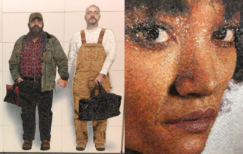
My Mama and I have just returned from four days in Brooklyn, New York City and New Jersey. The catalyst was the opportunity to see Joseph Raffael’s art in- person at an exhibition in a gallery in Chelsea. But the real heart of the visit was the chance to spend time...
November 8, 2017 – One place at a time
I wasn’t raised with poetry. Though, we did have Mother Goose and I remember reading Robert Louis Stevenson’s “A Child’s Garden of Verses” at a friend’s house. But apart from that, Mom read us story books. I had two friends from middle childhood through high school...
November 1, 2017 – Making friends with challenge
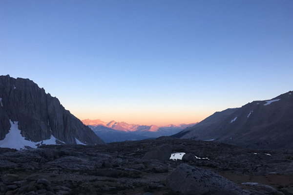
My hope and intention when I decided to hike 60 miles up and back to the summit of Mount Whitney this summer was to give myself a physical test. I wanted to know the strength in my body. Though it did take stamina and I ran out of energy on day 5 because I didn’t...
October 25, 2017 – A story of two bears
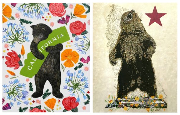
Annie and Eric's two bears. Last weekend poking around online, I came upon a New York Times interview of Tom Hanks. It’s entertaining and charming – like he is. He’s just written a book of short stories – Nora Ephron was his writing coach; she admonished: “voice,...
October 19, 2017 – Resurrecting beauty
I took this photo on the side of Highway 12 in Sonoma. It just happens that I'm painting it now. We’ve been living with wildfires in California for as long as I can remember. The house my family lived in from the time I was a toddler was across the street from Marin...
October 11, 2017 – Riding the currents
The trail streaked with orange light - sun shining through smoke in the air. I woke at 4:30am on Monday morning and whispered to Joe that I smelled smoke. He asked me: inside or outside? Outside, I smell wildfire. A bit later I got up to go to the bathroom and...
October 4, 2017 – Brave for beauty
Life has pulled me away from my art a lot these past few months. It is so good to be in my newly beautified "room-of-my-own" working on a painting! Weeks like this one are a challenge for me as a writer – when the world is particularly stirred up – fears, anger,...
September 27, 2017 – Blessed Unrest
I am even happier to be painting in my newly freshened studio. started the project to refresh the inside of our house just after the fourth of July and as of Sunday, we are officially done. Last week we had the hardwood floors refinished which meant that our...
September 20, 2017 – A room of one’s own
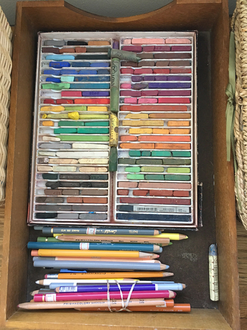
Pastels on display in Sue's studio. Last week Sue, an artist in our community, texted to say she wouldn’t be coming to paint with us on Thursday. She had a project to finish. She was reclaiming her childhood bedroom as her studio. Many years ago she and her husband...
September 13, 2017 – Brave
The most bold and brave painting I've done - yet! I left the gala at 9:45 completely comfortable in just my spaghetti strap cocktail dress. On Saturday everyone: artists, volunteers and the courageous festival goers who did come out mostly just coped with the 106...
August 23, 2017 – Facing Fears
One of the nights during my Mount Whitney hike, as I was lying awake in the dark in my sleeping bag – not sleeping, certain thoughts came up – thoughts about my relationship with fear. We all have fears – they are part of being human. I’m not alone in that...
August 16, 2017 – Force of Nature
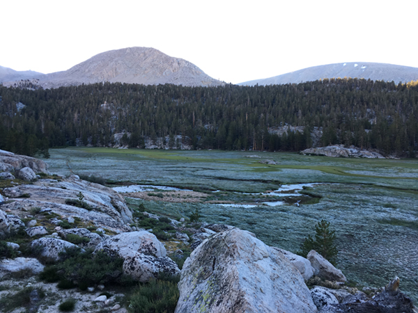
Frost on the meadow around Rock Spring Lake on Saturday morning. is a continuation of a post I wrote on Sunday, the day after returning from a six-day hike to the summit of Mount Whitney. Sunday’s post was the story. Here’s how I’m holding it all – what made it...
August 13, 2017 – My big hike
The view looking back as daylight was breaking on the morning we hiked to the top. morning I was looking out the kitchen window in my dear friend Steff’s house – gazing upon the mountains of the Eastern Sierra that are visible just west of where she lives in Big Pine,...
July 19, 2017 – Pressing Pause
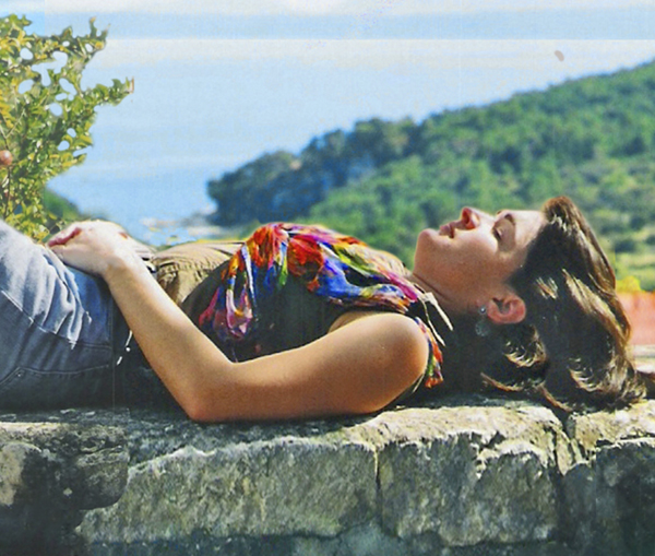
This is me - in 1996 on the island of Brac in Croatia, where my grandparents came from. I started these posts more than two and a half years ago because I was challenged to. My coach Lissa Boles challenged me to act in the face of the fears that I’d quit. A part of...
July 12, 2017 – When it’s hard to focus
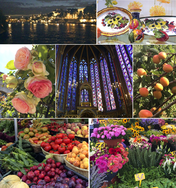
Some of the light and color that caught my eye on our trip. Joe and I have been back a week and a half from a rich and full trip to Paris and several places in Italy with my family. Since coming home life has been full – working with Carla, our bookkeeper, Fourth of...
July 5, 2017 – 10,000 hours – sticking with it
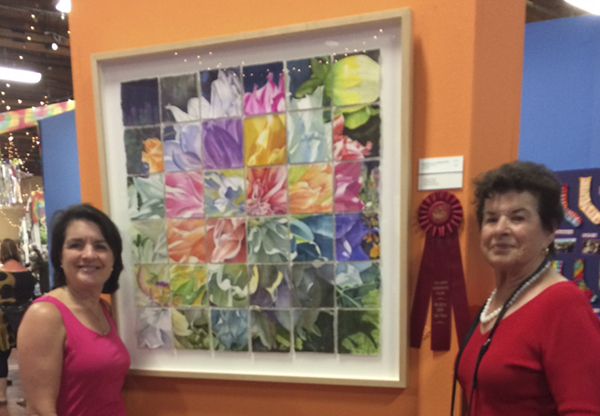
Mama (Niz) and me with Kaleidoscope - it won second place at the fair! This is a re-post from June 7, 2016 - 13 months ago. It's late again today - the holiday yesterday and a project that had to be done today kept me away from writing. I'm still not quite on this...
June 28, 2017 – Stone Soup Art
"Kaleidoscope - the work of: Robin Bentel, Sondra Blake, Jean Brady, Cara Brown, Niz Brown, Shannon Brown, Karen Burkland, Maria Carlile, Sue Devinny, Velda Draper, Ann Eichhorn, Paulette Engler, Heather Hughes, Ann Jessen, Virginie Kortekaas, Suzie Lahr, Pam...
June 21, 2017 – When art must wait
"This painting will hold down the fort in my studio while I'm away." We are getting ready to go on vacation and I’m in full-on get-ready mode. The list of things to do today is long and if I let myself think about it too much, I can get almost stopped in my tracks by...
June 14, 2017 – Learning to paint fuzzy
The painting I'm working on - I got the hard part done first - the fuzzy background. I still don't find them easy! Do you ever wonder who ate the first artichoke? Who saw this prickly, thistly thing and thought it would be edible? I ask myself these questions all...
June 7, 2017 – The two faces of color
Blossoming Hope - the yellow roses I painted... in yellow! I’ll never forget her question: it was at my second festival in San Anselmo 9 years ago, a woman held up a print of “Blossoming Hope” and asked if I “had this available in red?” It took me a...
May 31, 2017 – Painting the Light
Here it is! Meet "Gala" - my newest painting. Look for the story in my gallery later this week. During Marin Open Studios earlier this month, I was paid a visit by two lovely people – Trinette and James - who I’d met at last summer’s San Anselmo festival and they took...
May 24, 2017 – When whispers become passions
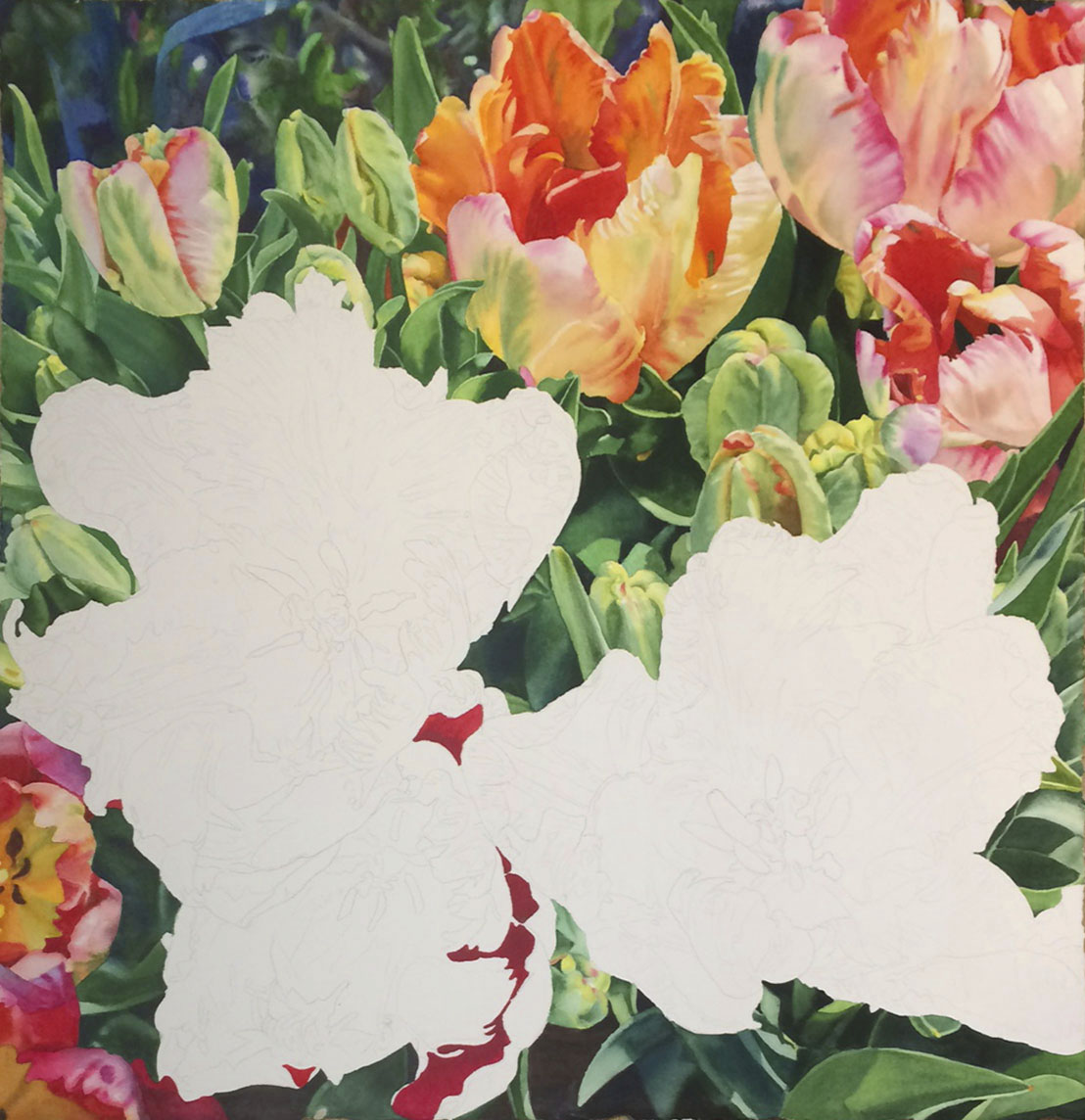
"Getting there with my parrot tulip painting - and contemplating what's next." There is this idea in our culture that we should find our passion. What’s more, we hear that this passion is like a switch – you come upon a way to channel your energies and boom: You fall...
May 17, 2017 – Painting the truth
My tulip painting is coming along - I'm having fun with these colors! Marin Open Studios 2017 has just passed, which means I spent the past two weekends hanging out at my mom’s real estate office in Larkspur, my artwork all over the walls, as people came in to see it....
May 10, 2017 – Beatitudes for Artists – Part 2
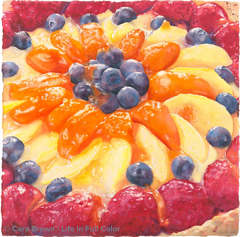
"Fruit Tart - a painting from a decade ago that gave me great challenges. I needed these Beatitudes when I was painting them - it would have been much easier on me!" This week we continue with the second half of Jesus’ eight Beatitudes that I’ve re-interpreted...
May 3, 2017 – Beatitudes for Artists, Part 1
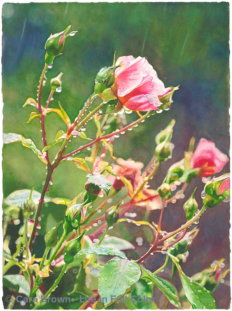
"Raindance - rain and beauty, thorns and petals." As promised last week, (when I provided you with the context for why I’m doing this!) below are the first four of the eight Beatitudes that I’ve re-interpreted looking through the lens of making art and becoming an...
April 26, 2017 – Supremely Blessed
"Beatitude" You know I’m an artist; you know that I am a guide to those on their own creative journeys - and if you have been reading these posts for a while, you likely know that I’m also a spiritual seeker. My seeking began in my 30’s centered in what would be...
April 19, 2017 – Art springs eternal
The reward for hiking to the top: all the green this year is intoxicating! Fear is a big character when it comes to making art. I see it all the time – in myself as well as in those around me. Last week I received an email from someone who had come into my mom’s...
April 12, 2017 – When love leads
Starting a new one - my first painting of tulips(!). The warm colors are a welcome change for me. Last week at dinner with a couple of the artists in the Friday group, the subject of jury duty came up and I found myself recounting the experience I had when I sat on a...
April 5, 2017 – Ain’t mishavin’
That last bee, last bud, last flower center painted. This one is now officially finished. I'm calling it "Eden." Look for it on my website later this week. It's already spoken for, but I'll have beautiful giclee prints available soon. Brené Brown (no relation) is one...
March 29, 2017 – Why make art?
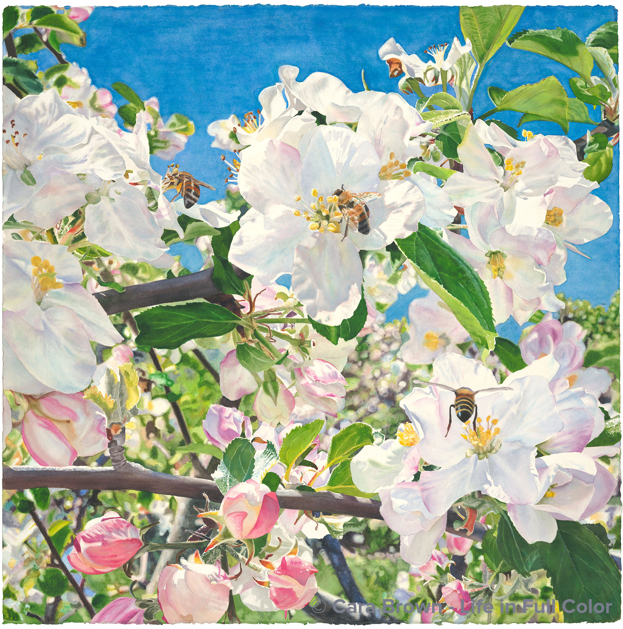
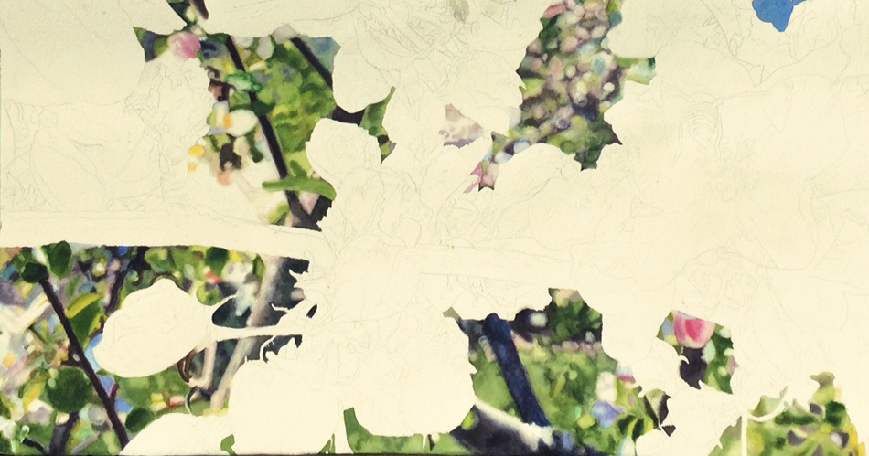
I'm back to the painting of apple blossoms I started last spring - it's the perfect thing to paint - and be in love with - in this moment. I spent the day last Tuesday sitting on the jury for this year’s Sausalito Art Festival. It’s a big honor - to be asked to...
March 22, 2017 – Desiderata – things desired
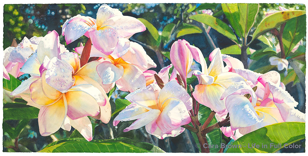
"The painting of plumeria started last month on Kauai is done. I'm just not yet sure what its name is..." It’s all gotten to me lately – the state of the world, especially as depicted by the news media, the political situation, the divisiveness and outrage that seems...
March 15, 2017 – Getting Personal
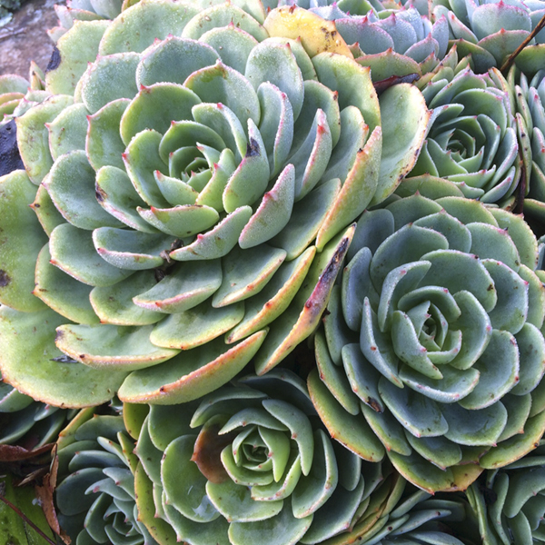
The succulent in Adrienne's garden. In January I took this picture of a succulent growing in our neighbor Adrienne’s front planting bed. It was moist with dew with the light catching the edges just so. I cropped it square and posted it on Instagram. ...
March 8, 2017 – Who is our art for?
"Not yet done, but getting there. The clusters of water drops are a challenge, but I'm loving working with these colors." I’ve become a new fan of the singer-songwriter Sara Barielles, after hearing her gorgeous and soulful version of Elton John’s “Goodbye Yellow...
March 1, 2017 – Trusting your own rhythm
Finding joy and play painting these clear, light colors. I’ve just past the second weekend in a row when I didn’t pick up a paintbrush. Not once during the four days did I do what I love to do – sit alone with my work and bring something to life with paint on paper....
February 22, 2017 – Making beauty a practice
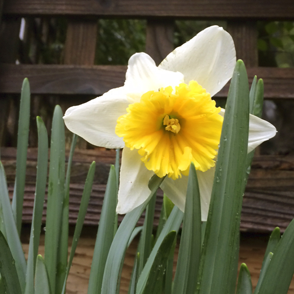
I did take this one picture of a daffodil that popped up in the front yard while we were away. A few days into this new year I decided I’d post a photo of something that I found beautiful on Instagram every day for the remainder of the year. We’re not yet two months...
February 15, 2017 – Beauty will save the world
We watch as we rotate away from the sun - a daily event and it still gathers us and draws us to it. Sometime in the past few weeks I heard my coach Lissa say that she just read a book called “Beauty Will Save the World.” These words – just the title of the book -...
February 8, 2017 – Time to let go
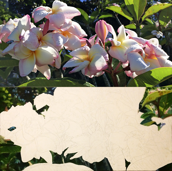
The painting I'm working on (bottom) and the reference image (top). Two weeks ago four of us gathered at my mom’s office at the end of the day to take Hallelujah, my really big painting, out of the frame and into a huge shipping tube. Lissa Boles, my beloved coach,...
February 1, 2017 – What is in a name?
"The painting I finished yesterday, which I gave what feels like the most audacious title of any so far!" “The Magnolias,” as Sue has dubbed our group of artists, are having a show at the Sausalito Presbyterian Church and in preparation, Marilee asked for help naming...
January 24, 2017 – Holding on to Humanity
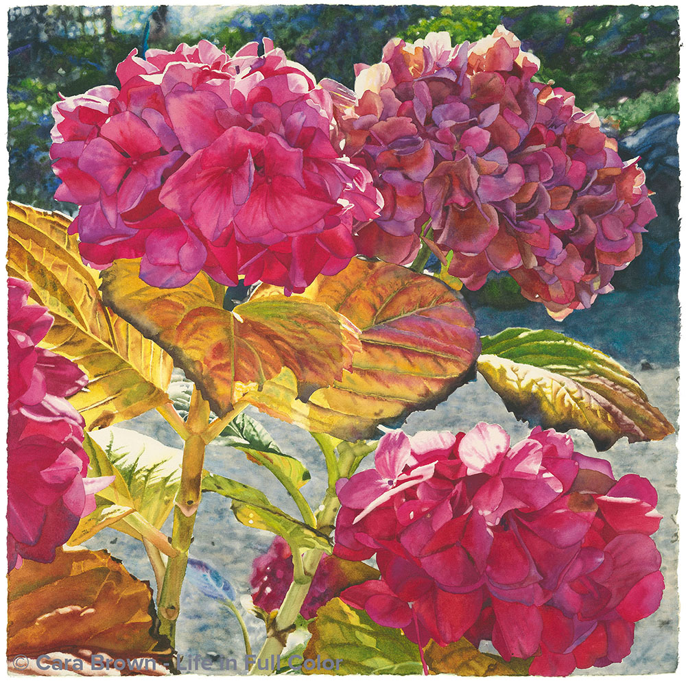
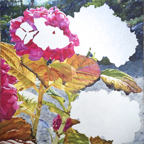
"I'm swimming in pink and red paint as I work on these hydrangeas." My commitment to show up here at my computer, open up Word and start writing every Tuesday morning has shifted the way I operate the rest of the week. As I do the rest of my life there is now an...
January 17, 2017 – What’s next?
"Promise - my little rose and Reverence - the one I just finished." The last couple of weeks in our regular groups I’ve spent time with several disconcerted artists who were at a bit of a loss about what to paint next. There are a few things I notice about what I’ve...
January 10, 2017 – Orienting towards beauty
I'm making progress on the leaves in this hydrangea painting and just the final details to go on this little one of a rhody. I’m so fortunate to have all the support – incredible support - in this life I’m living. It comes in the form of several wise elders – people...
January 3, 2017 – Gifts from last year
My painting as it is today. I took a full week off from painting, which was nice. I'm back to it now. Last week, just after finishing my post I drove up to Sonoma County to see my friend Cathryn Couch. Being on the cusp of a new year, on our walk she asked me what...
December 27, 2016 – The futureless present moment
The two paintings I'm working on - as they are in this moment. At the end of last year – 2015 – I made a promise to paint every single day this year. And I did, until mid-June when I missed my first day. I felt terrible, I reported in to you and re-committed. ...
December 20, 2016 – The light of Christmas
Bo and U cozied by the tree on Sunday afternoon. I am more seriously tempted this morning to “re-run” a post than I have ever been. At this time last year, I wrote one I called, “Being Christmas” that received quite a bit of appreciation. I just re-read it which has...
December 13, 2016 – Watching for miracles
"The background is in and I'm now ready to start on the scraggly leaves." I woke up really early Sunday morning - something like 4am – with the thought – I have no idea where the tickets are - the tickets for tonight’s Chanticleer Christmas concert with my husband’s...
December 6, 2016 – All the light we can and cannot see
I’m still working on a little painting I’m calling “Reverence” - and have started this larger one too. I wanted to paint its imperfection, beauty beyond what is generally seen as its prime. And, of course, there is that light. Last Friday, one of the artists asked me,...
November 29, 2016 – Trusting yourself
This is "Eve" a painting I did earlier this year - for the simple reason that I loved the image - in all its pinkness and light. And I painted it despite the fact that this kind of art is so not in style these days! A few times a year, I offer a hands-on demonstration...
November 22, 2016 – Nourishing others – and a recipe
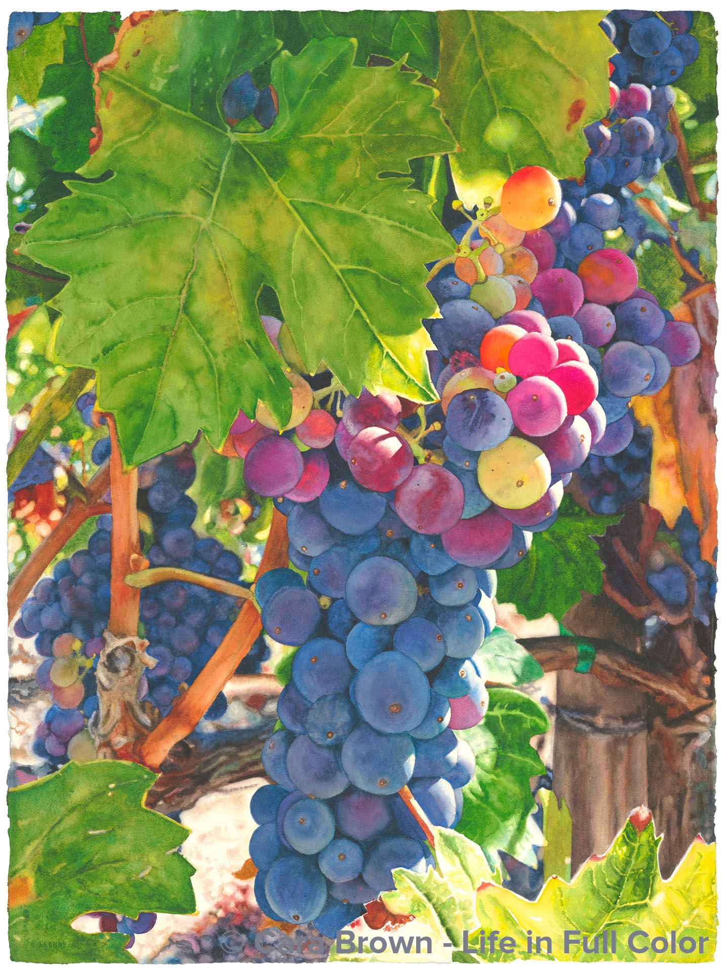
“Zintopia” – My newest – just finished on Sunday. Zinfandel grapes from the hills above the Alexander Valley at the Rink Ranch.
November 15, 2016 – Dancing in the dark
The "Eternal" feminine as she came through me in this painting. It’s a whole new world. Last week I wrote about how much we wanted the election to be over. Now for many it feels like the nightmare has just started. The world is a swirl of emotion, much of it being...
November 8, 2016 – What the world needs now
"One of the paintings I'm working on - almost done with the background." have to have been on a sojourn to some other part of the Universe, to not feel the tension, and have experienced the negativity of this election season in the United States. It has to be the...
November 1, 2016 – Touched by the Sun – on permission and risk
The painting I named after Carly Simon's song - Touched by the Sun These past few weeks, I’ve been asked to take a closer - and more gutsy - look at my work and the impact that it has. The effect is that I’m suffering a big attack of “just who do you think you are?”...
October 25, 2016 – Your visual voice
A Google images search for my work reveals these images ... I sure do love color! I’ve had another morning, feeling unclear about what to write about. I’m in the midst of a big inner tussle, about my work and my art and its purpose and mine. But it’s not time yet to...
October 18, 2016 – My other dad
"Bob and Evelyn looking jovial when they came to see me at the Healdsburg Art Festival several years ago." Joe woke me up sometime about three in the morning last Wednesday. “Dad is gone.” Crumpling into tears I got up to take a steamy shower to try to clear my head...
October 11, 2016 – A peek behind the curtain…
My body is working to rid itself of a virus. Instead of sleeping, my nights have been filled with coughing, making my brain not at its best in putting together words. But playing with images sounded restful – and do-able! - this morning. I’ve just finished a painting....
October 4, 2016 – Soul on Deck
"Paris Roses - the painting from my first studio in the garage." My first art studio was in the back of our garage. No more painting just on the dining room table, it was time for a special place set aside, just for me to paint in. This was eleven years ago – I was...
September 27, 2016 – Belonging to each other – beyond right and wrong
Filoli as we head into fall Where we live in Marin County, California, it is a sea of blue – political blue. I don’t know the percentages, but overall, California leans towards the liberal end of the spectrum, the San Francisco Bay Area even more so, and Marin is...
September 20, 2016 – Cooking my love – and a recipe
My fresh tortilla soup - the recipe is at the bottom of this post “Love people, cook them tasty food.” As I shared in a post about my love of cooking a couple of years ago, this is what the only bumper sticker on my car says. It’s from Penzey’s, the spice company...
September 13, 2016 – Painting our prayers – an invitation
"Heather, a Friday group artist, painting cherry blossoms - whether she thinks so or not, this is sacred practice." start with a confession. I didn’t paint two more days – this past Saturday or Sunday. I share this not as a mea culpa, but because of how much I...
September 6, 2016 – Schlep art, carry panels
"Hula, found her home this weekend - it's always poignant to say goodbye to these paintings I spend all those hours with." Last week in my coaching group call the conversation arose about what constitutes a “healing business.” Implicit in the conversation was a...
August 30, 2016 – Our Love Affairs with our Paintings
One, big apple - just in time for back-to-school. Last Wednesday, just after posting about how I was able to be really productive by not making myself do anything, but shifting gears to keep myself fresh and engaged, I called foul on myself. I had been using this as a...
August 23, 2016 – Offering the driver refreshments
The front cover of next year's calendar - this time it's all fruits! The Sausalito Art Festival is the weekend after next. It’s a big deal in my art life. Yes, it’s just an art festival, but it’s a big festival, it costs quite a bit of money to do and a whole lot of...
August 16, 2016 – Just make beauty
A few glimpses of the richness of our weekend - I just love this time of year - it is SO "full color"! I spent this past weekend on a ranch and vineyard in Cloverdale with six other women-artist-friends. We took photos of the ripening grapes and other fruit, of big,...
August 9, 2017 – Summer stargazing, connection and the future of Earth
"Zoomed in to the lower part of this big painting I'm working on - it seems to be its own kind of universe" Last week, while up in Tahoe, my friend Steff and I went to Sugar Pine Point State Park, to gather with a few dozen others and listen to a ranger-led talk on...
August 2, 2016 – Mindfulness, simplified…
"Just finished this little one (15" x 15"). My painting to keep my promise to paint every day." Right after sending off last week’s post, Joe, Bo (our puppy dog) and I went on a hike, and the thing that I couldn't remember, came back to me! A victory of memory recall!...
July 26, 2016 – The wisdom in not knowing
There's so much "fuzzy background" in this painting I'm working on! My path to being a teacher has been a reluctant one. I’ve come to it haltingly, not easily landing in the authority to share what I know and what I think. The workshop I offer on color, is the only...
July 19, 2016 – Holly
Holly's bright smile - last summer when painted out at Susie's in Inverness. In the fall of 2011, when I first tiptoed out through my fears to lead watercolor groups, Holly was one of the early joiners. She wasn’t there the very first Tuesday, but within the first...
July 12, 2016 – Our immortal creations
"Holly's hand working on a painting of her son, Toby" Our hearts are full and heavy, as we mourn the loss of one of us. Yesterday morning our sweet, kind, gentle, beautiful and courageous Holly passed on – as her best friend Marilee said - to be with the angels. It’s...
July 5, 2016 – The choice we DO have
The two paintings I'm working on. I'm loving having this rose to paint when I just want to play. The other is of an apple, I'm planning for the 2017 calendar. This morning as Bo and I were taking off down our street to head up the hill, we ran into Ed – a neighbor –...
June 28, 2016 – Destruction before Creation
"I finished the eggplant. I called it "Global". During the festival I started a new one - of one big apple." The week before last, I went to see my dear friend Julia and to meet her brand new son. Julia and I have a magical connection. Though there is a pretty big gap...
June 21, 2016 – Modern art – is it love?
My painting in-progress. Funny how the under painting of the big eggplant is quite abstract. Reminds me what my artist friend Julia told me: it's ALL abstract. Just after finishing last week’s post, I met my mom, my niece and her partner and went to the newly opened...
June 14, 2016 – I missed a day…
"The finished painting - I'm calling it "Offering". Its story will appear soon in the gallery." I woke up very early, it was still dark. Lying there awake and alert, it dawned on me that I didn’t paint yesterday. Oh, no… I checked the time – 4:04 am. My heart sunk. It...
June 7, 2016 – 10,000 Hours – Sticking with it
Here's where I left it today. I'm so glad to have more time to get it done. [Note: I will return to recording next week - I promise!] It’s late. I’ve not started a post this late on a Tuesday since I started writing every week. I’m working against a deadline on this...
May 31, 2016 – Love what you love
The soft animal of MY body is in plumeria heaven on Kauai. [Note: I’ll resume recording when I’m back home from vacation.] When I was four years old, my older brother Joe (who was 5 at the time) and I were on the Bay Area Romper Room TV show. We rode in the car over...
May 24, 2016 – Healing places, healing spaces
"A glimpse from the plumeria tree that I see when I'm painting here. [Note: I’ll resume recording when I’m back home from vacation – at the latest.] Joe and I are over on the island of Kauai. This year I’m here for 15 days – a good long time (by most of our...
May 17, 2016 – In the Eye of the Human Hurricane
"I'm in the eye of the hurricane with this painting - it's home while I'm away for two weeks! I'll get back to the flurry of all these hydrangea petals in June." [Note: I’m travelling today. I’ll resume recording when I’m back home from vacation – at the latest.] On...
May 10, 2016 – Holding Space for HOPE
The physical space that holds me while I do most of my painting. My somewhat messy studio! My mentor and coach Lissa Boles, shared a link to a blog post with my coaching group, suggesting it was a useful read. The post is written by another coach/writer/speaker,...
May 3, 2016 – Seeing with the eyes of love
I've decided that trying to get the huge blossom and bee painting done my mid-June is crazy with all else going on, so with the eyes of my heart, I've returned to this one. And, I'm very happy to be back with it. “Ding!” went my phone Sunday morning. It was a text...
April 26, 2016 – Why paint?
The new painting and the image I'm painting from. I’ve just started a new big painting. When my coaching sister Susan, gave Happy a home up in the wild grasslands of Canada last year, we decided it was easier to ship it unframed. So, for almost a year, there’s been a...
April 19, 2016 – The stillness in every painting
My latest painting. I'm calling this one "Eve" - it is just so feminine. The radio in my car is most often tuned to KQED – the NPR station in San Francisco. I really like classical music, but I just can’t listen to it all the time – it can get tedious to me - and the...
April 12, 2016 – Like potatoes on Mars
This rose is growing in its own ecosystem, as am I, in mine, while I paint her. I’m part of a coaching group – there are 6 of us, all women, whose intent it is, to make an impact in a purposeful way with our work. We are each building businesses – we're heeding a...
April 5, 2016 – What Brings Us Alive
The painting I'm working on - as it is today - bringing this rose and its surroundings alive My mom and dad host a dinner almost every Sunday evening. By Sunday morning, Mom sends a text or email to my three brothers and me and our spouses – this is what Dad's...
March 29, 2016 – Painting redemption
Moving on - my next painting underway, another rose - having fun with the detailed background. Most weeks, by the time Tuesday morning rolls around, I know what I’m going to write about. Today isn’t one of them. I’m stuck today. I didn’t sleep well – I woke at...
March 22, 2016 – Easter Saturday
In the past several weeks a very close, long-standing friendship took a painful turn and in the past few days, has very possibly ended. We’ve been friends for more than 25 years and have been through so much together. It’s hard for me to really grasp that six weeks...
March 15, 2016 – Sorta Perfect
My sorta perfect, getting there painting Last week Paulette, one of our Thursday faithfuls, forwarded to me an email with a plea for my help in responding to it. She’d been offered an opportunity to do a demonstration for a watercolor organization. First, I must say...
March 8, 2016 – Fine tuning my promise to paint every day
I'm enjoying painting what I'm in the mood to paint - I'm loving being in the world of these roses. It’s been over two months since I promised to paint every day, and I haven’t missed a day yet. Though one day in January, all I did was paint colored squares in...
March 1, 2016 – Taking a pink break
starting a new painting of roses I am a thought-ful person – I mean to say not so much that I’m kind and I think of others – which I do aim to be and do – but that I am full of thoughts. I’ve been watching myself think, and am realizing how incredibly busy it is...
