Flourish
Original Available -contact me for details
Shop Online for Archival Prints
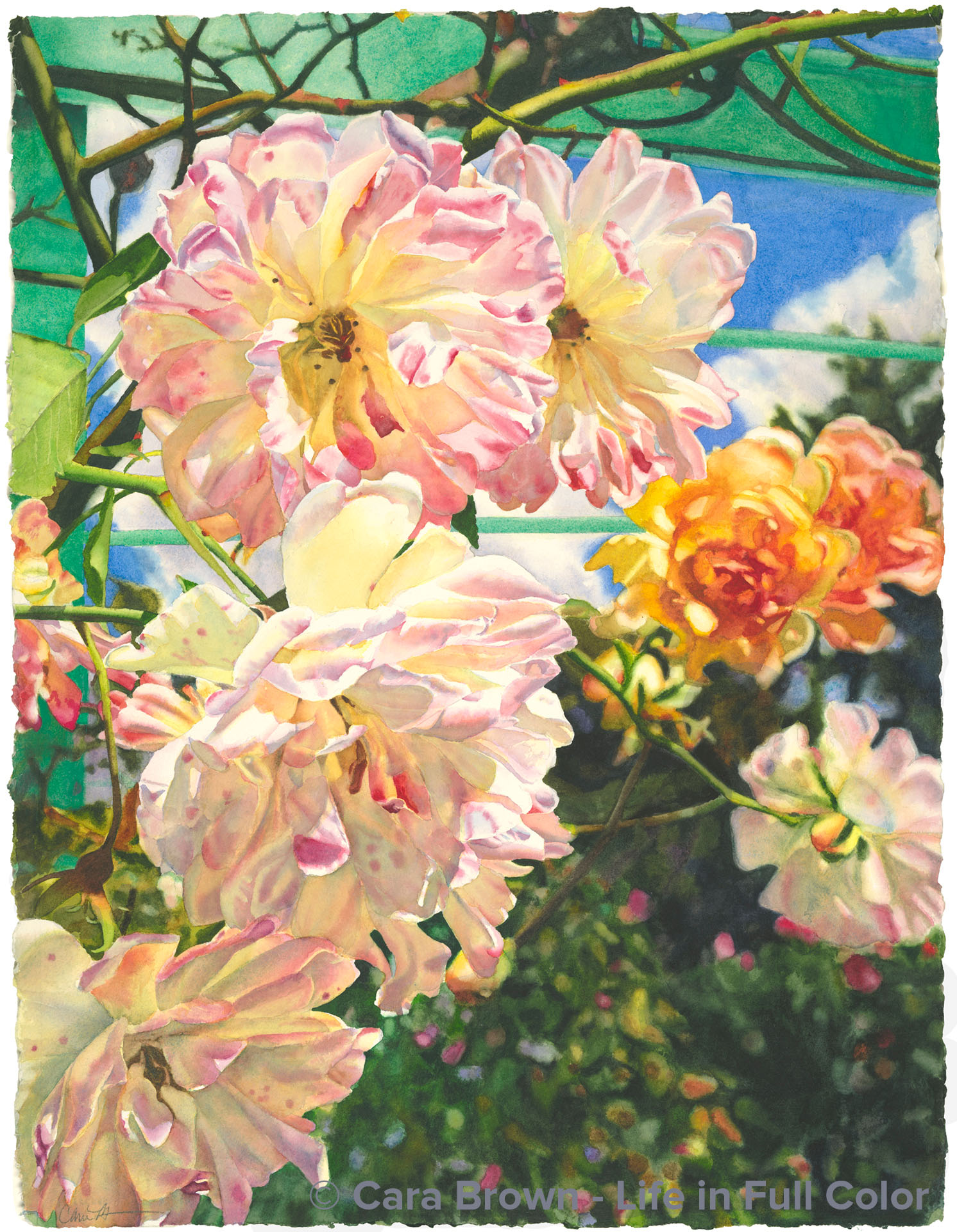
On the last day of the Pilgrimage to Paris I led in 2015 four of us took a day trip to another place of inspiration - Monet's gardens at Giverny. It had been rainy and cloudy all week, but that Friday was spectacular with blue sky and puffy white clouds. My previous two visits to Giverny were both in the springtime, so I wondered whether there would still be much in bloom in autumn. I was happy to discover there was plenty of color - with dozens of varieties of dahlias at their peak, as well as the beginnings of fall color in the big, established trees that surround the lily pond.
So what did I need to paint first? Roses, of course! I'm pretty hopeless in my devotion to them. These late-season blooms were cascading down from a vine on the large turquoise arbor-like structure in the part of the garden towards the house. They had arranged themselves in a lovely composition and the splashes of color and rich greens in the background were a nice contrast to the delicately colored petals. The deal was sealed by the blue and turquoise in the colors of the arbor and the sky.
When I paint I'm more of a mixer of color than a layer-er. My brush hits different wells on my palette bringing various colors to a spot in the middle until I come to the color in my mind’s eye. But the shadowy parts of these roses told me to try something different. I was concerned that if I mixed too much I might end up with dull, dead colors. So I decided to layer using just three paints: a rose, a yellow and a soft blue.
I painted in that order: I first laid down rose where I saw it - either on its own or under yellow. Then where I saw yellow, then blue. There were a few places where I just had to mix - the dark neutral browns, but I still used only these three colors to mix - The five central roses were done with strictly three paints.
At first I thought the name might need to be something that would intimate the French connection. Starting with the French word for flower: fleur, I found my way to fleurish, which is cute, but a bit much. When spoken the sound of fleurish is very close to flourish, which has other meanings as an expressive gesture as well as to grow vigorously, which both fit.
May I introduce you to Flourish?!
June-August 2017 - 30"x22" - Watercolor on paper
Flourish
Originals, Roses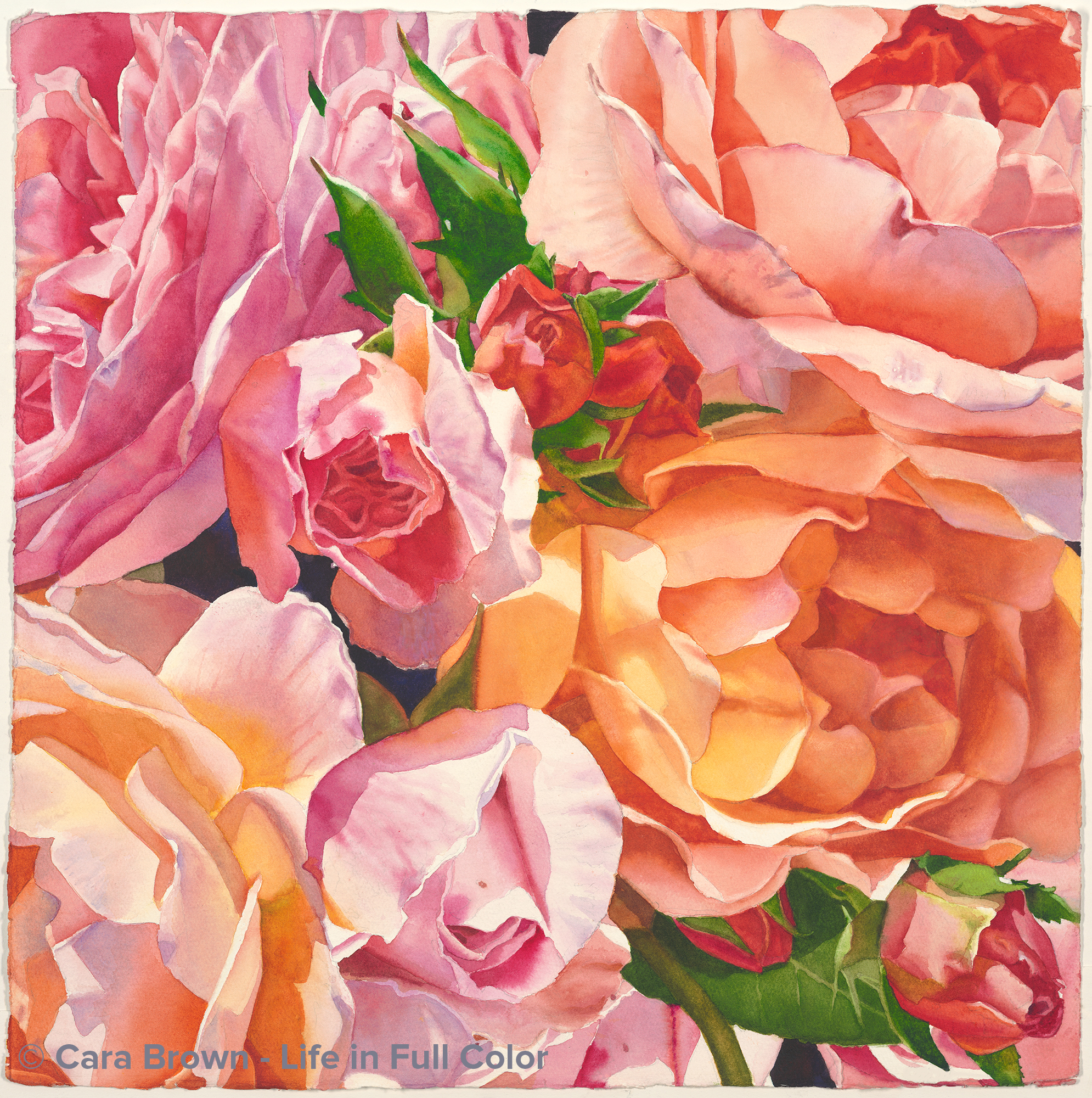
Glee
Original Available - contact me for details
Shop Online for Archival Prints
The wish for some easy, delight-filled painting time during the summer of 2023 inspired this one. Pink and orange are a very favorite color combination. There are no other flowers that get me than roses.
It's another view into the opulent boquet of roses that became Lavish. I squished the roses all in together with Photoshop, since the bouquet is years past. The bush itself is also gone. It didn't survive a garden remodel in Anne and Gary's front yard. These two paintings will have to be the rest of the story.
As is the way with making art in the real world, my fantasies about this being skip-it-y-do-da kind of painting evaporated fairly early on. The mostly orange rose, tucked into the shadow in the center-right gave me fits. I got it too dark and murky. I have come to terms with the reality that as long as I paint, there will be stuff like this I'll be faced with. There will always be parts of paintings I wish I could start back with bare paper. But, this is watercolor and the process has its limitations. Nevertheless, I am happy - enough - with it in the end.
I have no idea where the name came from, exactly. Glee just sounded right. The mood I was hoping for as I painted - and - a combination of harmonizing voices.
Summer 2023 - 22"x22" - Watercolor on paper
Glee
Originals, Roses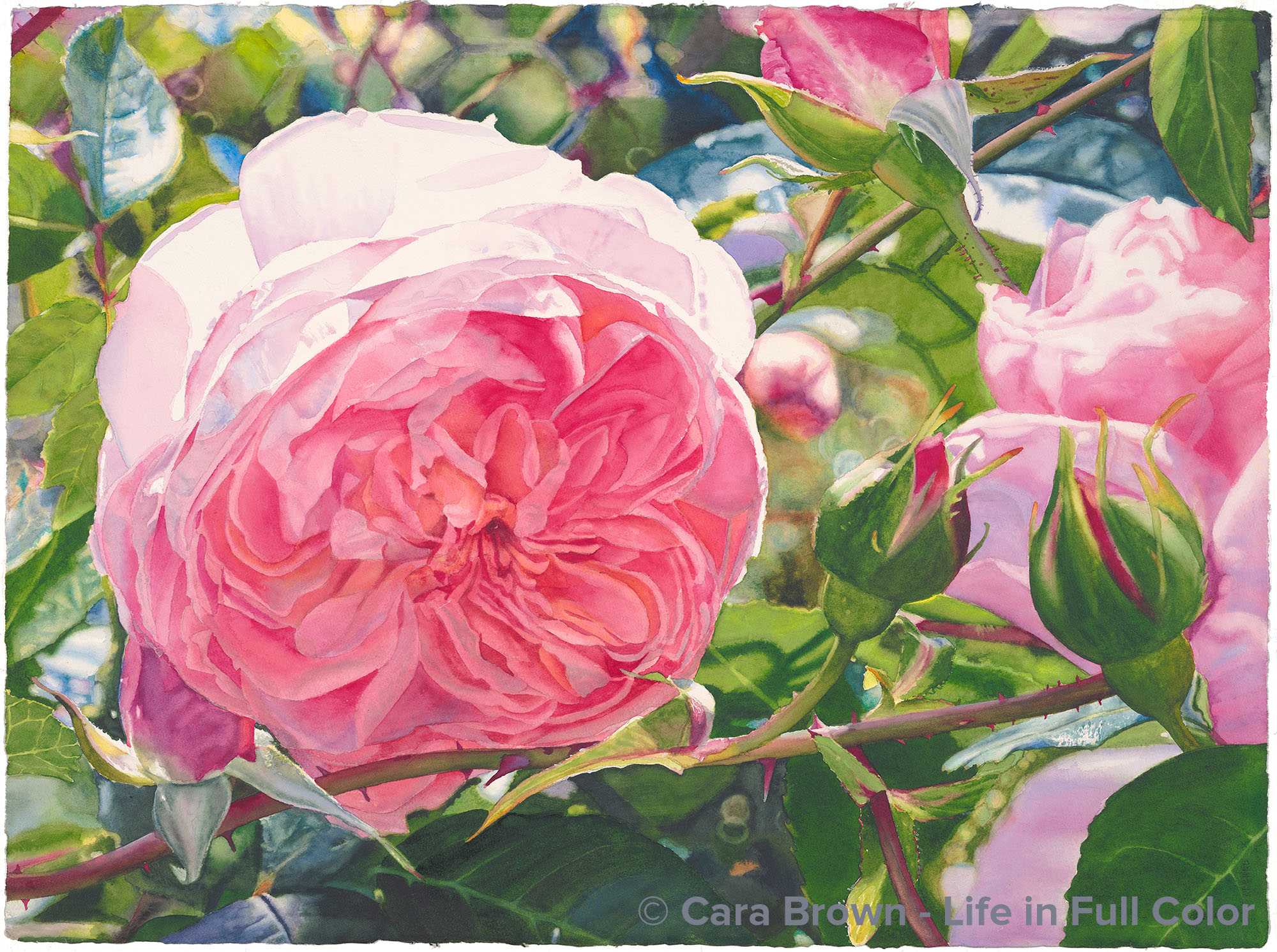
Eve
Original Sold
Shop Online for Archival Prints
These roses grow in a beautiful garden on an estate called Filoli in Woodside, California. Once a private home, it is now in the hands of a foundation that maintains it and makes it available to the public. Surrounded by 16 acres of formal gardens, it’s a parade of glory from the first blossoms in the earliest of spring, through the fall with colorful leaves and fruit hanging from trees. When I was in my 20’s and early 30’s I lived on The Peninsula – south of San Francisco – not far from Filoli. As my first marriage was unravelling, I found my way here and became a member so I could go often. I’m not sure why I didn’t take any pictures on those visits that year, but I do remember the flowers – daffodils and tulips, flowering shrubs – camellias and rhodies, then the peonies and roses along with the annuals and biennials in the cutting gardens: foxglove, delphinium, sweet peas – all the flowers of an English garden. Since I didn’t take pictures, I must have been there to restore my spirit as I faced my uncertain future.
Last May (2015) was my first trip back – 20 years later. Several of the artists in our groups took a trip down to see – and yes, photograph – the flowers. I took several pictures of this one rose – a climber – that was growing back behind the cutting garden cages. There was something about this one – the way the light hit it, the slight down-turn, that grabbed at me. The image needed some re-structuring in Photoshop – there was a bud and one of the leaflets blocking parts of the big rose. When I needed a dose of pink this spring, painting this was just what I needed. The background was fun to paint, one of the more complex I’ve done. Partway through it, I discovered that I had captured some of the chicken wire fence that it was hanging on – a welcome bit of pattern amongst all the organic shapes.
This is an utterly feminine image and painting. I felt a presence – almost that of a female spirit - come through as I was finishing it up, painting the big rose. It was as if I was painting someone’s portrait. The process of naming my paintings can start even before I begin working on them. With some of them, I look at images and wonder what I might name the potential painting. As it was with this one - I’d been pondering what to call it for a while. I wanted to name it “Eden” – the lushness and the intricacy - the mother rose with all her buds around her. But there is a variety of rose called Eden - which this is not - and I didn’t want rosarians to think I’d named the painting after the rose variety. I wanted to invite the viewer all the way back to that first garden. It wasn’t a big leap to go from there to the name we’ve given to that first woman, who inhabited that garden.
I present to you “Eve,” in her garden.
April 2016 - 22"x30" - Watercolor on paper
Eve
Roses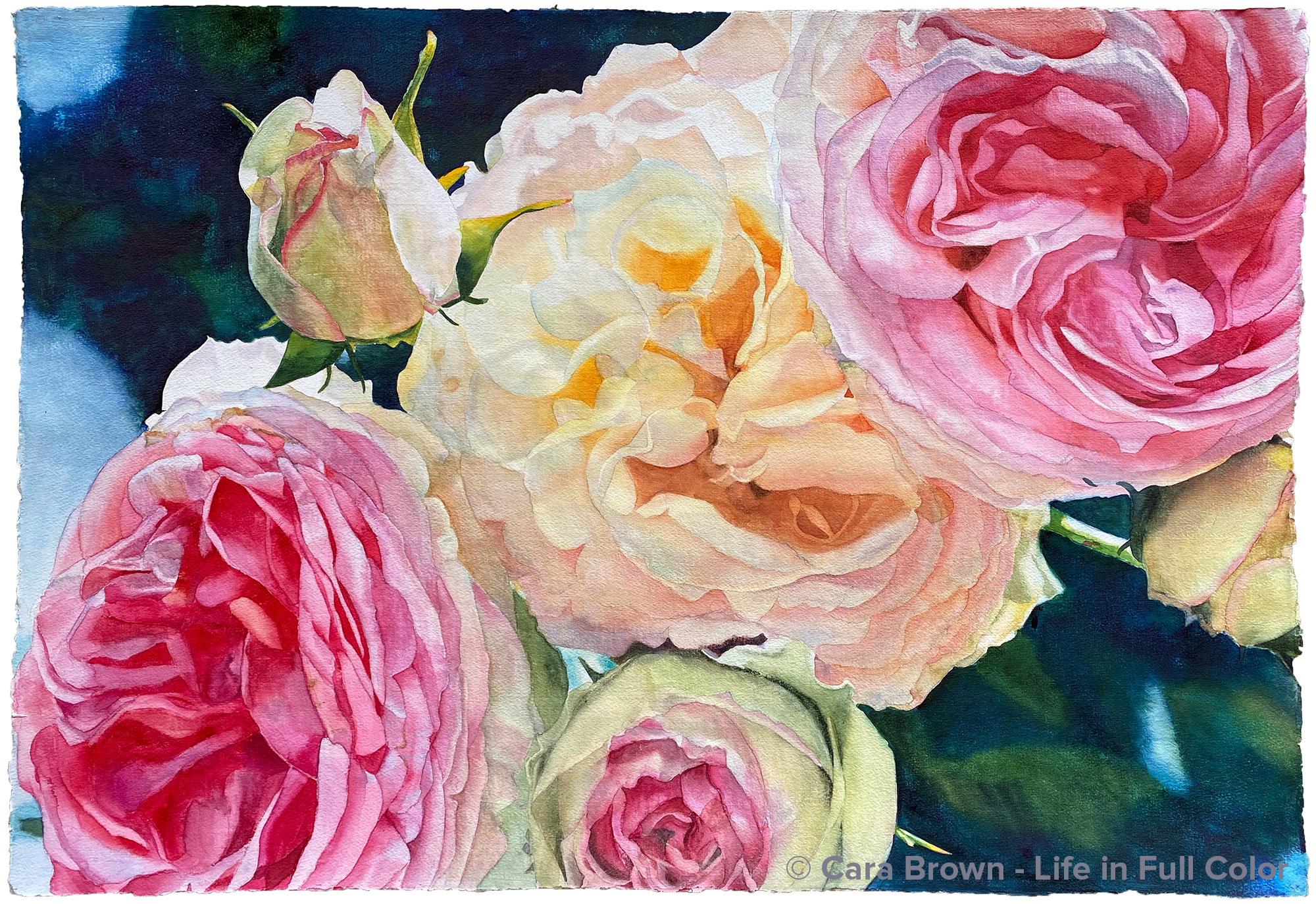
Love
Original Sold
I've decided not to make reproductions available for Love since there are prints still available for Paris Roses, my first painting of these roses.
Shop Online for Archival Prints of Paris Roses
The story of this painting is one of two stories that came together, resulting in a painting unlike any other I've ever done.
First, the reference image. I’ve never had any interest or energy for re-painting an image. Plenty of artists revisit the same exact subject many times - which can be instructive and interesting. Yet, for me, after I’ve finished a painting, regardless of whether I think I could have done a better job, I’m ready to move on to the next thing. We've already covered that territory, says my muse.
Except for this image.
This photo was taken one afternoon in the rose allee in the Jardin de Plantes on a trip to Paris in 1998 with my friend Karen Nugent. I cropped the right side a bit and painted it on a full sheet in 2005, calling it Paris Roses. It continues to be a favorite of many who are familiar with my art.
A decade later, in a search for something to put behind the image of my silhouette and the Musee d’Orsay clock, I ended up back with this image, resulting in the painting I called Eternal. Though I experimented with several other images behind the clock, none sang like this one - maybe because the two images were captured on the same trip to Paris with Karen. This painting is now the third - and I'm guessing the last - time I've portrayed these lovely roses and buds.
Now, the story of the sheet of paper.
In the late aughts I took an evening class at the College of Marin, from Chester Arnold. I had a yearning for a mentor and he had a great reputation as an artist and teacher. But the class required that I paint in oil or acrylic. I spent $300 on a complete set of what he said were the best, creamiest acrylic paints so I could see what was in store for me.
One evening I brought in an elephant sheet (41”x29”) of 555lb Arches watercolor paper. Chester enthusiastically suggested that I ought to paint it with gray gesso. Being a faithful disciple, I did just that. I painted it a dark, battleship gray.
I didn’t end up sticking with the class. I was still working during the day at that point and I wasn’t getting enough time painting in watercolor. It felt like I was cheating on my true love, moonlighting with these sticky acrylics.
Now, what to do with this lovely piece of paper – all covered in gray???
There it sat, in the stack of stuff in my studio for months… years…? begging me to answer this question.
My neighbor-friend Lynda Zahn gave me a container of white acrylic gesso as a start - at least the gray was gone. My attempt to paint watercolor on the gesso was hopeless; it just beaded up, the gesso resisting the watery paint. So maybe I’d paint it with acrylics?
More time went by before I got the idea to coat it with the Daniel Smith Watercolor Ground I had around, bought just to play with. This was better – not the same as fresh paper, but it did at least take the paint.
Here’s where the stories merge – a beloved image and an entirely new surface to paint on.
The proportion of this rectangle - made even more narrow because of an encounter with my dog’s teeth on one side - meant that I could bring into the painting the part I’d cropped off the right side. New territory of shapes to cover, including another bud tucked in on the far right.
I started painting it sometime in 2019, but didn’t stick to it. Layering the paint was a big challenge because the surface was hard and the paint didn’t soak in at all. I was missing my velvety cotton rag paper. I really do have a love affair with my medium and its materials.
In the uncommitted space and time, just after finishing another painting, and just before the pandemic hit in 2020, it called to me again. It turns out that working on this particular painting at that time was perfectly aligned with making do with what was on hand, as the world as we knew it was shutting down.
I was far along enough with it - before we all went home for the remainder of the year - for me to share it with the artists in my groups. One Friday morning, as two of the regular artists, Pam and Glena, were just getting settled, I wondered aloud what to name it. My dear Pam said, with a matter-of-fact certainty that caught my ear “you should call it Love."
I wouldn’t have come up with this name, but it works. Love lies right next to devotion in my heart. This painting is nothing if not devotion – to stubbornly refusing to throw away a sheet of paper that could be made useful, and to a lovely image of roses from my soul’s ground zero.
Love, yes, love.
26”x41” – February-March 2020 - Watercolor on gesso-coated paper

Love
Roses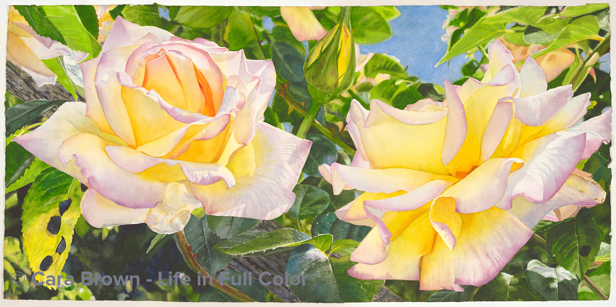
Peace
Original Sold
Shop Online for Archival Prints
This painting is a direct result of life in a pandemic.
In the early months of 2020 the parking lots at the Marin watershed, where we hike most weekends were closed. If we wanted to keep doing so, we had to walk or bike in.
Joe and I took turns giving each other rides up to the trails. A few times I decided to hike all the way home, which meant that I walked through neighborhoods that I don’t otherwise visit – especially not on foot. Walks in Beauty are meant to be actually walks. Being ambushed by beauty is much more likely with our feet on the ground.
One blue-sky day in April - the world was singing of spring everywhere - I was walking back home from the watershed when I was gobsmacked by the largest single tea rose bush ever! It was growing behind a six foot fence at the upper end of a driveway; there was more bush above the fence rail than below, and it spanned the width of two cars. I mean huge!
And… it was a Peace rose. I adore Peace roses. Their delicate lavender-pink-edged, golden yellow petals, stately with their pointed folds, fat buds, and glossy leaves – such a classy rose – and one with a remarkable origin and history.
iPhone in hand and up on my tippy toes, I took as many photos of the lower flowers I could reach, lit up in the mid-morning light.
Then came an email… a lovely person had seen my work in the open studios guide and had been following me for a number of years. It was time to find a piece of my work for over her fireplace. She sent me photos of the other art in the room and the space she was looking to fill. With all of that input, I could SO see a horizontal painting of these yellow Peace roses. We talked and emailed back and forth as I collaged something together for her in Photoshop. She liked the concept and the result I’d come up with. So, I got busy painting.
I sent photos of the painting in progress and she returned appreciation and encouragement. Once it was done we were both excited for her to take it home and see how it looked in place.
But, it wasn’t right. It was too much. My work sometimes is. It carried a lot of energy and overwhelmed the space. Ok… so now what? Well, I’d have to find something else to paint for her - and, another home for this painting.
Part of me was quite disappointed. All that energy, work and expectancy. But I’ve long since known that there are no guarantees with how it goes with art – AND that I am not at all in charge of where my art goes, nor to whom.
There is a line in the movie “The Best Exotic Marigold Hotel” that the Dev Patel character says often. “Everything will be alright in the end, so if it is not alright it is not the end.” I have adopted this philosophy for my life – at least whenever I can remember to! If I take a broad enough view, it’s never failed me.
It turns out the end came pretty quickly and easily. I have a dear friend, Randi. Ours is my longest-standing friendship - we were suite-mates in the El Conquistador Dorm at San Diego State in 1980.
Randi and I had recently begun regular conversations about my work and life. She is an incredibly successful person and maybe the most gifted listener I know. What she hears between the lines and what she retains astonishes me. The current incarnation of her work is executive coaching. And I was benefitting from her very special attention - focused in on me.
Once Randi discovered that the Peace rose painting didn’t work and was thus available, she decided it was the right thing for her home-office. Her beautiful mother Barbara, who is no longer alive, loved yellow roses. And, as I considered the composition I came up with, rather than carrying the spirit of a pair of lovers – (they would be more intertwined), this painting represented friendship - or a coach/client relationship. So off to its new home in New Jersey it went.
Here’s the rest of the Best Exotic Marigold Hotel wisdom: “The only real failure is the failure to try, and the measure of success is how we cope with disappointment. Remember you are everything, or you are nothing.”
The name of this painting was easy. Besides it being the storied variety of this elegant rose, it’s a reminder of the state we can find our way to, or back to, even in the face of disappointment. Because there is no question in my mind or heart – we are most certainly everything. Every one of us.
I wish you Peace.
20”x40” – May-June 2020 – Watercolor on Paper
Peace
Roses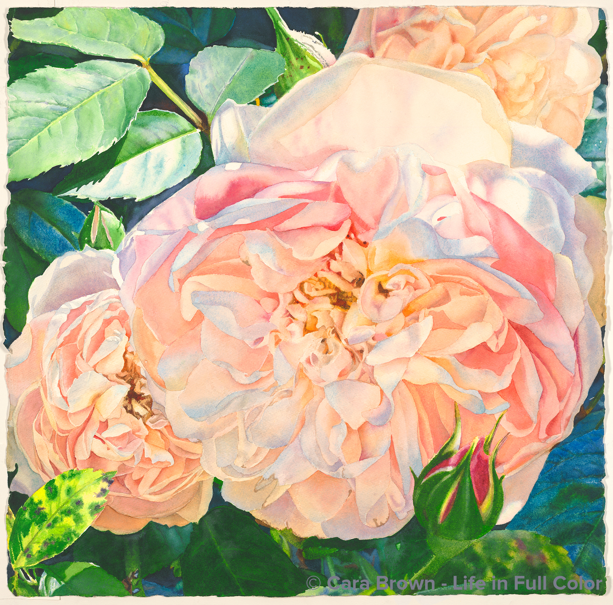
Hush
Original Sold
Shop Online for Archival Prints
“Hush” is “Cherish’s” sister. The rosebushes that inspired these two more recent paintings grow next to each other in our backyard. The images that became these two paintings were taken in the same spring, when I was looking out the kitchen window just as the sun was lighting them up. It seems I just can’t get enough of heartbreakingly beautiful roses.
When the rose painting I called “Peace” wasn’t right for the person who I painted it for, I thought of this image. She loved it, which relieved us both – making me really happy to dive into painting it during our pandemic summer.
The challenge in this painting was portraying its tenderness. This wasn't happening right away as I painted a bunch of distinct abstract shapes with their hard edges. Mid-way it was looking like the dreaded “paint by numbers.” But I kept finding places to soften edges and add shading; it worked out ok.
More than the roses, the artists in my regular groups expressed appreciation for the leaf cluster in the upper left. Funny how it was one of the easiest parts of this painting. Leaves more often than not are vexing to paint. Many of us in my weekly groups find them super challenging – including me. it was lovely that these leaves weren’t - another way in which this painting is about gentleness.
My beloved Sister Mary Neill said about another of my paintings a bunch of years ago that “it didn’t insist.” I feel this way about this painting. It asks for a bit of quiet to really take it in.
I have this thing about associating songs with my paintings and their titles. k.d. lang’s “Hush, Sweet Lover” kept playing in my as I was considering its name. Her song gives “Hush” a bit of sultry romance that seems to fit this painting too.
A gentle request for quiet – “Hush.” Who knows what might come then…
Summer 2020 - 22”x22” - Watercolor on paper.
Hush
Roses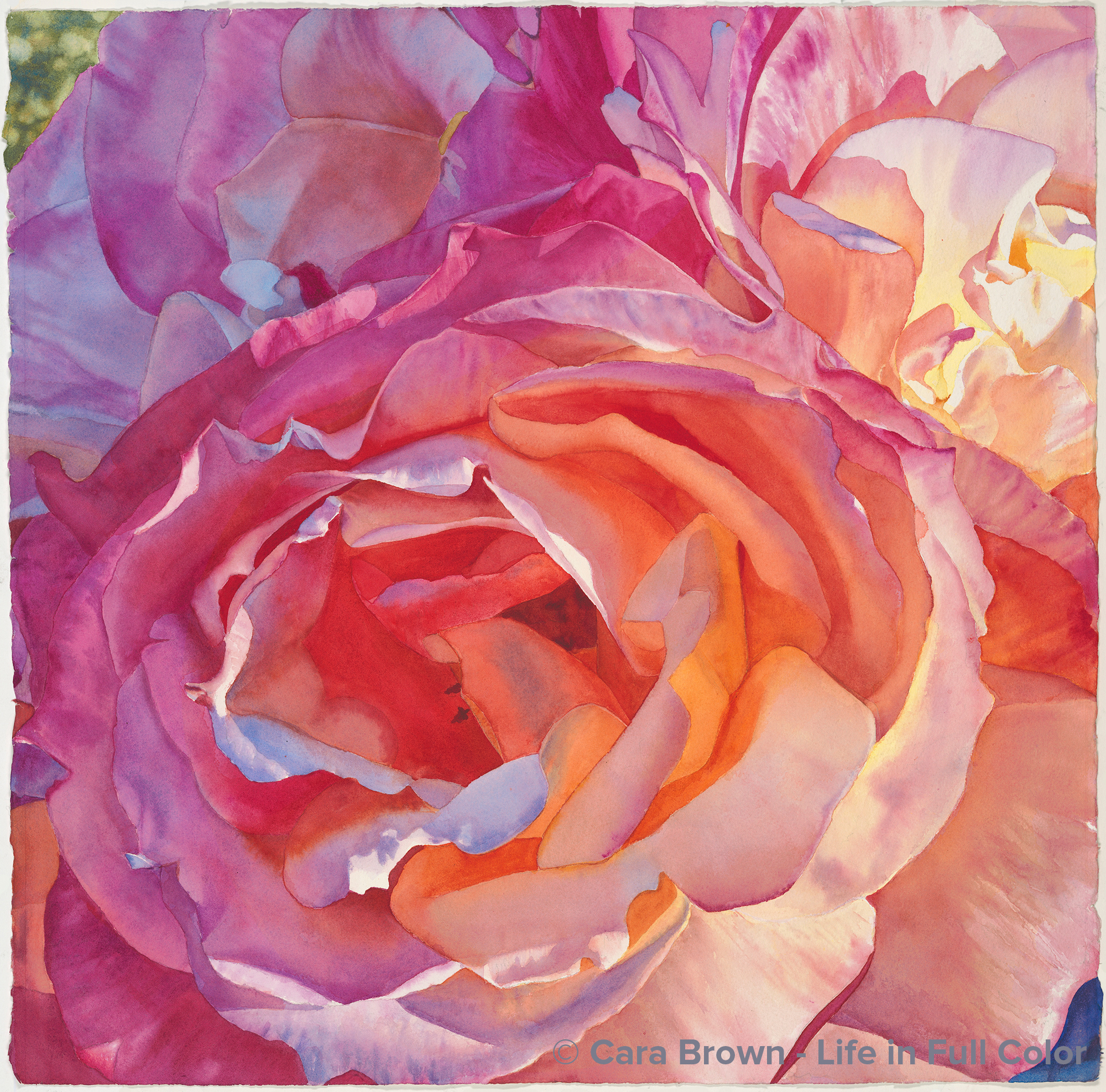
Nova
Original Sold
Shop Online for Archival Prints
This is a “Broadway” rose. It’s a show stopper – with gorgeous color, big fat buds and a heady fragrance. What’s not to love?
I’ve been coddling a set of images I took of a trio of these roses, full and open, taken in the early evening light. They were incandescent in that light, but the composition with the vase I had them in wasn’t revealing itself readily.
When in doubt, crop! Once all the extra stuff was out of the way, the composition landed. Cool, shadowy light on the left, the always-alluring bright sunshine on the right.
In a color workshop I was leading on Zoom in the autumn of 2020, a student, Wendy Buckley asked me if I had to reduce the paints/pigments to the absolute minimum, which would they be? This was easy. I’ve painted with just three pigments in a few of my paintings. Then she asked what if I could add in, which would come next. Nowt this was a fun and interesting question! It sparked an exploration and eventual realization that I actually could do without my beloved quinacridone rose – as long as I had quinacridone coral and quinacridone magenta. Mixing those two together I could make a color that was quin rose! OMG!
For those of you for whom this all means nothing, I apologize for geeking out on color stuff. But this was a major bit of insight! Imagine finding out you could make strawberries by combining peaches and raspberries. I was amazed!
I decided I’d put it in practice with my next painting.
This painting was decided upon because it was the perfect opportunity to do without quin rose. I decided to limit to as few as I could - just four pigments. Besides the two quins, I used my favorite yellow and my favorite blue - hansa medium and cobalt, respectively.
It took a while to complete, as it accompanied my life from the time just days before my dad died, and his celebration of life, through getting the 2021 calendar finished, produced, on the website and then shipped out, and then… Christmas. There was plenty clamoring for my time away from my brushes. A few days after New Years, life quieted down and I found the gusto to dig in and get it done by mid-month.
I painted it in a spiral – starting from the blue-purples in the upper left corner, counter-clockwise around and around to the center. The swirling of the petals had me think about whirling of celestial bodies in outer space. On a Zoom painting session with my dear friends Sue and Lenore, Lenore suggested it was like a supernova. Yes!
Supernova… nova… new (year)… “Nova.”
22”x22” – Winter 2020/2021 - Watercolor on paper.
Nova
Roses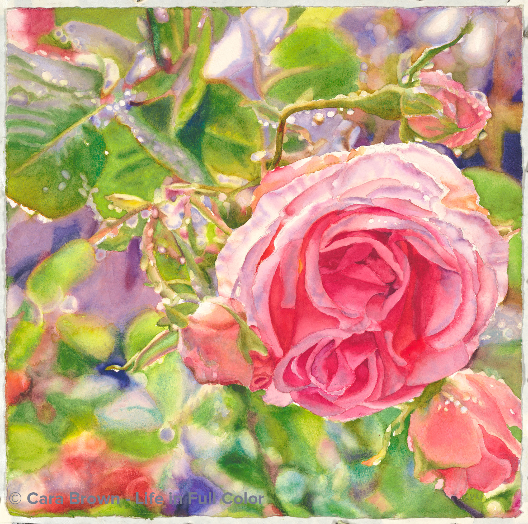
Promise
Original Sold
Shop Online for Archival Prints
Raindrops are magic. They just are. They hang there for a short while – until they either grow heavy and drop, are blown off by wind or dried up by the sun. When there is sun, they sparkle, becoming even more enchanting. We artists are drawn to them – to paint, to capture and store the delight we have for them. This is a New Dawn climbing rose from a vine that grows on our side fence – over by the garbage cans. By growing roses there, even dumping the trash and recycle can offer a glimpse of beauty.
I’ve had this image for a long while. I always thought I’d paint it bigger like four times bigger. But at the start of this year (2016) I made a promise to paint every single day. To help myself keep this promise, I drew this one on a small (15”x15”) square and set myself up with a small palette (about 3”x6”) and squeezed out some of my favorite paints in it. This way I could have something to paint while couldn’t or didn’t want to work on a large painting. I painted on this one in both the SFO and LAX airports and I finished it up along the side of Lake Tahoe on vacation, while I waited for my car to be repaired. In between, it was what I picked up when it was late and I didn’t have the energy for working off the computer on a big one. I painted the whole thing with a #6 cheapie brush plus a tiny scrubber here and there.
I so loved having this keep-my-promise painting that I’ve drawn myself another, the same size. And I’ll use the same palette of colors. I think I’m on to something, a painting that I’m not as invested in, that is more play than anything else. There’s also something about the size – painting small sometimes is a challenge – what I want to paint is usually so detailed. But this felt bite-sized. Small plates are a fun way to eat. I see now that small paintings are a fun way to paint!
January - July 2016 - 15"x15" - Watercolor on paper
Promise
Roses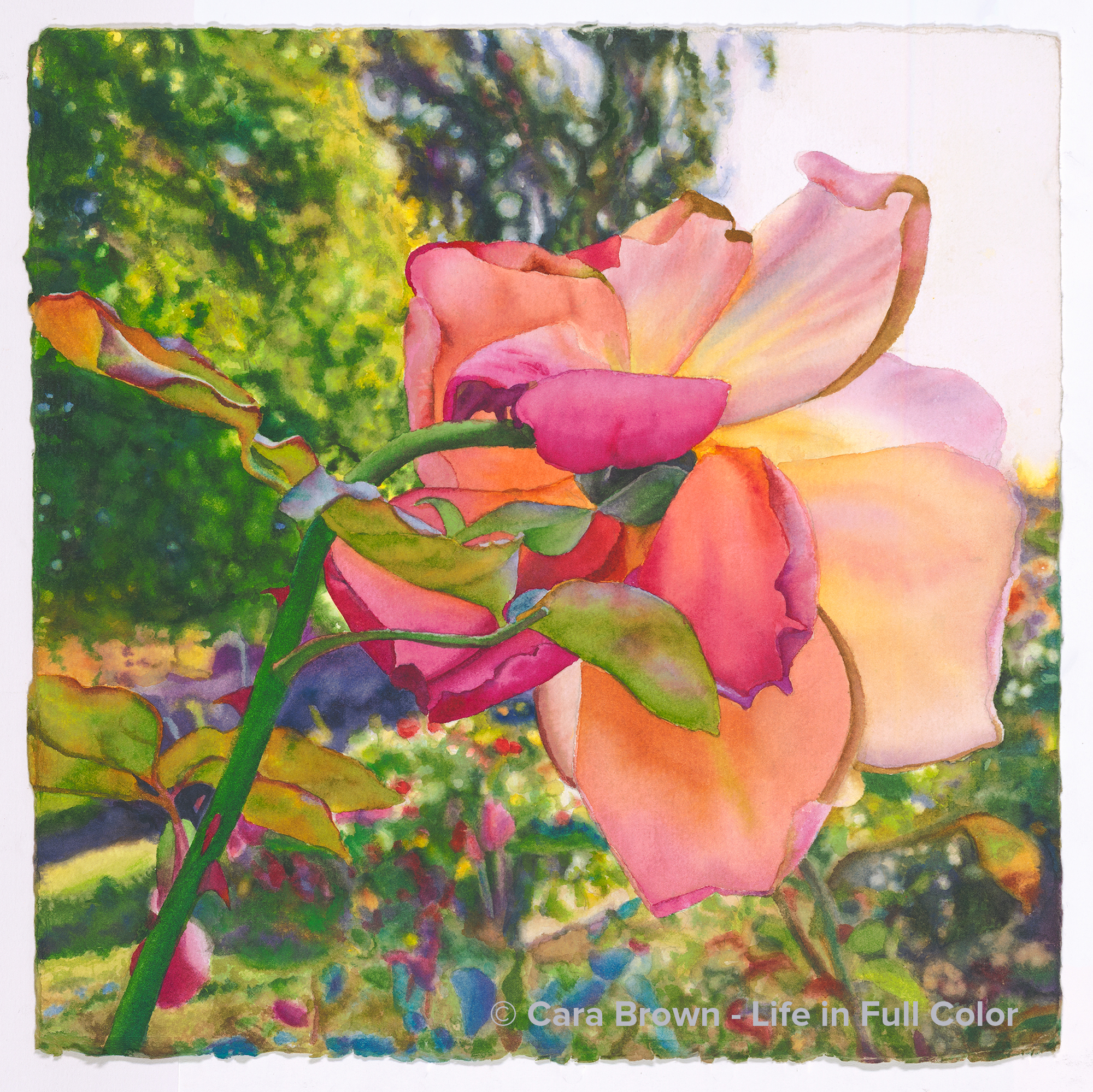
Farewell
Original Sold
Shop Online for Archival Prints
On the way back from a late autumn trip to Tahoe in 2015 we made a stop at UC Davis Med Center in Sacramento. John, Joe’s flying mentor, who had COPD, had gotten sick. It progressed into pneumonia putting him into the hospital with the expectation that he was likely not going to come back from this one. Since I’d only seen John once or twice in passing, I stayed away while they had their time together.
Right next to the hospital was a lovely rose garden, giving me plenty to occupy myself with. Though it was late in the season, and some of the roses were about finished, there were still quite a few that had painting-promise.
I followed a honey bee around for a while – always happy for the prospect of another rose+bee painting. But this was the image that won out. It’s not the first under side of a rose that told me to paint it, but this one had two-tone color, cute curled petals and a crazy-fun - but super detailed! - background to add to the allure.
I started painting at the beginning of 2018, but this one mostly sat on the back burner for two years. I brought out to work on it on only I needed something small enough to paint at the beach on Kauai – that is - until the start of 2020 when I thought: Ok, it’s time to get this one done! We were on Kauai again in January and I added yet more sand to my tiny travel palette as I hopped with my brush around the petals and leaves at the beach.
John left his earthly body a few days after Joe’s visit. Though he was still here when I took the photo, I see the rose looking skyward, following John’s final takeoff. We are all here such a short time, even if we get to live to a ripe age. Never before in my life has this felt more real as it does now, as I write this in June of 2020.
I see this brightly colored, late-season rose as a reminder that we can really live - be really alive - all the way to the end, just as John did.
2018 - 2020 - 15”x15” - Watercolor on paper
Farewell
Roses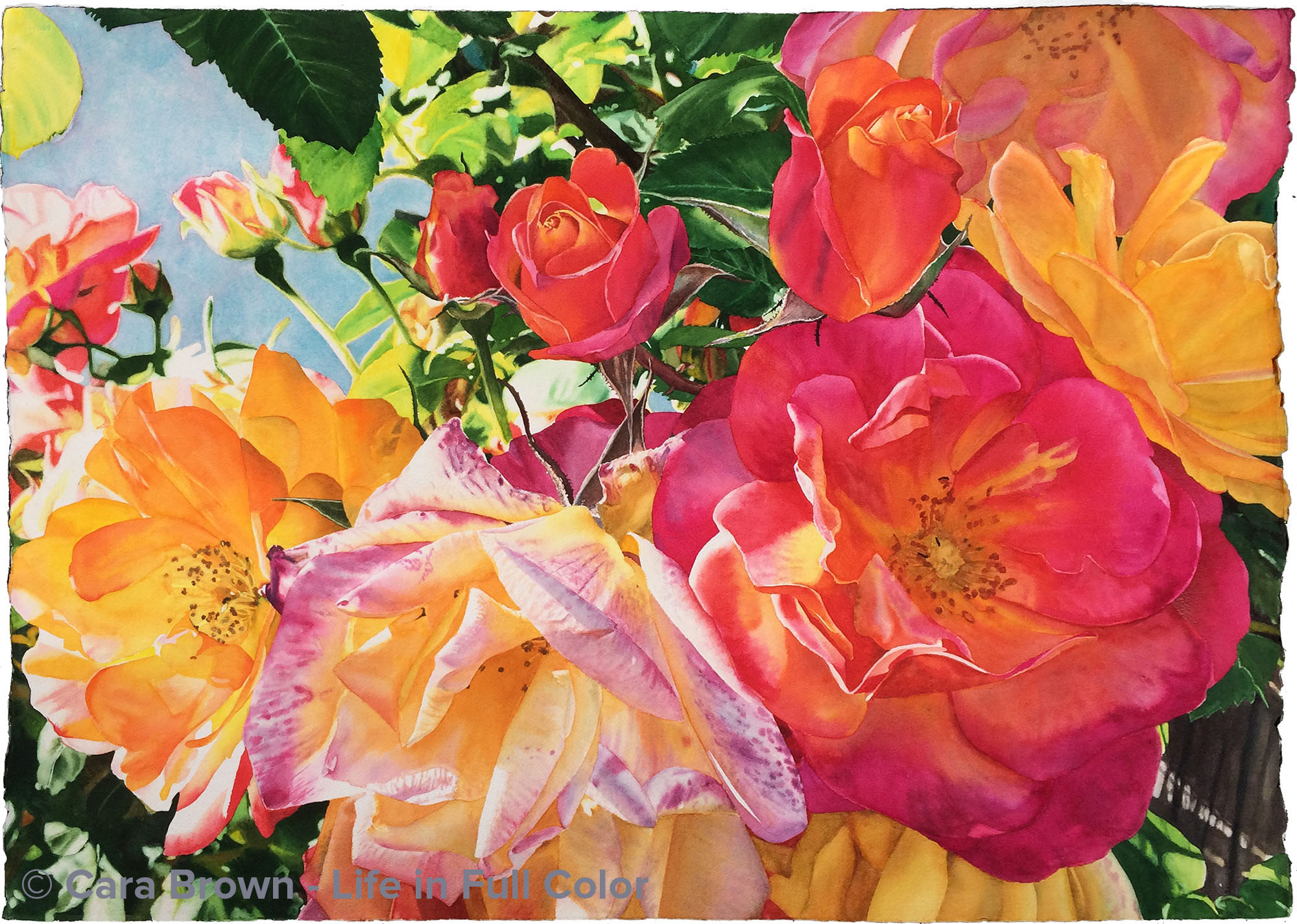
Jubilee
Original Sold
Shop Online
Archival Print Sizes/Prices:
29"x41" - $650
21"x30" - $495
14"x20" - $250
7"x11" - $85
There is a story to how this painting got its name. Nineteen years ago Mary Chapin Carpenter’s Stones in the Road album was the soundtrack to my divorce. The song “(The) Jubilee” met my heart’s desire for my soon-to-be-former husband to come home to “the Jubilee” instead of wandering in the spiritual wilderness in pain. But this is something we can only wish for each other – we each have our own path. Fast forward (very fast) to the summer of 2014, I saw myself as the wilderness wanderer. We were on vacation in Tahoe and the subject came up of an event that I regret more than anything I'd ever done - something I was continuing to torture myself over. The next morining while I was working on this painting and “Jubilee” came up in my playlist.
For the first time, I heard the song being sung to me. I was the one being invited to the land of forgiveness and freedom. Through plenty of tears and a few chuckles, I realized how for more than 50 years I’ve lived this life with a tyrannical compulsion to be perfect, and a fierce resistance to ever see myself as anything less than. If I said or did something wrong, or God-forbid, was human enough to hurt someone, I hung myself from the hook forever. Jubilee is forgiveness of debt, freedom from slavery and a big, huge celebration – every 50 years.
I was asked why I’d included the faded, floppy rose in the composition. Besides it being super fun to paint – all those curls, colors and splotches, it needed to be here. It’s not the “perfect” rose - and it makes this painting for me – it is its soul. The promise of the bud is sweet, and has its place. But the Jubilee really lives in the rose that has lived more of its life and is still connected to a vine that is hanging from a wooden cross (which I didn’t realize until later!) lit through by the evening sun. Today, for me, that’s perfection.
July-August 2014 - 29"x41" - Watercolor on paper
Jubilee
Roses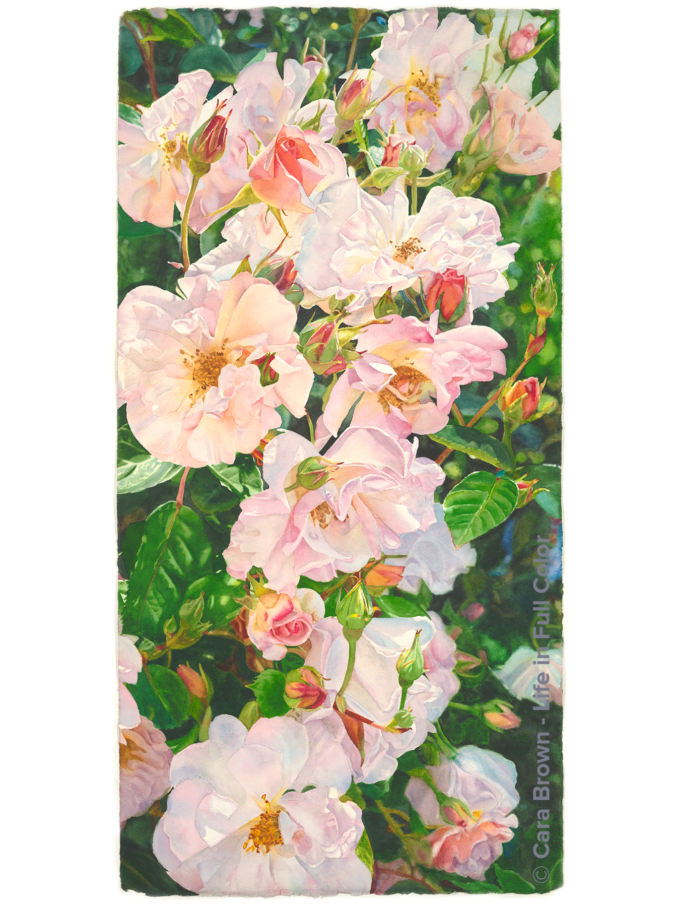
Galorosa
Original sold.
Shop Online for Archival Prints
This is the first of two paintings that came out of a visit to our beloved Filoli gardens in Woodside, California. It was the first Friday in May, 2021. Everyone had been vaccinated so we could gather in person for the first time since the lockdown in March of 2020. A beautiful sunshiny day, spring in full, flourishing bloom, and being able to look right into each others' eyes for the first time in over a year. It hardly gets any better than how it felt that day.
I took a whole bunch of photos of this Sally Holmes rose. One vertical photo looked like a cascade of petals and wanted to be a painting. It was a big Photoshop project before getting it down on paper to paint. There must be 10 versions of the file. I kept going back in to put in antother open center, move a bud, clarify and simplify. I wanted the flowers to take the eye along the length of the painting, with places to linger alonge the way. One of my favorite bits is the downward-facing bud in the lower right. The purples and blues of the shadows along with the peach of the part that is just opening cracks my heart open.
The flower petals are painted with my favorite three-color paint combo: Permanent Rose, Manganese Blue Hue and Hansa Yellow Medium. Mixing with a limited palette brings harmony and cohesiveness to a painting. Plus, it's easier to remember from start to finish which colors/paints were used. I did not paint the whole background first, as I normally do. I painted top to bottom - background, leaves, then flowers. Rinse, repeat.
This is my first 20"x40" vertical painting. This composition is effective hanging on the wall, in the right spot. Viewing it is a full-body encounter with the roses. I think I'll do more in this shape/orientation.
The title is another of my made-up names - a mash-up of "galore" and "roses", with an "a" at the end to bring it a romance language fragrance. Roses galore became Galorosa because Rosagalora seemed a bit much!
May - August 2022 - 41" x 20 1/2" - Watercolor on Paper
Galorosa
Roses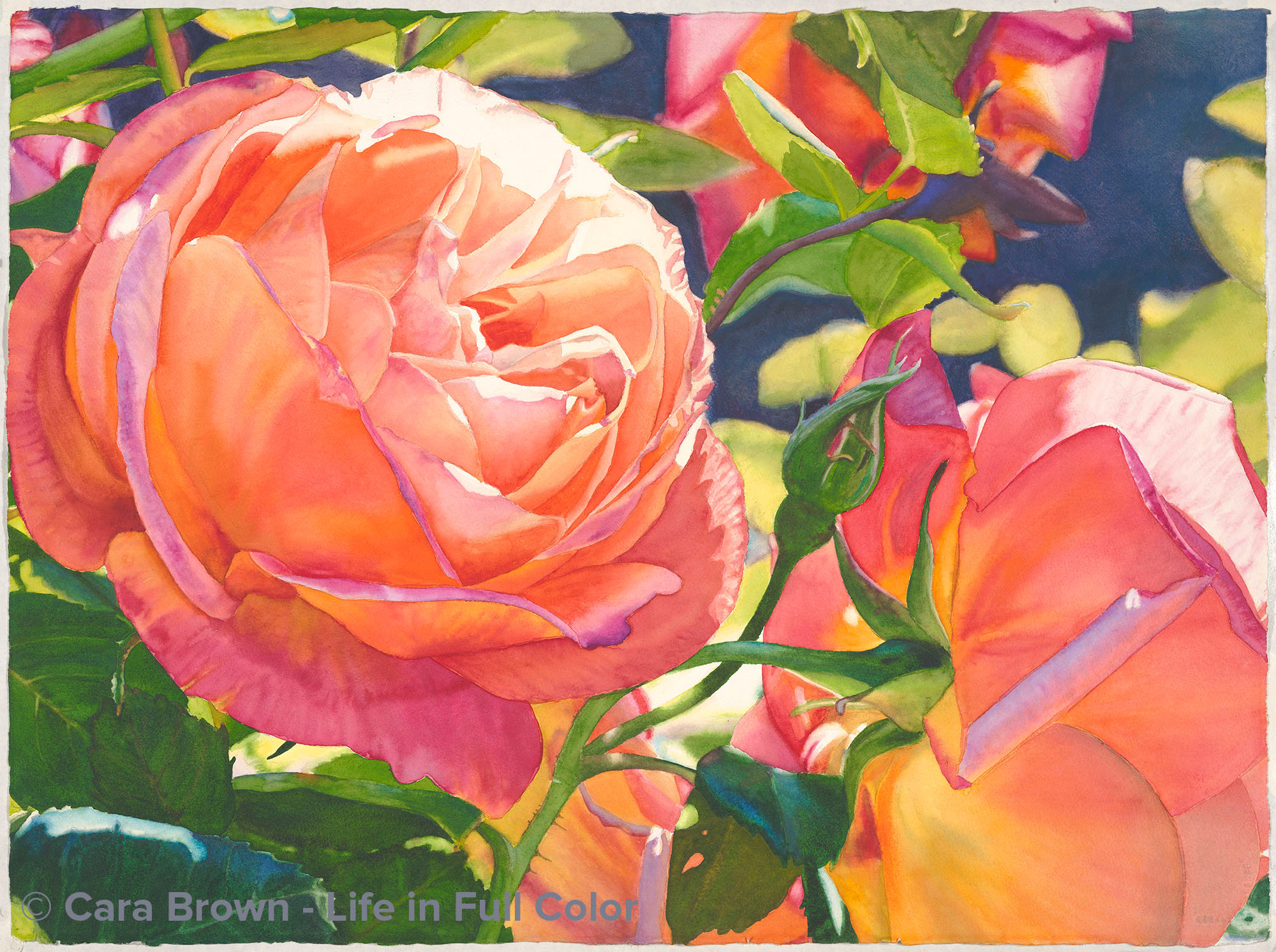
Together
Original Sold
Shop Online for Archival Prints
I was drawn to the tropical-punch colors of these roses that were growing in a dear friend’s garden. Add to that the combination of the back side of one rose - which I find just as compelling as the front – and the ¾ view of another, catching the light just so, and it had to go in the hopper to become a painting.
In the early spring of 2016, my friendship with this friend took a painful turn. Spending time up close with the beauty from her world was consoling.
As I grappled with this sudden shift in my friendship, another friend, Vicki, suggested I say to myself the word “together” whenever I thought of her. She called it a “magic word.”
We are not in each other’s lives. Who knows whether or not there is a relationship for us in the future? Regardless, we traveled more than 25 years of life’s road with each other and have touched each other indelibly.
I’m certain that some aspect of us – of our spirits and souls – will continue to be together in some way, on some plane of existence.
“Together” is the perfect name for this painting.
June-August 2016 - 22"x30" - Watercolor on paper
Together
Roses
Firelight
Original Sold
Shop Online for Archival Prints
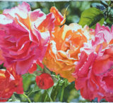
This painting has quite a story. I’ve written a whole post about it so I won’t repeat it all here. Briefly, I started it on a trip to Kauai in 2013 then abandoned it until early in 2015 when I realized it needed a color scheme change. What was mostly red turned into a lot more pink and orange, making me much happier.
Then in November 2015 it went through an entire background transplant, requiring lifting the dark background that I’d started with and putting in leaves and “light bubbles.” This meant using gouache – since I’d lost the white of the paper – to paint the leaves in the upper right. This gave me a whole fresh appreciation for the way watercolor on clean white paper transmits luminosity. I so love this medium!
I finished it on the second day of 2016 – over two and a half years since starting it. And in doing so, I’ve no longer got any in-progress paintings awaiting my attention in the studio – at one point there were four of them! It seems some pieces of work just have their own timeline. The name for this one, like the one before it – Juicyfruit – simply came to me, without any apparent meaning. "Firelight" just sounded right.
April 2013 - January 2016 - 22"x30" - Watercolor on paper
Firelight
Roses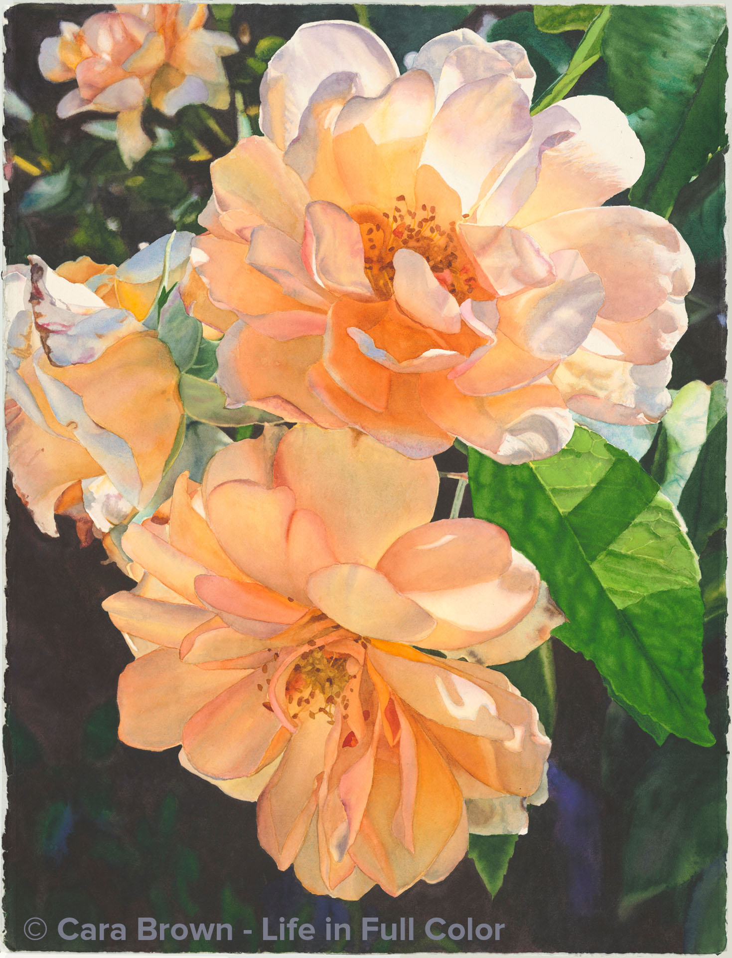
Dolce
Original Sold
Shop Online for Archival Prints
These were little roses – no more than 3” in diameter but the way they were touched by the sunlight, I had to make them big. As I was painting , it occurred to me that this is the first painting I’ve done whose origins were from Italian soil. I’ve painted France quite a few times – flowers, food, scenery – from Paris, the countryside around Paris, spots in the South of France. I can speak decent French and feel like I was French in a past life, but I also love Italy …almost… as much. And I have been there nearly as many times – so it surprised me that I’d not yet gotten around to painting anything Italian.
I took this picture in the Boboli gardens which are on a steep hillside across the Arno from the center of Florence. I was there with my sweetheart and our nibbling, Leigh on an afternoon in late June 2017. It was part of a big family vacation that at times included eight other Browns and the Mantovanis - our “Italian family” from Milan. Joe, Leigh and I had 24 hours together – just us - that was one of the sweetest days ever.
We woke up in the farmhouse where the whole gang of us had stayed the previous two nights – all alone. Not a soul on the property deep in the countryside except us three. The people who ran the place came about 9:00 put out the breakfast food, but until then we had the place to ourselves. Late morning we drove to the small town at the bottom of the hill to catch the half-hour (3 euro!) train into Florence. It turns out we had just missed a Firenze-bound train - and once we figured out the schedules (without any attendant in the station), we realized that the next train wasn’t coming for another whole hour.
None of us were at all upset about it! Leigh and I walked from the station into town and found a place to buy panini and drinks and went back to join Joe sitting on the bench at the side of the tracks. We spent the hour listening to the quiet of the small town, talking a bit and enjoying the sun on our faces, until the train arrived. It would have been so easy to be upset and agitated that we were “wasting” an hour that we could have spent in Florence. But it wasn’t that kind of day.
I’ve named a painting “Douce” which means soft, sweet, tender in French – “Dolce” is the same word in Italian. For all he ways it can be frustrating and chaotic, isn’t there something undeniably captivating, alluring, so special about Italy? It just has to be la dolce vita.
February 2018 - 30"x22" - Watercolor on paper

Dolce
Roses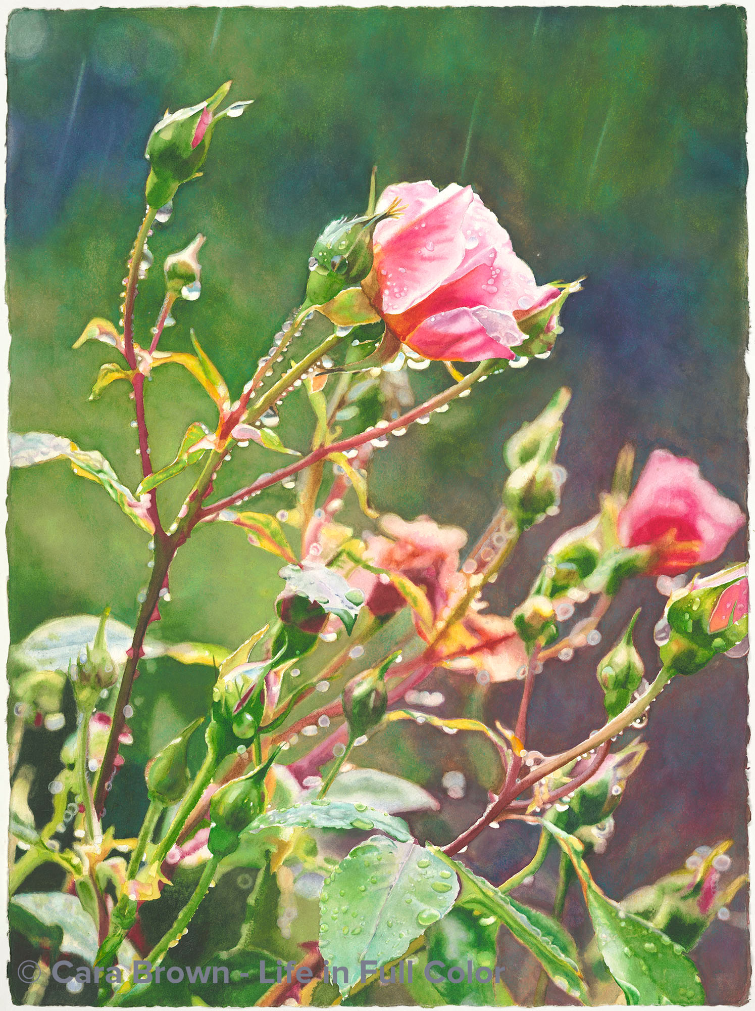
Raindance
Original Sold
Shop Online
Archival Print Sizes/Prices:
30"x22" - $495
20"x15" - $250
10"x7.5" - $75
We generally don't get rain in the Bay Area while roses are in bloom. Though our weather has been anything but usual in the past few years, normally our rainy season ends by March-April and roses come in April-May. The year I took this photo, we had a real downpour in early June. It was a Saturday and I was outside, barefoot in the mud and still in my PJ's taking pictures of the drenched roses. I felt like I was 6 years old! The freedom to get all muddy and wet and in my pajamas, no less! It was such fun.
Deciding to paint this and making the drawing came some time later. My mood was heavy and sad. From this vantage point I have no idea why, but I imagine I was resonating with all the water drops as tears. I think because of this, I've been reluctant re-visit those feelings and hadn't really gotten into this painting. I've started and stopped painting it over several years as it kicked around my studio. One morning a few weeks ahead of Open Studios 2014 I woke up with the thought that I didn't have anything new that I could hang in the Open Studios gallery that was small enough for the size restriction. I thought of this one and decided it was time to finish it.
Since the drought we've been experiencing with 2013 being the driest year on record, we've all been talking about doing a rain dance to get the skies to open up. It occurred to me that I, along with most Californians, had a new relationship with rain! These drops are not only tears consoling a broken heart, they are life. A rain dance can be the freedom of childhood, drenched by a spring rain, as well as a physical prayer for the environment to provide our life-bringing water supply. Miraculously, this spring we did get enough rain here in Marin County to fill our reservoirs and take us out of peril. Though our hopes are not always fufilled, this is a reminder that sometimes they really are.
April 2014 - 30"x22" - Watercolor on paper
Raindance
Roses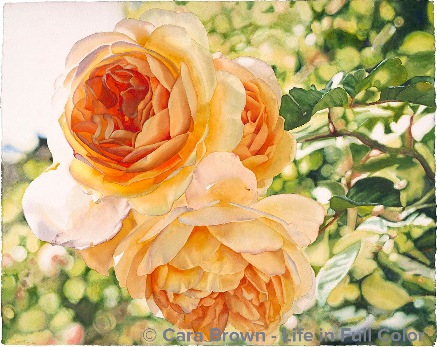
Blossoming Hope
Original Sold
Shop Online
Archival Print Sizes/Prices:
29"x38" - $650
24"x30" - $495
16"x20" - $250
8"x10" - $75
Another large painting! These Graham Thomas roses grow in the same garden as the Persimmons. I was in Jen's garden down the street later in the afternoon one day early this summer to take photos of her Queen Anne cherries - (another painting on the way!). This one had to come first - I had really been missing painting roses. I began working on it mid-September after recovering from the late summer festivals. I finished it the night after the election. It is so filled with my desire for fundamental change in our world - and the anxieties that cropped up before really knowing who would be our next president. It expresses the hope bursting inside me for what's possible for our world.
November 2008 - 29"x38" - Watercolor on paper
Blossoming Hope
Roses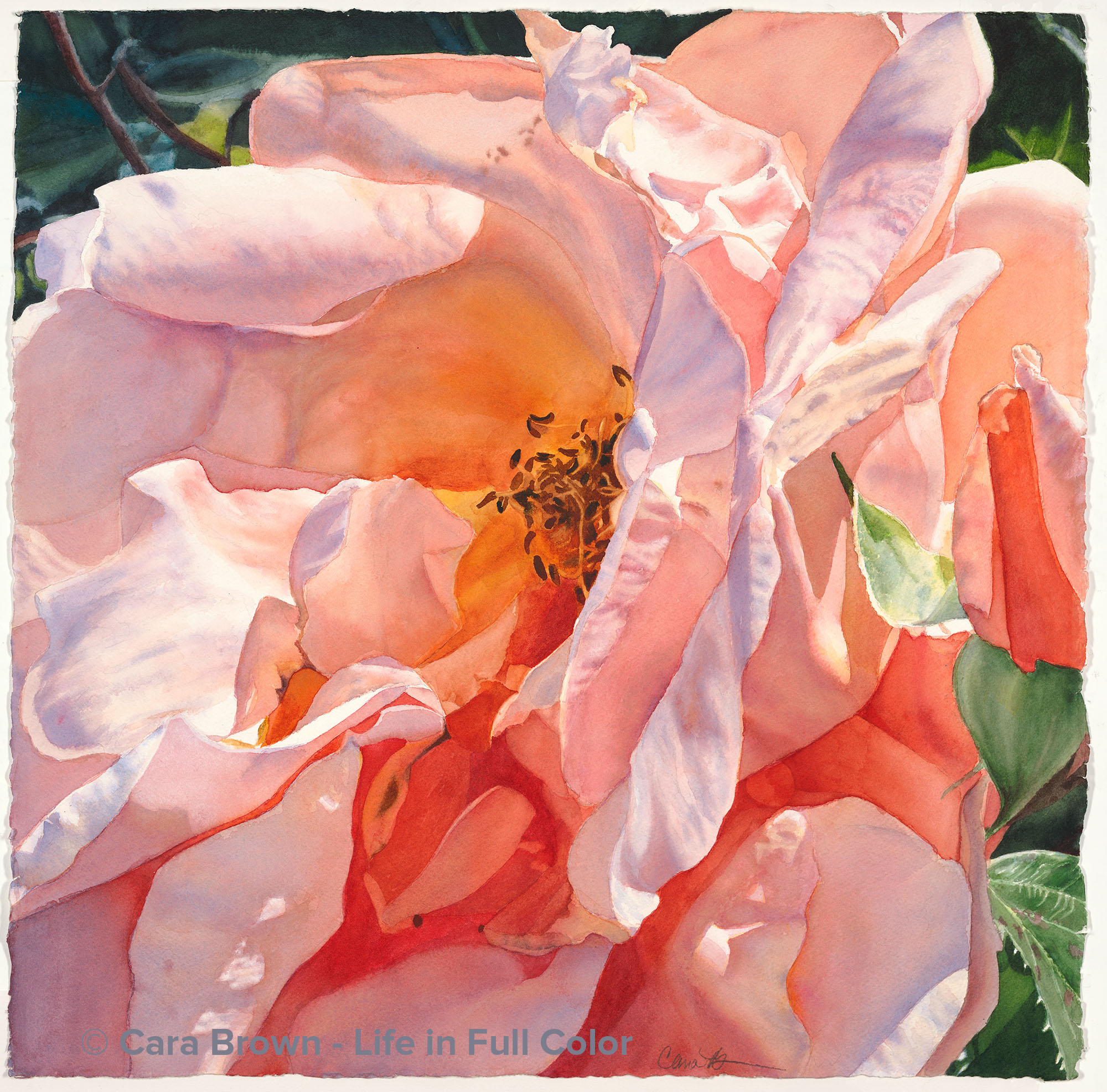
Cherish
Original Sold
Shop Online for Archival Prints
You know those moments when everything stops, for just a split second? This painting started like that. Our kitchen sink looks out through a garden window to the back yard into a terraced hillside. It’s big huge hill behind us and it blocks the early morning sun; it isn’t until at least 11am before there is direct sunlight cast on the back yard. It was just about this time – late morning - on a spring morning when my eye was grabbed by the light on these roses. I saw how blue and violet were reflected in the impartial light. What a gorgeous combination with the peachy pink! So much more interesting than when the flower is lit by full sun and all the colors are uniformly warm.
I climbed up the rocks on the face of the retaining wall so I could get to the same side of the rose I could see from the window, lit from the side. iPhone in hand, I took a series of photos of the roses on this bush. The rose variety is called “Abbaye de Cluny” and is one of the Romanticas from Meilland Roses in France. Of course I love that it’s a French rose. I wonder if they’ve actually grown the rose in the gardens around that abbey?
I’ve been wanting to paint a big, floppy, “mature” rose for a while. I love how much character rose blooms have after they are no longer perfect. The autumn of 2019 I went hunting through my photo collection and this one beguiled me. It’s funny how even though I was captured by the rose, the photos didn’t call me to paint right away. Inspiration and the creative process can be quite mysterious!
I’ve been painting more and more with a limited palette. Apart from the background and the greens of the bud, I painted this one with just three paints: Permanent Rose, Hansa Yellow Medium and instead of my usual Manganese Blue Hue, I used Cobalt Blue – one of my can’t-imagine-living-without paints. Cobalt is more violet and makes more pure purples and lavenders when mixed with the Rose. It was fun to use something different.
Along with a collection of photos for potential paintings, I keep a collection (mostly in my head) of potential painting names. It’s an interesting thing to contemplate: what would I paint that would suit this particular word? “Cherish” is one of those names I’ve been holding onto for a while. At first I felt shy about using it for this painting. One of my dear artists suggested “Magic,” which I love, but then the word kept popping up over a few days in a way that I couldn’t ignore.
Apart from being the subject of a sunshine pop song from the 60’s by The Association, it’s a word that I think could use a higher profile these days. Looking up the actual definition I found: to cherish is to protect and care for lovingly, to hold dear and to keep in one's mind. On top of that the root of the word is the same as my first name. Cherish and Cara both come from “carus” in Latin. Cherish came to us by way of… the French language! Viola! It’s clear this one is to be called “Cherish.”
Cherish - 22"x22" - Autumn 2019 – Watercolor on Paper
Cherish
Roses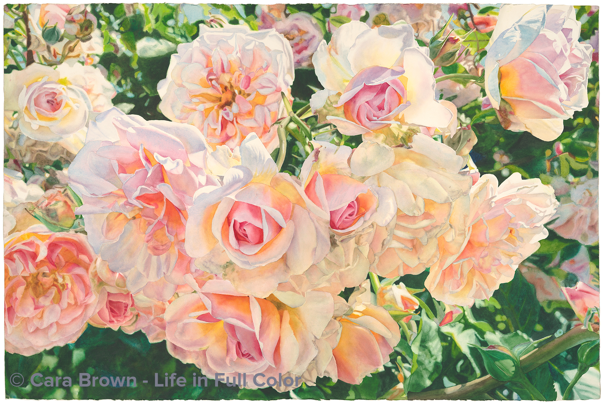
Sherose
Original Sold
Shop Online for Archival Prints
I had first encountered these roses at the Russian River Rose Company in Healdsburg, CA years before they grabbed me. And when they did they would not let me go until I painted them. This ambush happened during a Thursday evening group at the beginning of March, 2018. I had been looking through my photo library for images of softly colored roses to help a student with a painting she was working on, when I came upon it. I first saw the image in its entirey, but needed to zoom in to see what each of these roses looked like more closely. Taking in the light, the colors, the shapes of the rose that is just to the left of the rose in the upper right corner (why that one specifically, I have no idea), and I gasped a bit.
It was as if I was, from that moment, under a spell. This has never happned before. I've been captivated, but not like this. I was compelled! I said to the artists there that evening: "if you need me, please send up a flare, because I just found out that I have to paint this image and it needs some work in Photoshop before I can start drawing it." I knew these softly colored roses had to be a big - 40"x60" - painting. By the end of the evening I had found all the pieces it needed for the composition to come together. I drew it the following Sunday - which took a good two hours, standing there, my back soaking in the projected image, discovering the shapes that would be the bones of the painting.
I told myself I had to first finish "Dolce" the roses from the garden near Florence. It was so close to being done and I'd be happier painting this new one if Dolce weren't sitting there scolding me for not getting it done.
I've painted just one other painting this size - Hallelujah. But this one is more detailed, more involved. It also had a lot of subtleties in color and lighting that were going to be tricky to pull together. In order to support myself in some level of consistency and harmony, I decided to paint it with only four paints/pigments: Winsor & Newton Permanent Rose, Qor Benzimdazolone Yellow, Daniel Smith Manganese Blue Hue and Daniel Smith Phthalo Green, Yellow Shade. Almost every single touch of my brush in this painting contained 2 or more of these colors.
I worked on it faithfully, but not obsessively. Including a couple of weeks away from it while on vacation, I finished it in early June, in time to enter in the 2018 Marin County Fair. I so wanted to be thrilled with how it came out, but I wasn't. I layered thin washes of various colors trying to make myself happy, to no avail. I ended up taking on faith the appreciation other people were offering it. The fair ended up giving it pride of place - on a wall opposite the main entrance. When I walked in to see it, lit up in the center of that beautiful exhibition, I saw it's essence. To fully experience this painting it needs to be seen well lit and from many feet away!
What about this strange name I've given it? "This"? It's awkward and challenging to use a word like "this" as a title, but it's what has come to me as its name! "This" stems from my desire to re-orient myself and anyone in my midst to the feminine, to the beautiful, to the life-giving-ness of nature. This, my friends, This.
UPDATE: Ok, so the strange name turned out to be too strange. It was awkward, confusing and I could never use it to find the files on my computer! So...we've gone back my the original "working title." Sherose is what I first wanted to call this feminine, feminist paiting. Guess I should have stuck with it.
Spring 2018 - 40"x60" - Watercolor on paper
Sherose
Roses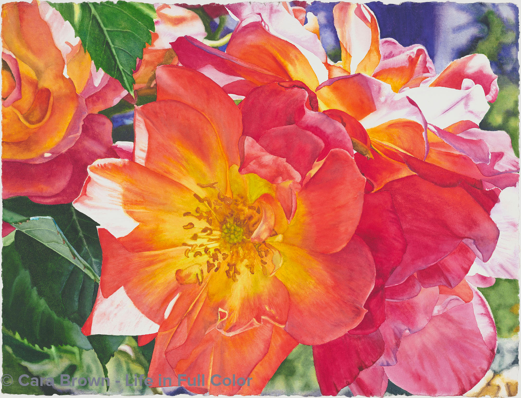
Radiance
Original Sold
Shop Online
Archival Print Sizes/Prices:
22"x30" - $495
15"x20" - $250
7.5"x10" - $75
There must be something about this time of year. Coming out of winter, having just painted something that had more muted colors, just as last year, I crave bright, intense, warm colors. Last year I painted "Awakening," Joseph's Coat roses growing in my mother-in-law's garden in Corte Madera. This year I've painted Joseph's Coat roses growing in my mom's garden in Woodacre. Nice symmetry. Though they are the same variety of rose, the two paintings have quite a different feel to me. The two roses in "Awakening" are both in full sun, opening to the light. The main rose in this one is lit from behind, with the surrounding roses getting most of the light. Yet, they don't keep the light from making its way through. There is a quiet receptivity to this image that gives me peace and is a reminder of that part of me that can be a bit more private and still be radiant. And I was drawn to other aspects of this image - the cobalt blue-violet in the upper right and the deep green leaves. Though there are differences, it does make a nice companion to "Awakening." My two moms and the love of roses I share with them.
March 2012 - 22"x30" - Watercolor on paper
Radiance
Roses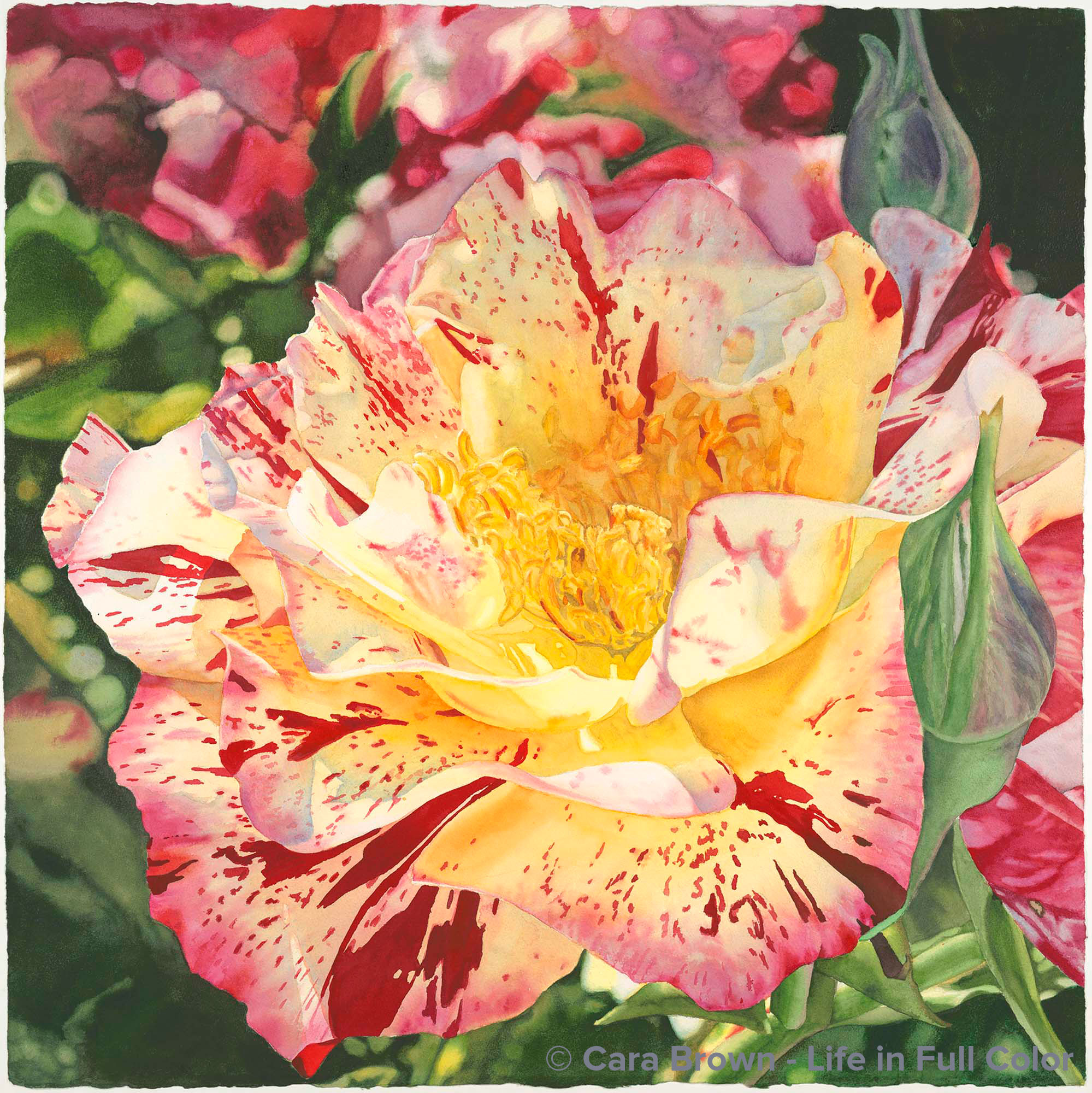
Faith
Original Sold
Shop Online
Archival Print Sizes/Prices:
29"x29" - $495
22"x22" - $395
15"x15" - $195
7.5"x7.5" - $60
I had been doing an errand for my husband in late spring, dropping something by his friend Bill's on Magnolia in San Anselmo. Uncle Bill, as we call him, has a collection of beautiful roses out front, some of them so old their gnarled trunks look like olive trees - and they are beautiful - never better than in May. This one bush was covered with these beautiful roses, splashed with color - and - it was swarming with honey bees! I've been lusting after another image of with bees and flowers to paint, so I snapped away. Alas, none of those with bees ended up being destined for paint and paper, but this one did. I love how the back is in shadow, but the center glows with sunlight. And somehow, this one needed to be bigger - nearly 30 inches square. Though in real life, this flower is only about three inches across, It has so much life, it needed to be blown way up. I finished it on our Tahoe vacation in July. Joe and I sat one morning tossing about possible names - nothing really stuck. When Brenda came over and saw it, she about fell on the floor, saying it made her heart burst open and that I should call it "Faith." Though I wouldn't have come up with that, it just fit for me. Faith is something that I had just been talking about as a theme in my life right now. It took Brenda to put that together. Now I just need her to tell what me she meant by the connection she sees to the Book of Ruth in the Bible. I'm curious about that.
August 20011 - 29"x29" - Watercolor on paper
Faith
Roses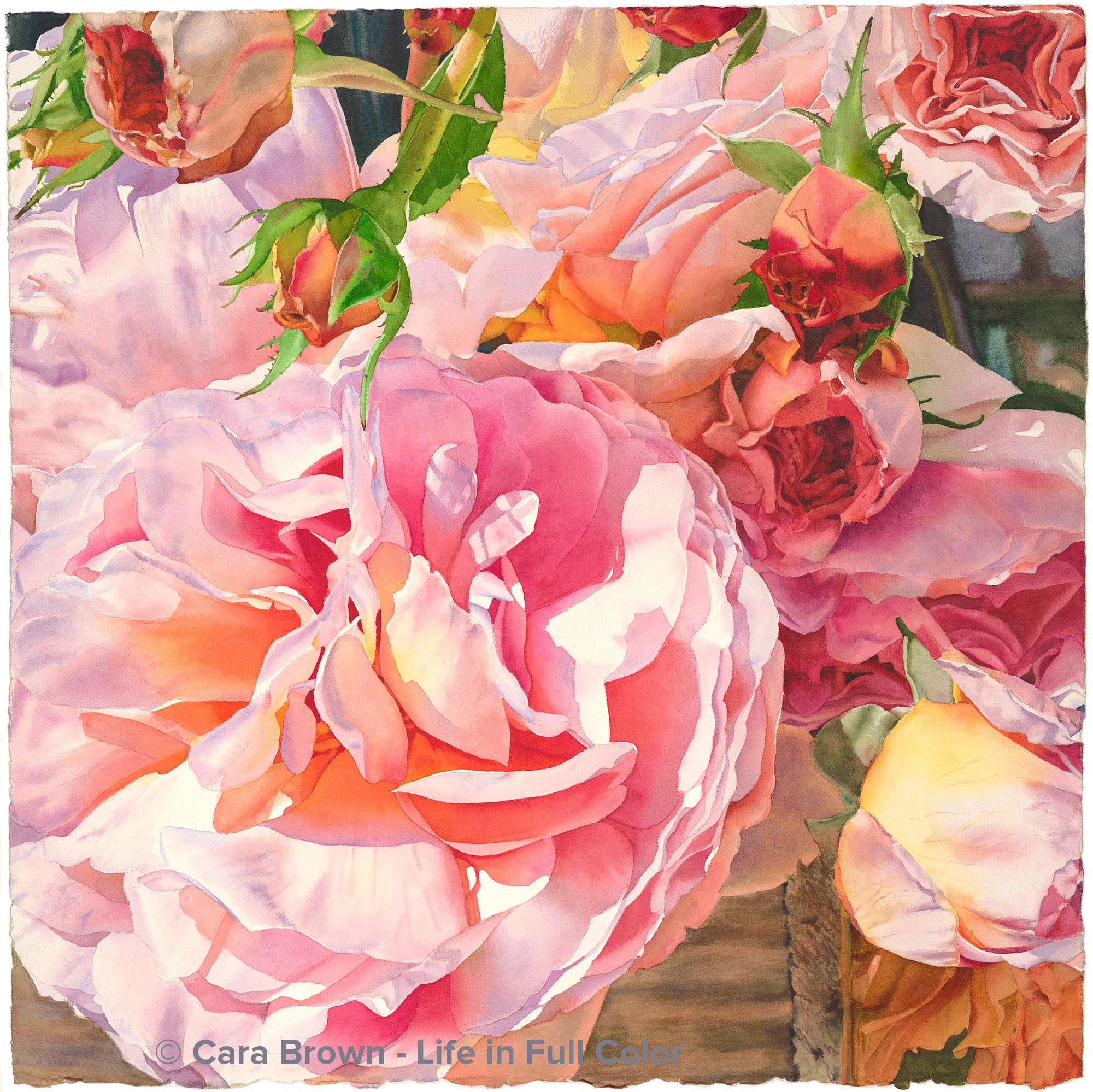
Lavish
Original Sold
Shop Online for Archival Prints
These roses grow in Anne and Gary’s garden, the same patch of earth as the apricots and peaches that I’ve painted. I just looked to see that I took the photo in April of 2014, which meant they were part of that year’s first big bloom. Anne had arranged a cluster of roses and buds in a wooden box-vase and had it sitting on the back patio. I loved the soft colors and old-fashioned-ness of the roses. But I but couldn’t see a painting in any of them – at least not right away. Late summer 2018 I revisited the set of photos, playing with cropping and enhancing the colors, and the potential painting sprung right out! I love it when this happens - like finding a hidden jewel.
I saved the edited image as the wallpaper on my iPad (which I use every day). Every time I opened it my heart melted. I could NOT wait to paint it. First came a commission of orange persimmons and leaves that needed to be painted while it was still winter. As soon as the commission was done, I took a big dive into the pinks, oranges and yellows of these roses.
I painted starting from the lower right, bringing out the buds. And as I did each one, the reaction was strong and immediate – people were drawn right into the centers of them, each a world of its own. When I got to working on the biggest rose, the artists in my regular groups started saying that this was the best thing I’d ever painted. Really? I was loving working with the colors and mixing lavender with my beloved Cobalt Blue, but I wasn’t really certain what it was about this one that was so special.
The story behind this painting is as much about what happens when we keep painting our paintings and our stories change, as it is about the roses, though.
One of my beloved artists in our community was called to claim this one for her own even before it was done. This is not the first of my paintings to find its home this way, but what she said was new. She told me that I put so much more than light, color - more than roses - in this painting. She said there is something else that ends up in my work – and especially in this painting.
I’ve been contemplating what she’s saying. Art contains the consciousness of its maker – our art actually is the manifest form of our consciousness. So then, what’s here?
I’ve been quiet over the past year and a half – especially on the Internet. I’ve not been writing or sharing much at all. Nevertheless things have been shifting inside me. On one hand, this is a given - regardless of what we may think, evolution does not take time off! On the other hand, without marking it by writing, it’s harder for me to see.
Looking around inside, today I find more peace, more acceptance and a certain surrendering to intentionally allowing the waves of life take me where they will. I have been spending a lot of time and energy looking for how I can make stuff happen, already!
More than ever before, regardless of how much evidence there is to the contrary, I can see that pure, simple goodness is just everywhere. I feel that abundant goodness here - the buds and petals in this image are pouring forth, as if a wave in an ocean of roses.
I try to find one, specific word for each of my paintings. I love it when I come upon a word that has layers of meanings. Lavish is one of those words. Some of its meanings have a negative connotation – wasteful, too much, over the top. But I’m going for the mercy, peace and love that are lavished upon us. Lavish is extravagant, lush, given in profusion – all of this goodness showered over us.
March 2019 - 29"x29" - Watercolor on paper
Lavish
Roses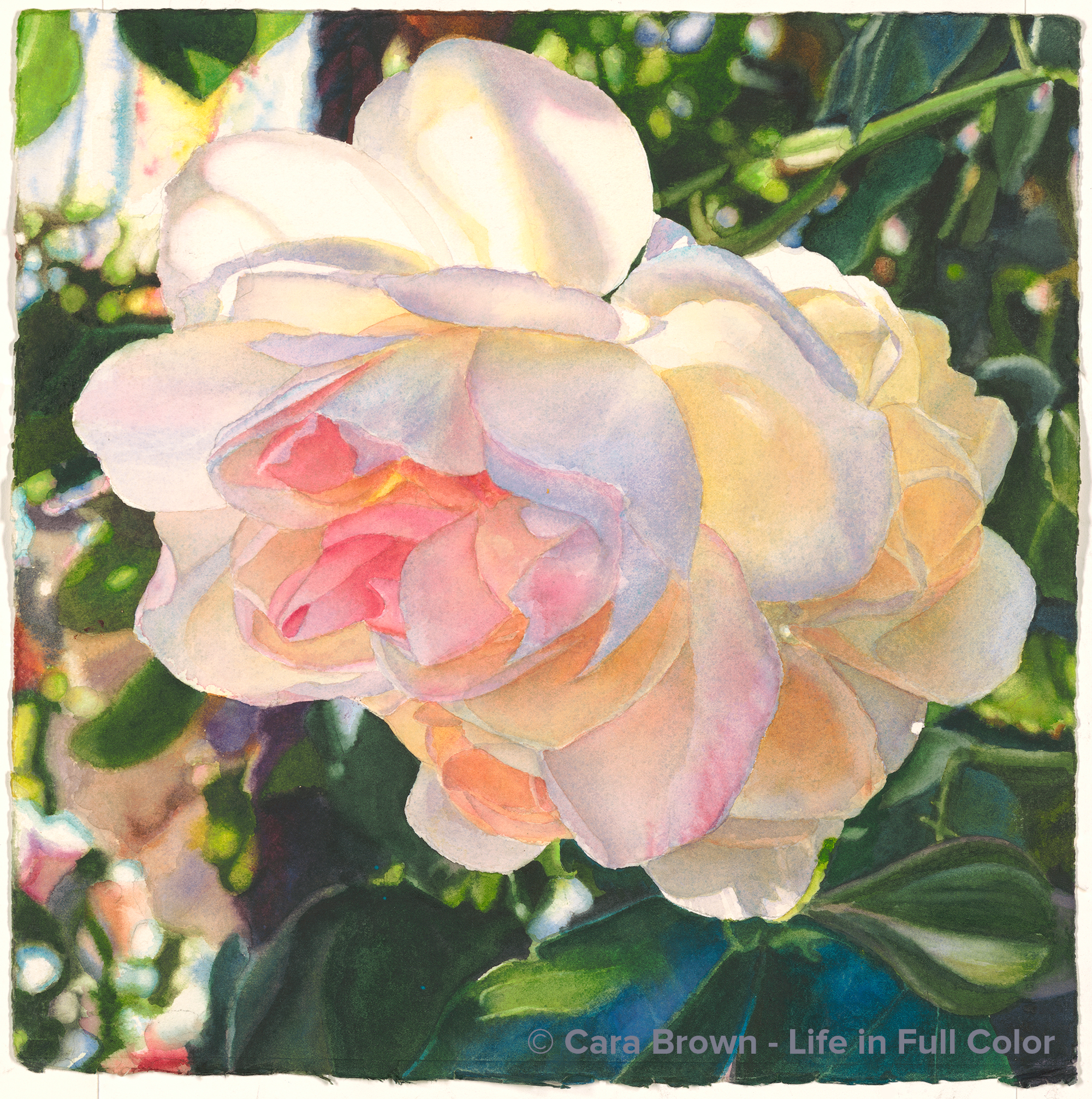
Lullaby
Original Sold
Shop Online for Archival Prints
I took the photo that inspired this painting on the same visit to the Russian River Rose Company that beget my latest “big” painting: “Sherose.” This is the third in a series of smaller paintings (15” square) that I have for fill-in, background, don’t-feel-like-taking-it-seriously kind of painting.
I painted this one, very intermittently, on low-energy evenings, after finishing a painting, and even on my towel at Poipu Beach. It has been set aside for weeks (months?) at a time – only to be remembered when I was going through my portfolio. At one point I thought that I’d not given it enough focus and attention such that it really wasn’t worth really finishing. But I’ve learned almost all of what I’ve learned by finishing every painting – so I carried on. Someone asked recently how I can do what I do and what came out of my mouth applies to this painting. I said “I’m patient and determined.”
I have an every-other-Wednesday conference call with two remarkable women: Maralyn Cale and Lyn Allen. We talk about our lives, our work and the ways in which we and our work are evolving in response to the world. Our conversations are unlike any other I have – and an enormous amount of my self is sourced through them. It was on one of these calls that Maralyn told of singing a luluby to one of her clients who had lived through a lot of trauma. I had been working on this painting the morning of that call and it came to me that “Luluby” would be the perfect name for it.
2017 - 2019 – 15”x15” – Watercolor on paper
Lullaby
Roses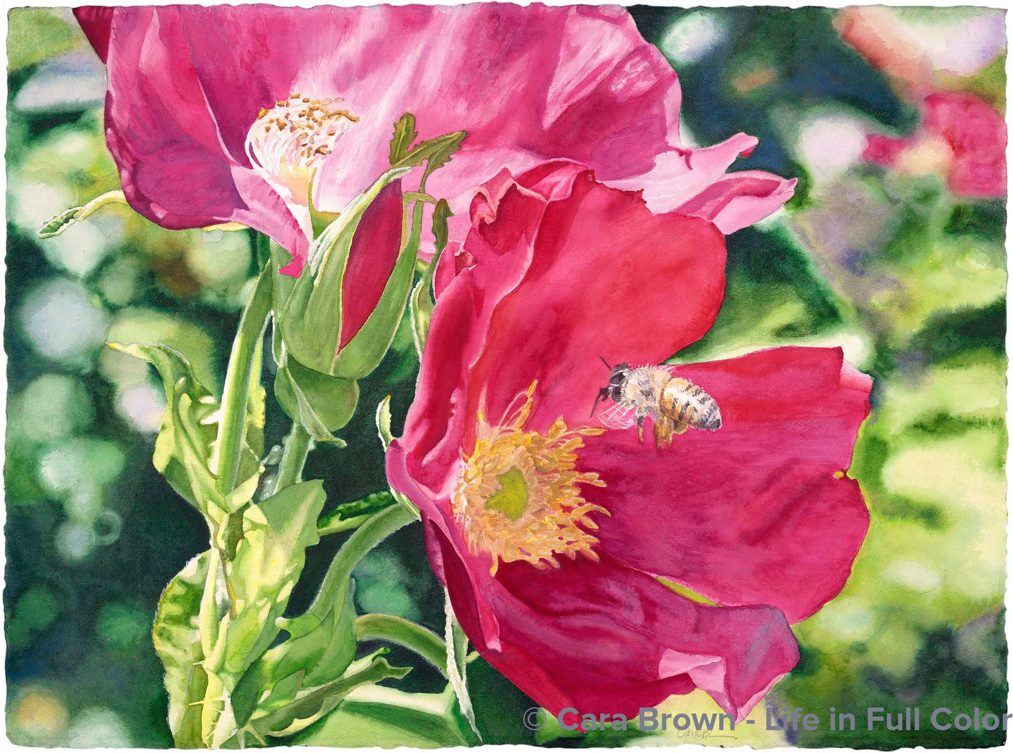
Honey Bee and Rugosa Roses
Original Sold
Shop Online
Archival Print Sizes/Prices:
22"x30" - $495
15"x20" - $250
7.5"x10" - $75
One bright day summer day, as I headed out to our side yard to dump the compost bucket, the color of these Rugosa Roses grabbed my eye. I ran back out with my camera and hopped up on the rock wall to capture the flowers. Some honey bees had come flying around - my heart jumped with delight. There were some images with two bees, but this one, with the solo bee flying into the cupped flower was the ONE I had to paint. This painting came through nearly in its entirety on a 10-day trip to Kauai. The intense color that had grabbed my eye was hard to reproduce with watercolor - and I'd never worked with quinacridone paints so saturated like this. Even dry, they move around easily, making layering difficult -- in every painting I find a new challenge. I painted the bee last - a fun treat. Honey bees are sweet, docile creatures that are the link to our food supply and their populations are dwindling - baffling scientists. This painting expresses my appreciation for them. Next to paint one pollinating a food plant.
November 2008 - 22"x30" - Watercolor on paper
Honey Bee and Rugosa Roses
Roses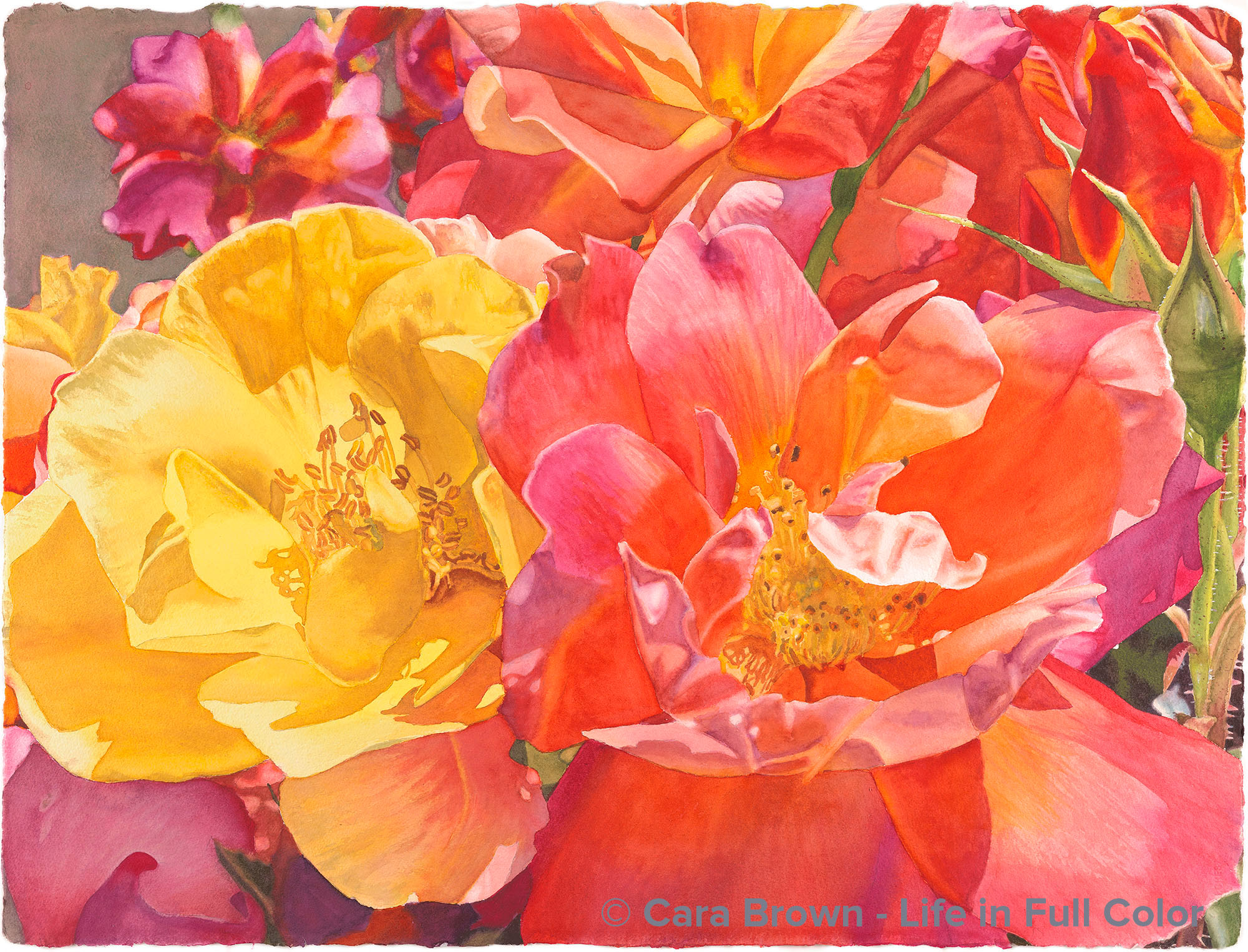
Awakening
Original Sold
Shop Online
Archival Print Sizes/Prices:
22"x30" - $495
15"x20" - $250
7.5"x10" - $75
This painting filled a craving. Once I got the previous painting finished so clients could have a giclee of it, my insides called out to paint with yellows, pinks and oranges. It took just about two weeks from start to finish - pretty quick for me - and it was so much fun! My brush water bucket was the most gorgeous peachy orange color - it looked like it would taste good like some some fruity tropical nectar. This painting reminds me that color is a nutrient - it fills a need that I have - and I know I'm not alone! Yummy is not just for our taste buds and noses! These are Joseph's Coat roses from my mother-in-law Evelyn's front garden in her home in Corte Madera. In painting them, I was struck by how the same plant makes these two incredibly different blooms. Not only are the colors of the petals clearly different, but how the stamens in the two flowers are different shapes and sizes. I gain so much intimate knowledge about my painting subjects in the process of painting them. There is so much we can learn if we pay close attention to what is right here in our midst.
April 2011 - 22"x30" - Watercolor on paper
Awakening
Roses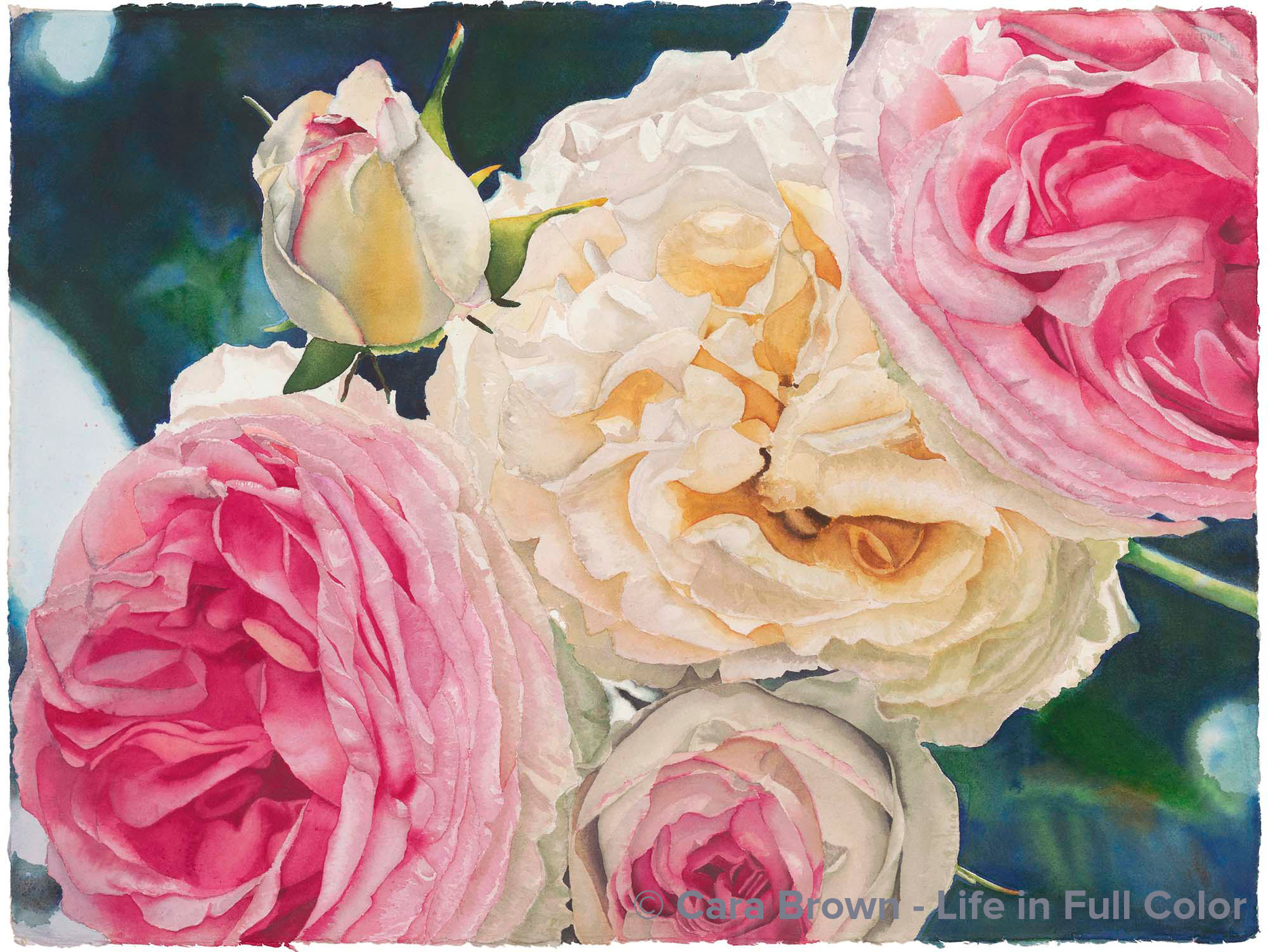
Paris Roses
Original Sold
Shop Online
Archival Print Sizes/Prices:
22"x30" - $495
15"x20" - $250
7.5"x10" - $75
This painting came from a photo I took of these roses that were hanging from a trellis in a rose allee in the Jardin de Plantes on a trip back to Paris, in late May, 1998. This was before I'd really begun painting in earnest. Yet, the photograph stayed with me. I had been wanting to paint it for a long, long time - in 2000, I did a few quick watercolor sketches, which showed me both the potential of this image and how painting these roses quickly was not going to be satisfying. It had frightened me to attempt to paint it - that the finished painting could never express what I felt looking at the image. I started on the yellowish center rose, then left it lying undone for a while. I see now that I had to trust the process. When I came back to it, I just painted one petal at a time. And then it hooked me in - it couldn't wait to get time to work on it. Finishing this painting was a turning point. My courage and work had raised to a new level. This is the second of my paintings to sell. My friend Victoria Bentley bought it because of the way it moved her just looking at a scan of it I e-mailed to her! She said when she saw it, it took her to a place inside that she didn't even know existed. Several years later, David and Cindy told me they would love to have had this painting, never thinking they could. I put this out to Vicki as she had since put her life and much of her resources into her cause in Africa Empower Congo Women. It happened to come at a perfect time when she needed to fund a project. Now David and Cindy have Paris Roses, Vicki has a specially-embellished giclee and children's school fees in Africa have been paid.
December 2005 - 22"x30" - Watercolor on paper
Paris Roses
Paris, Roses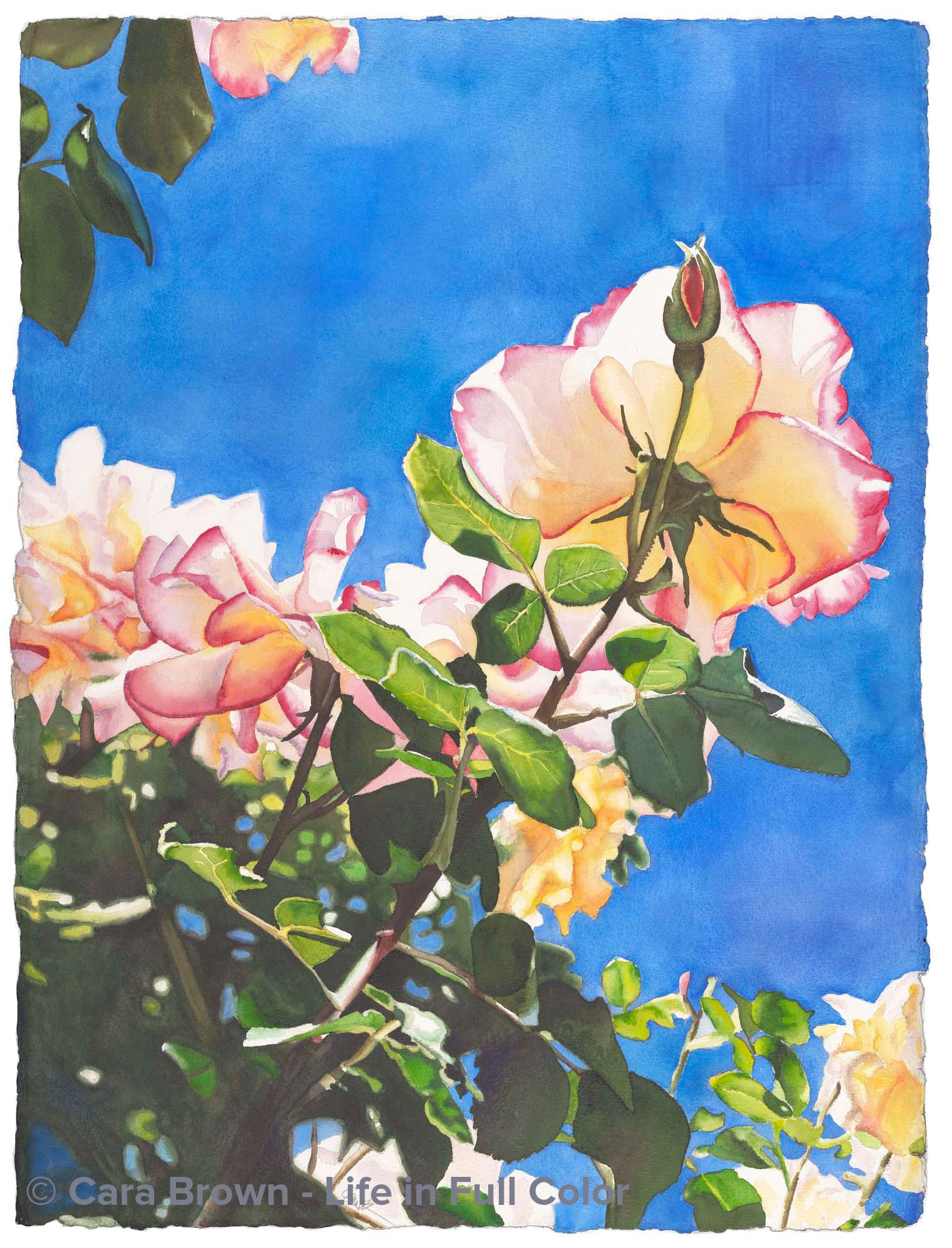
Reach
Original Sold
Shop Online
Archival Print Sizes/Prices:
30"x22" - $495
20"x15" - $250
10"x7.5" - $75
L'Hay les Roses is an absolutely phenomenal and overwhelming rose garden in a suburb south of Paris. I visited it one Saturday in June, several weeks after arriving in France in 1996. It had been gray and cloudy since I'd arrived. This was the first sunny weekend and I was buoyant and eager. The underside of this rose growing skyward caught my eye. I love interesting perspectives. Painting it I kept fretting that it was going to be a too-sweet, grandma painting, ugh. I painted the sky last. I had an awful time getting the even, clear wash I wanted. I was convinced I'd ruined it. Creative impulses were fed by my aghast and frustration. I got a 4" house painting brush out of the garage, moved outside on the patio table, painted standing up and just slapped on a lot more paint and water, dropping in new colors. The now on-purpose textured sky is deeper and the painting far more interesting than it would have been. This is a life-in-full-color sky!
July 2007 - 30"x22" - Watercolor on paper
Reach
Paris, Roses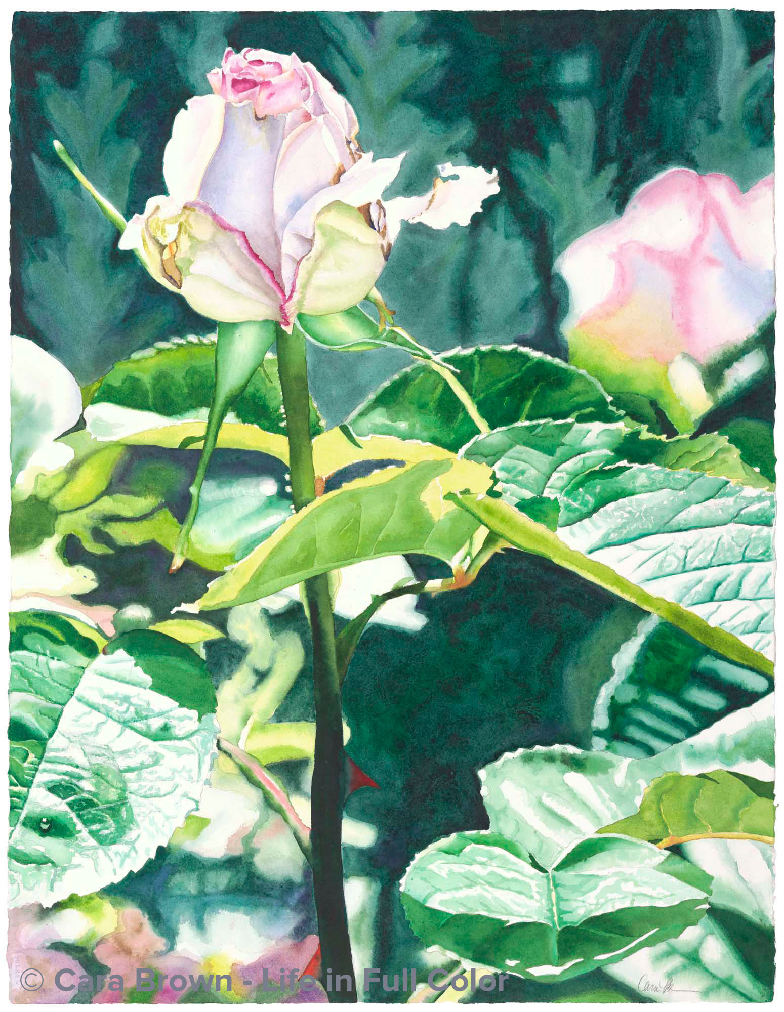
Moonstone Rose
Original Sold
Shop Online for Archival Prints
One of the masters who inspires my work is Joseph Raffael. In and email update of his work was a painting of pale roses with pink edges called "Roses Reverie" that knocked my socks off - and it kicked off a hunger in me to paint something like it.
Then, I took photos of some Moonstone roses in my back yard. There just wasn't a composition of a group of them like he had painted that worked. But this single rose did. I just loved the way that one petal curled out to the right.
As it turns out, this painting is not so much about the rose, though. The way the light landed on the leaves and the way they stretch out like a dancer's arms is the why of this painting. I left the main bud to the end, (with most of my paintings I paint the "centerpiece" last) and it was actually anti-climactic - I'd already done my favorite part!
Now, when I look at this painting I see elegance and self-assurance, I think of the first two lines of one of my favorite poems: "St Francis and the Sow" by Galway Kinnell and the powerful meaning this poem has had for me.
"The bud stands for all things, for all things flower from within of self blessing."
January 2007 - 30"x22" - Watercolor on paper
Moonstone Rose
Roses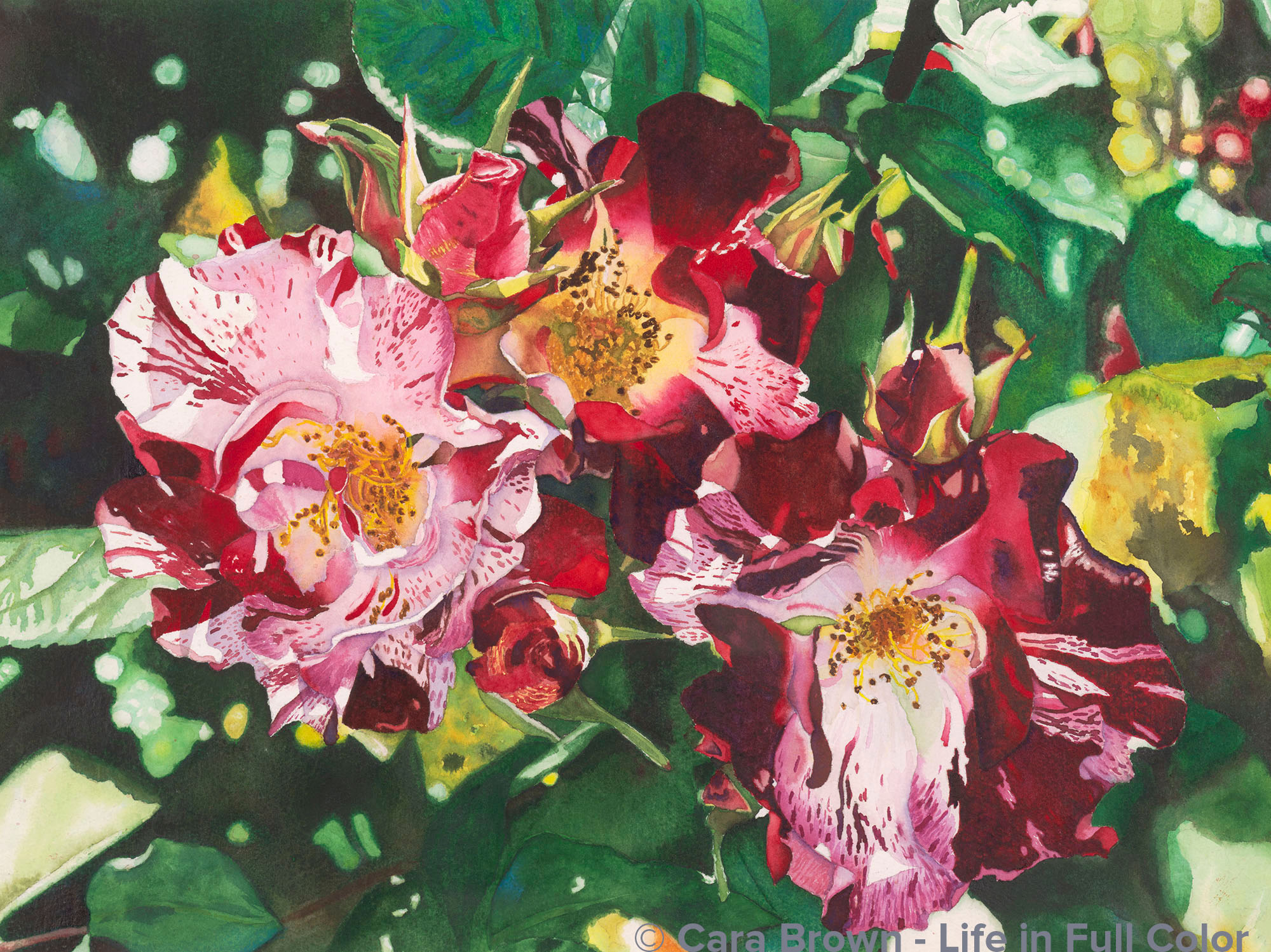
Roses for Annie
Original Sold
Shop Online
Archival Print Sizes/Prices:
22"x30" - $495
15"x22" - $395
7.5"x10" - $75
This painting really frightened me. I think it was drawn on the watercolor paper for over a year before I put a brush to it. These roses were growing at the AARS test garden at Garden Valley Ranch in Petaluma. I have no idea what variety they are, or if they even became one. Annie is my sister-in-law. I was inspired by her fiery energy to paint these wildly detailed roses.
October 2004 - 22"x30" - Watercolor on paper
Roses for Annie
Roses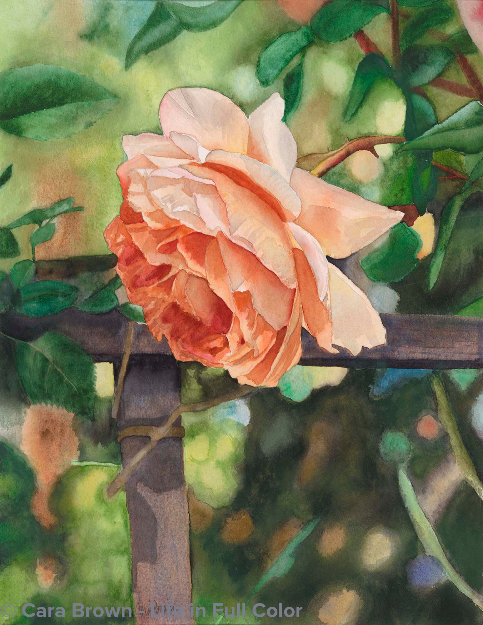
Nancy’s Rose
My Private Collection
Shop Online
Archival Print Sizes/Prices:
15"x11" - $195
8.5"x6.5" - $60
The photo that inspired this painting was taken in the garden at friends Dean and Nancy's home when they lived in Fairfax. It's the earliest of my paintings here on my website. Here is where I first attempted to portray what I now call a "fuzzy background" giving my paintings a sense of depth. I began to see how much more interesting it is to paint subjects in context. The fence behind this rose places it in space, giving the painting it's third dimension.
I also earned not to use black watercolor because of this painting as I did in the bottom right corner. The original painting looks sooty and flat whereever there is black. With the wonder of Photoshop, I've warmed it up for the giclee prints!
2000 - 15"x11" - Watercolor on paper
